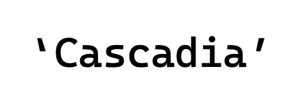
Open quotation marks, single and double, feel as though they’re pointing the wrong direction.
The characters have a bit more weight at the bottom but ‘point outward’, making it appear backwards.
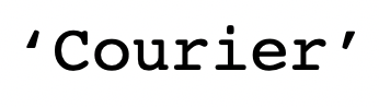
Contrast this with Courier and Courier New, both of which use a similar glyph style:
Courier has a weighted bottom, pointing ‘in’:
Courier New has a weighted top, pointing ‘in’:

Cascadia should use a ‘pointing inward’ glyph for its quotation marks.
I find the ‘weighted top’ style to be easier to read when using this style of glyph. For example, compare to SF Mono, whose quotes are very difficult to discern at anything but large sizes because it uses a ‘weighted bottom’ style:

Open quotation marks, single and double, feel as though they’re pointing the wrong direction.
The characters have a bit more weight at the bottom but ‘point outward’, making it appear backwards.
Contrast this with Courier and Courier New, both of which use a similar glyph style:
Courier has a weighted bottom, pointing ‘in’:

Courier New has a weighted top, pointing ‘in’:

Cascadia should use a ‘pointing inward’ glyph for its quotation marks.
I find the ‘weighted top’ style to be easier to read when using this style of glyph. For example, compare to SF Mono, whose quotes are very difficult to discern at anything but large sizes because it uses a ‘weighted bottom’ style: