Repository navigation
[UI] Fix a Read-Only 'Warnings' tabs and also fix Tab-order and behaviour - #756
Merged
Merged
Conversation


 goneng
changed the title
goneng
changed the title
goneng
force-pushed
the
fix-preferences-tab-margins
branch
from
October 3, 2026 17:45
2a833c5 to
e70c4e0
Compare
goneng
changed the title
goneng
force-pushed
the
fix-preferences-tab-margins
branch
from
October 3, 2026 18:35
e70c4e0 to
4fbe576
Compare
goneng
marked this pull request as ready for review
October 3, 2026 18:35
goneng
marked this pull request as draft
October 3, 2026 20:19
goneng
force-pushed
the
fix-preferences-tab-margins
branch
2 times, most recently
from
October 3, 2026 22:49
90804b5 to
f921434
Compare

Give both Preferences tabs the same top and bottom margins that the
General and Updates tabs already have, and fix the Warnings list.

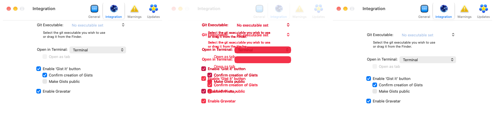
- Integration: add room above the Git Executable row, which sat against
  the toolbar, and balance the bottom margin.
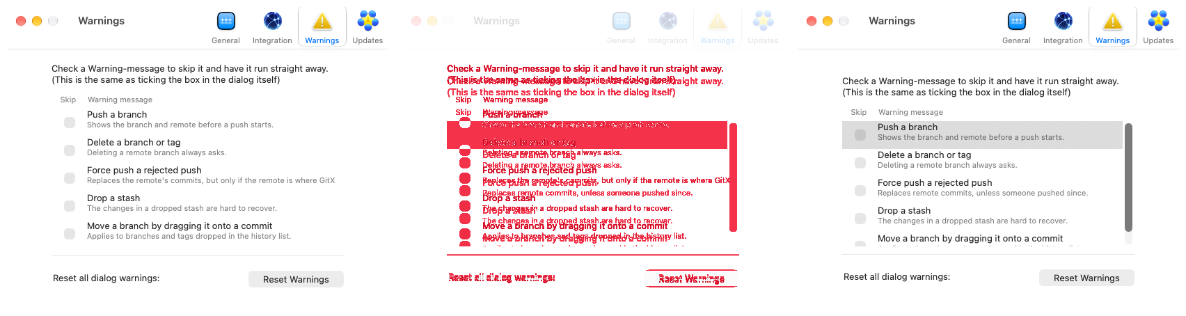
- Warnings: add room above the description and below the Reset row.
- Warnings: reserve room for 4.5 rows and keep the tab at a fixed size,
  so the half visible row hints that the list scrolls once there are
  more dialogs. Drop the code that resized the list to the row count.
- Warnings: shorten the Force push description, which was cut off.
- Measured through accessibility, all four tabs now have 37 to 41 points
  above and below their controls.
goneng
force-pushed
the
fix-preferences-tab-margins
branch
3 times, most recently
from
October 3, 2026 23:42
b2a43a9 to
ff517cd
Compare
goneng
marked this pull request as ready for review
October 3, 2026 23:50
goneng
changed the title
Make the Warnings list react to clicks and Space, and let Tab leave it
in one press.

- Drop the delegate method that refused every row selection. The table
  tracks a click on a checkbox only when its row can be selected, so
  neither a click nor Space toggled anything.
- Make Tab and Shift-Tab leave the list at once. A cell-based table
  stopped on its checkbox column after the table itself, and its hidden
  scroller was a stop of its own, so it took several presses to get out.
- Add tests that click a checkbox, press Space on a selected row and
  press Tab in the list.
Move focus between the Preferences tabs with the arrow keys the way
Tab does, and turn Return into a click, so the focused tab reacts to
Space and Return.

- Left and Right put focus on an internal toolbar view that ignores
  Space. Step through the key view loop instead, which lands on the tab
  button itself.
- The tab button ignores Return and Enter, so click it for them.
- Checked with real key presses: Tab, Right and Left reach the tabs and
  Space or Return then shows the pane. No automated test, since the
  toolbar cannot be reached through the key view loop in the test run.
goneng
force-pushed
the
fix-preferences-tab-margins
branch
from
October 3, 2026 23:55
ff517cd to
3efabfe
Compare

Contributor
|
Screenshot differs: emulatorApi=arm64 with 2 screenshot(s) |

hannesa2
approved these changes
Oct 4, 2026


Collaborator
Author
Contributor
|
I just created 1.7.1 |
Collaborator
Author
Great! |
This file contains hidden or bidirectional Unicode text that may be interpreted or compiled differently than what appears below. To review, open the file in an editor that reveals hidden Unicode characters.
Learn more about bidirectional Unicode characters
Sign up for free
to join this conversation on GitHub.
Already have an account?
Sign in to comment


Add this suggestion to a batch that can be applied as a single commit.This suggestion is invalid because no changes were made to the code.Suggestions cannot be applied while the pull request is closed.Suggestions cannot be applied while viewing a subset of changes.Only one suggestion per line can be applied in a batch.Add this suggestion to a batch that can be applied as a single commit.Applying suggestions on deleted lines is not supported.You must change the existing code in this line in order to create a valid suggestion.Outdated suggestions cannot be applied.This suggestion has been applied or marked resolved.Suggestions cannot be applied from pending reviews.Suggestions cannot be applied on multi-line comments.Suggestions cannot be applied while the pull request is queued to merge.Suggestion cannot be applied right now. Please check back later.
Fix the Integration and Warnings tabs in Preferences, whose controls sat
too close to the toolbar and the bottom edge compared to General and
Updates, and fix the Warnings list at a size that hints at more rows.
Workplan
so the half-visible row hints that the list scrolls.
The code that (automatically) resized the list to the current row-count is removed.
Screenshots
(the list's vertical size is uneven on purpose, based on Apple's UI-design best practices)
Test plan
Gaps above and below the controls, in points:
General 38/39, Updates 38/41, Warnings 37/41, Integration 39/39.
including a test for the 4.5 rows.
reach the tabs; Space and Return show the pane. No automated test.