Repository navigation
Cosmetic: Better align the ref labels - reading low in their capsules - #690
Merged
Merged
Conversation


A ref label's capsule is the text's line box, which reserves room for
an ascender and a descender that most branch names never both use, so
the glyphs sat low in it and a name ending in a descender came to rest
on the capsule's border with nothing underneath it.

* Lift the text a point inside the capsule rather than drawing it into
  the capsule itself. That balances the space above the glyphs against
  the space below and gives a descender its clearance, without the
  capsule changing size at all.
* Leave the capsule alone. Padding it was the first attempt and it is
  the wrong remedy: it preserves the ratio of air above the glyphs to
  air below and merely adds more of both, which reads worse.
* Cover the lift with tests, one of which pins the capsule's height so
  that the padding does not get tried a second time.

Leave the baseline where it is. The labels sit on cap-height centring,
which is what keeps master and MASTER sharing a baseline rather than
drifting apart from one another.
The details view lists the same labels in HTML, where the background
box covers the font's content area and the text sat low inside it for
the same reason it did in the history rows.

* Take a pixel off the top of the label's padding and add one to the
  bottom, lifting the text inside a capsule of unchanged height, which
  is the stylesheet's equivalent of the lift the cell now does.

goneng
force-pushed
the
pad-the-ref-label-capsules
branch
from
September 19, 2026 14:11
6dd9419 to
daf26fe
Compare
goneng
changed the title
goneng
marked this pull request as ready for review
September 19, 2026 14:13
goneng
changed the title
goneng
changed the title

Contributor
|
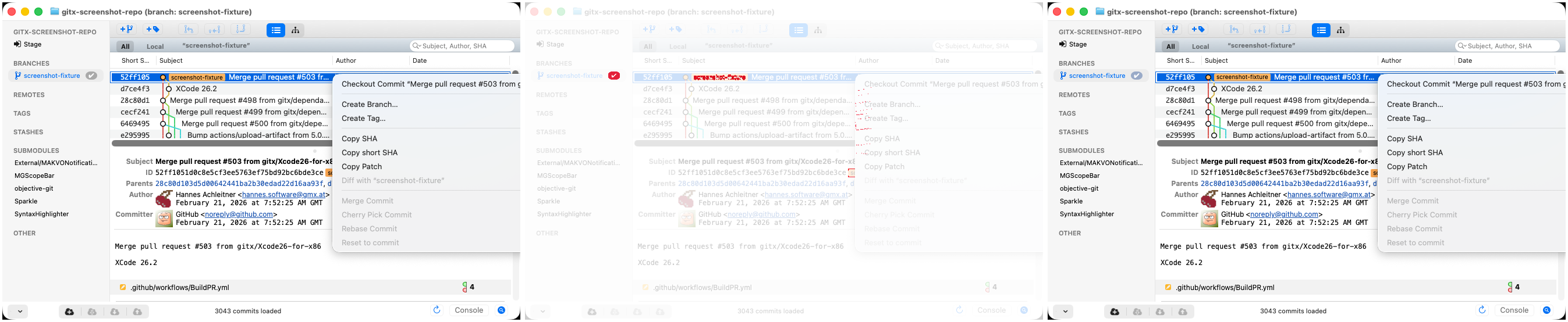
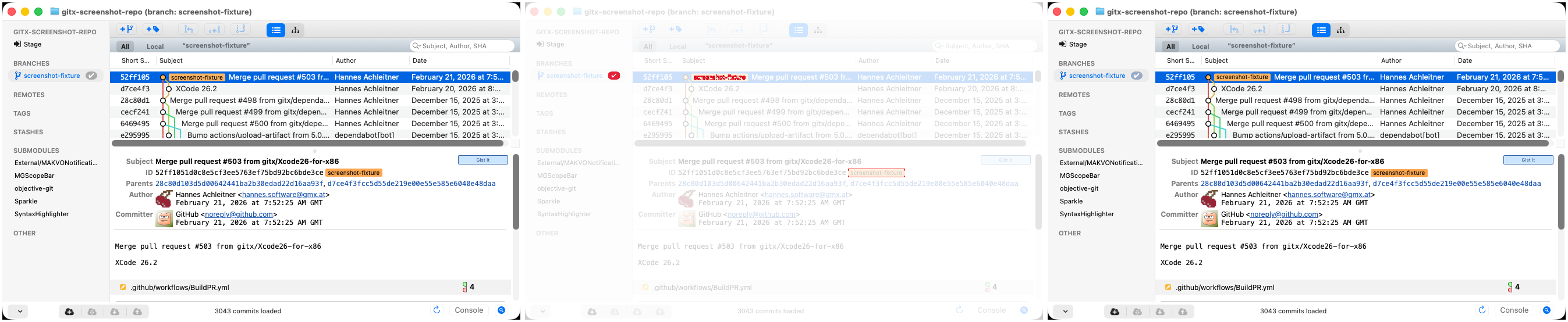
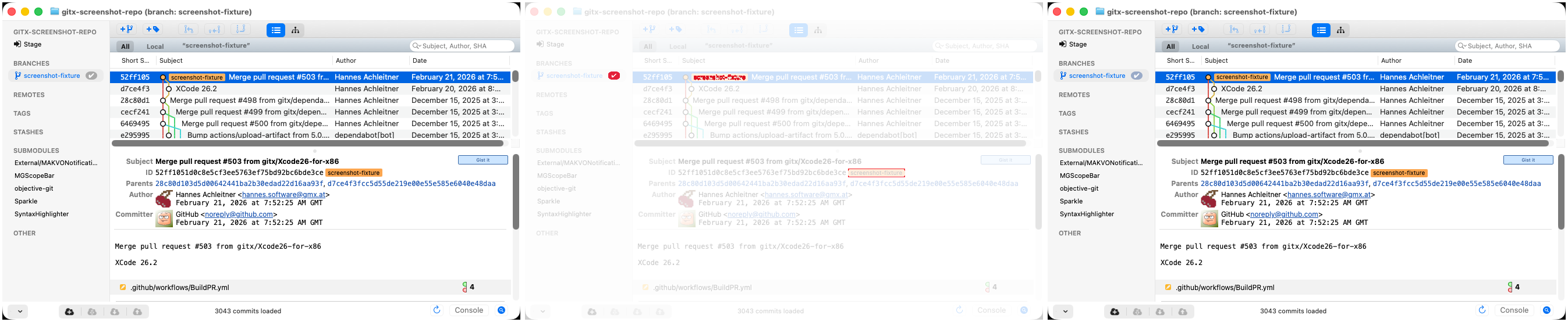
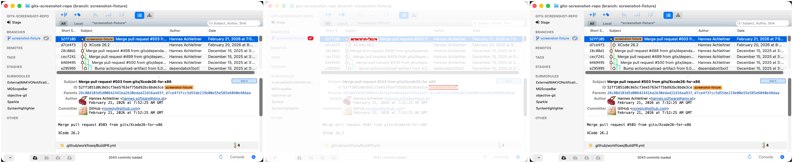
Screenshot differs: emulatorApi=arm64 with 4 screenshot(s) |

This file contains hidden or bidirectional Unicode text that may be interpreted or compiled differently than what appears below. To review, open the file in an editor that reveals hidden Unicode characters.
Learn more about bidirectional Unicode characters
Sign up for free
to join this conversation on GitHub.
Already have an account?
Sign in to comment


Add this suggestion to a batch that can be applied as a single commit.This suggestion is invalid because no changes were made to the code.Suggestions cannot be applied while the pull request is closed.Suggestions cannot be applied while viewing a subset of changes.Only one suggestion per line can be applied in a batch.Add this suggestion to a batch that can be applied as a single commit.Applying suggestions on deleted lines is not supported.You must change the existing code in this line in order to create a valid suggestion.Outdated suggestions cannot be applied.This suggestion has been applied or marked resolved.Suggestions cannot be applied from pending reviews.Suggestions cannot be applied on multi-line comments.Suggestions cannot be applied while the pull request is queued to merge.Suggestion cannot be applied right now. Please check back later.
Follow-up to #683, against the remainder of #679.
#683 lined the subject and the short SHA up on the row and deliberately left the ref labels alone. With those two settled, the labels were the element still reading wrong, in the history rows and in the commit header alike.
The cause is not alignment. A label's capsule is the text's line box, which reserves room for an ascender and a descender that most branch names never both use. The glyphs therefore sit low in it, and a name ending in a descender comes to rest on the border with nothing underneath.
Measured off a real row, capsule spanning
y=14..25:masterorigin/mastermasterbecomes 3 and 3,origin/master2 and 1.The two commits are separable. The first is the history row, the second the commit header.
What was tried and rejected
Padding the capsule instead, so a descender would clear the border. It is the obvious move and it is wrong: growing the capsule by a point on each side preserves the ratio of air above the glyphs to air below and merely adds more of both. On screen the labels simply looked bloated, with the text no better placed. A test now pins the capsule's height so this does not get tried a second time.
What this does not change
The baseline. The labels sit on cap-height centring, which keeps
masterandMASTERsharing a baseline instead of drifting apart. Measured against the capsule, the ink centre still lands differently per name, and that spread is the font's rather than the cell's:MASTERmasterorigin/masterCentring each label's own ink would flatten that column but give adjacent labels different baselines, which is worse.
Expected results
Test plan
PBGitRevisionCellLayoutTests: that the text is lifted above the capsule's top edge, that a descender no longer reaches the bottom border, and that the capsule stays the size of its text.