Repository navigation
Cosmetic: Move the content of the preference panes a bit to the left (where their title starts) - #674
Merged
Merged
Conversation


The content of every pane sat 12pt to the right of the pane title, so
the window read as if its contents were pushed off to one side.

- Move the content of all three panes left onto the title's column,
  keeping the columns they now share
- Leave the Check Now button centered, since it acts for the whole
  Updates pane rather than belonging to that column

Contributor
|
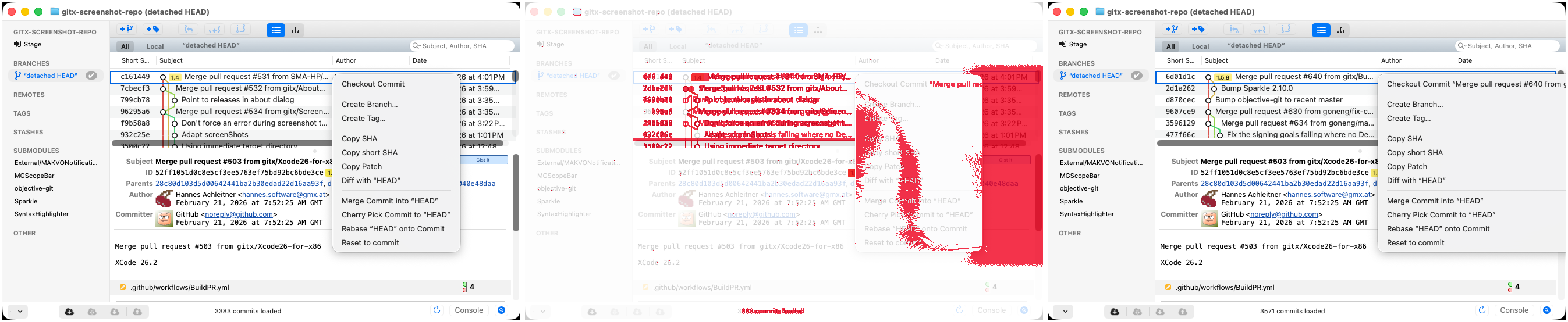
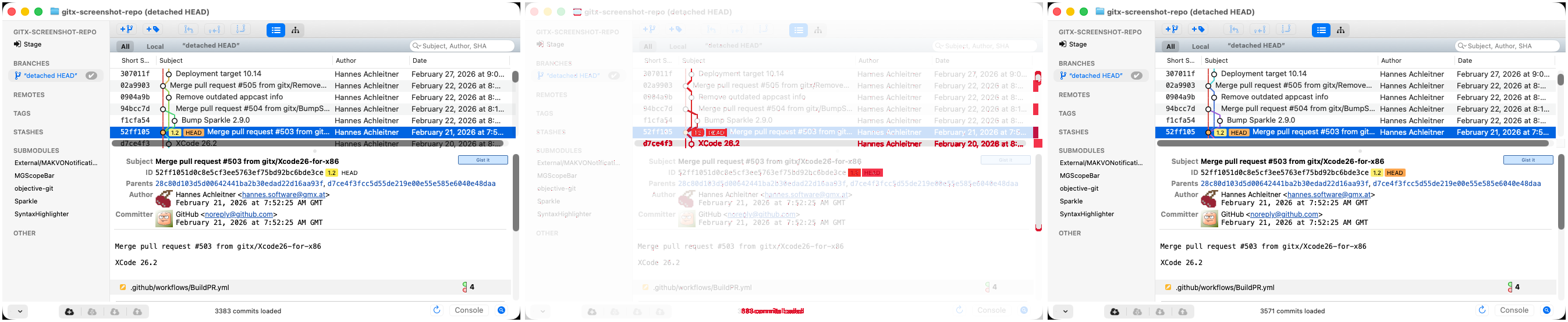
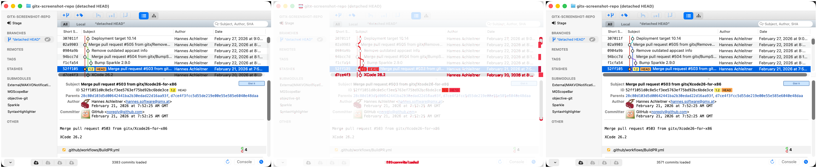
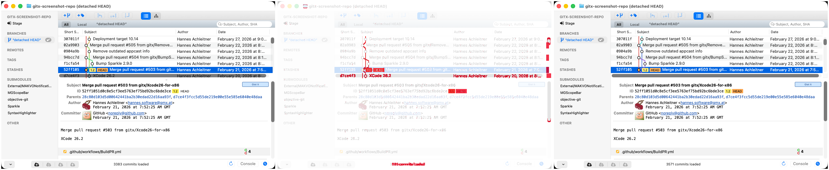
Screenshot differs: emulatorApi=arm64 with 4 screenshot(s) |
 goneng
changed the title
goneng
marked this pull request as ready for review
September 18, 2026 23:27

hannesa2
approved these changes
Sep 19, 2026
 hannesa2
left a comment
hannesa2
left a comment
Contributor
There was a problem hiding this comment.
Thanks for the screenshots !
Unfortunately the screenshot compare mechanism is WIP, otherwise we would see it automatically


This file contains hidden or bidirectional Unicode text that may be interpreted or compiled differently than what appears below. To review, open the file in an editor that reveals hidden Unicode characters.
Learn more about bidirectional Unicode characters
Sign up for free
to join this conversation on GitHub.
Already have an account?
Sign in to comment


Add this suggestion to a batch that can be applied as a single commit.This suggestion is invalid because no changes were made to the code.Suggestions cannot be applied while the pull request is closed.Suggestions cannot be applied while viewing a subset of changes.Only one suggestion per line can be applied in a batch.Add this suggestion to a batch that can be applied as a single commit.Applying suggestions on deleted lines is not supported.You must change the existing code in this line in order to create a valid suggestion.Outdated suggestions cannot be applied.This suggestion has been applied or marked resolved.Suggestions cannot be applied from pending reviews.Suggestions cannot be applied on multi-line comments.Suggestions cannot be applied while the pull request is queued to merge.Suggestion cannot be applied right now. Please check back later.
Follow-up to #673, which put the three panes on shared columns but left
that column 12pt to the right of the pane title, so the window still
read as if its contents were pushed off to one side.
keeping the columns they now share
Updates pane rather than belonging to that column
Screenshots
'General' pane
Before:
After:
Test plan
the accessibility tree now reports the options column at 92, the
sub-options at 113 and the controls at 207, where they were 104,
125 and 219
ibtool --errors --warnings --noticesreports no errors and no newnotices against master
shifts sideways between them