Repository navigation
Expand file tree
/
Copy pathdivider.dart
More file actions
385 lines (357 loc) · 13.3 KB
/
Copy pathdivider.dart
File metadata and controls
385 lines (357 loc) · 13.3 KB
1
2
3
4
5
6
7
8
9
10
11
12
13
14
15
16
17
18
19
20
21
22
23
24
25
26
27
28
29
30
31
32
33
34
35
36
37
38
39
40
41
42
43
44
45
46
47
48
49
50
51
52
53
54
55
56
57
58
59
60
61
62
63
64
65
66
67
68
69
70
71
72
73
74
75
76
77
78
79
80
81
82
83
84
85
86
87
88
89
90
91
92
93
94
95
96
97
98
99
100
101
102
103
104
105
106
107
108
109
110
111
112
113
114
115
116
117
118
119
120
121
122
123
124
125
126
127
128
129
130
131
132
133
134
135
136
137
138
139
140
141
142
143
144
145
146
147
148
149
150
151
152
153
154
155
156
157
158
159
160
161
162
163
164
165
166
167
168
169
170
171
172
173
174
175
176
177
178
179
180
181
182
183
184
185
186
187
188
189
190
191
192
193
194
195
196
197
198
199
200
201
202
203
204
205
206
207
208
209
210
211
212
213
214
215
216
217
218
219
220
221
222
223
224
225
226
227
228
229
230
231
232
233
234
235
236
237
238
239
240
241
242
243
244
245
246
247
248
249
250
251
252
253
254
255
256
257
258
259
260
261
262
263
264
265
266
267
268
269
270
271
272
273
274
275
276
277
278
279
280
281
282
283
284
285
286
287
288
289
290
291
292
293
294
295
296
297
298
299
300
301
302
303
304
305
306
307
308
309
310
311
312
313
314
315
316
317
318
319
320
321
322
323
324
325
326
327
328
329
330
331
332
333
334
335
336
337
338
339
340
341
342
343
344
345
346
347
348
349
350
351
352
353
354
355
356
357
358
359
360
361
362
363
364
365
366
367
368
369
370
371
372
373
374
375
376
377
378
379
380
381
382
383
384
385
// Copyright 2013 The Flutter Authors
// Use of this source code is governed by a BSD-style license that can be
// found in the LICENSE file.
/// @docImport 'color_scheme.dart';
/// @docImport 'drawer.dart';
/// @docImport 'list_tile.dart';
/// @docImport 'popup_menu.dart';
library;
import 'package:flutter/widgets.dart';
import 'divider_theme.dart';
import 'theme.dart';
part 'generated/divider_defaults_m3.g.dart';
// Examples can assume:
// late BuildContext context;
/// A thin horizontal line, with padding on either side.
///
/// In the Material Design language, this represents a divider. Dividers can be
/// used in lists, [Drawer]s, and elsewhere to separate content.
///
/// To create a divider between [ListTile] items, consider using
/// [ListTile.divideTiles], which is optimized for this case.
///
/// Learn more about [Divider] on the [Flutter YouTube channel](https://www.youtube.com/watch?v=_liUC641Nmk).
///
/// The box's total height is controlled by [height]. The appropriate
/// padding is automatically computed from the height.
///
/// <callout-box>
///
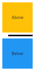
/// This sample shows how to display a Divider between an orange and blue box
/// inside a column. The Divider is 20 logical pixels in height and contains a
/// vertically centered black line that is 5 logical pixels thick. The black
/// line is indented by 20 logical pixels.
///
/// 
///
// TODO(framework): Replace the following block with a @dartpad directive
// when it's supported. https://github.com/dart-lang/dartdoc/issues/4123
/// {@macro material_ui.dartpad_guide}
///
/// {@example /example/lib/divider/divider.0.dart#body}
///
/// </callout-box>
///
/// <callout-box>
///
/// This sample shows the creation of [Divider] widget, as described in:
/// https://m3.material.io/components/divider/overview
///
// TODO(framework): Replace the following block with a @dartpad directive
// when it's supported. https://github.com/dart-lang/dartdoc/issues/4123
/// {@macro material_ui.dartpad_guide}
///
/// {@example /example/lib/divider/divider.1.dart#body}
///
/// </callout-box>
///
/// See also:
///
/// * [PopupMenuDivider], which is the equivalent but for popup menus.
/// * [ListTile.divideTiles], another approach to dividing widgets in a list.
/// * [VerticalDivider], which is the vertical analog of this widget.
/// * <https://material.io/design/components/dividers.html>
class Divider extends StatelessWidget {
/// Creates a Material Design divider.
///
/// The [height], [thickness], [indent], and [endIndent] must be null or
/// non-negative.
const Divider({
super.key,
this.height,
this.thickness,
this.indent,
this.endIndent,
this.color,
this.radius,
}) : assert(height == null || height >= 0.0),
assert(thickness == null || thickness >= 0.0),
assert(indent == null || indent >= 0.0),
assert(endIndent == null || endIndent >= 0.0);
/// The divider's height extent.
///
/// The divider itself is always drawn as a horizontal line that is centered
/// within the height specified by this value.
///
/// If this is null, then the [DividerThemeData.space] is used. If that is
/// also null, then this defaults to 16.0.
final double? height;
/// The thickness of the line drawn within the divider.
///
/// {@template material_ui.Divider.thickness}
/// A divider with a [thickness] of 0.0 is always drawn as a line with a
/// height of exactly one device pixel.
///
/// If this is null, then the [DividerThemeData.thickness] is used. If
/// that is also null, then this defaults to 0.0.
/// {@endtemplate}
final double? thickness;
/// The amount of empty space to the leading edge of the divider.
///
/// {@template material_ui.Divider.indent}
/// If this is null, then the [DividerThemeData.indent] is used. If that is
/// also null, then this defaults to 0.0.
/// {@endtemplate}
final double? indent;
/// The amount of empty space to the trailing edge of the divider.
///
/// {@template material_ui.Divider.endIndent}
/// If this is null, then the [DividerThemeData.endIndent] is used. If that is
/// also null, then this defaults to 0.0.
/// {@endtemplate}
final double? endIndent;
/// {@template material_ui.Divider.radius}
/// The amount of radius for the border of the divider.
///
/// If this is null, then [DividerThemeData.radius] is used. If that is
/// also null, then the default radius of [BoxDecoration] is used.
/// {@endtemplate}
final BorderRadiusGeometry? radius;
/// {@template material_ui.Divider.color}
/// The color to use when painting the line.
///
/// If this is null, then the [DividerThemeData.color] is used. If that is
/// also null, then this defaults to [ColorScheme.outlineVariant], or to
/// [ThemeData.dividerColor] if [ThemeData.useMaterial3] is false.
/// {@endtemplate}
///
/// <callout-box>
///
// TODO(framework): Add unit tests to this code snippet.
// https://github.com/flutter/flutter/issues/188530
///
/// ```dart
/// const Divider(
/// color: Colors.deepOrange,
/// )
/// ```
///
/// </callout-box>
final Color? color;
/// Computes the [BorderSide] that represents a divider.
///
/// If [color] is null, then [DividerThemeData.color] is used. If that is also
/// null, then if [ThemeData.useMaterial3] is true then it defaults to
/// [ThemeData.colorScheme]'s [ColorScheme.outlineVariant]. Otherwise
/// [ThemeData.dividerColor] is used.
///
/// If [width] is null, then [DividerThemeData.thickness] is used. If that is
/// also null, then this defaults to 0.0 (a hairline border).
///
/// If [context] is null, the default color of [BorderSide] is used and the
/// default width of 0.0 is used.
///
/// <callout-box>
///
// TODO(framework): Add unit tests to this code snippet.
// https://github.com/flutter/flutter/issues/188530
///
/// This example uses this method to create a box that has a divider above and
/// below it. This is sometimes useful with lists, for instance, to separate a
/// scrollable section from the rest of the interface.
///
/// ```dart
/// DecoratedBox(
/// decoration: BoxDecoration(
/// border: Border(
/// top: Divider.createBorderSide(context),
/// bottom: Divider.createBorderSide(context),
/// ),
/// ),
/// // child: ...
/// )
/// ```
///
/// </callout-box>
static BorderSide createBorderSide(BuildContext? context, {Color? color, double? width}) {
final DividerThemeData? dividerTheme = context != null ? DividerTheme.of(context) : null;
final DividerThemeData? defaults = context != null
? Theme.of(context).useMaterial3
? _DividerDefaultsM3(context)
: _DividerDefaultsM2(context)
: null;
final Color? effectiveColor = color ?? dividerTheme?.color ?? defaults?.color;
final double effectiveWidth = width ?? dividerTheme?.thickness ?? defaults?.thickness ?? 0.0;
// Prevent assertion since it is possible that context is null and no color
// is specified.
if (effectiveColor == null) {
return BorderSide(width: effectiveWidth);
}
return BorderSide(color: effectiveColor, width: effectiveWidth);
}
@override
Widget build(BuildContext context) {
final ThemeData theme = Theme.of(context);
final DividerThemeData dividerTheme = DividerTheme.of(context);
final DividerThemeData defaults = theme.useMaterial3
? _DividerDefaultsM3(context)
: _DividerDefaultsM2(context);
final double height = this.height ?? dividerTheme.space ?? defaults.space!;
final double thickness = this.thickness ?? dividerTheme.thickness ?? defaults.thickness!;
final double indent = this.indent ?? dividerTheme.indent ?? defaults.indent!;
final double endIndent = this.endIndent ?? dividerTheme.endIndent ?? defaults.endIndent!;
return SizedBox(
height: height,
child: Center(
child: Container(
height: thickness,
margin: EdgeInsetsDirectional.only(start: indent, end: endIndent),
decoration: BoxDecoration(
borderRadius: radius ?? dividerTheme.radius ?? defaults.radius,
border: Border(
bottom: createBorderSide(context, color: color, width: thickness),
),
),
),
),
);
}
}
/// A thin vertical line, with padding on either side.
///
/// In the Material Design language, this represents a divider. Vertical
/// dividers can be used in horizontally scrolling lists, such as a
/// [ListView] with [ListView.scrollDirection] set to [Axis.horizontal].
///
/// The box's total width is controlled by [width]. The appropriate
/// padding is automatically computed from the width.
///
/// <callout-box>
///
/// This sample shows how to display a [VerticalDivider] between a purple and orange box
/// inside a [Row]. The [VerticalDivider] is 20 logical pixels in width and contains a
/// horizontally centered black line that is 1 logical pixels thick. The grey
/// line is indented by 20 logical pixels.
///
// TODO(framework): Replace the following block with a @dartpad directive
// when it's supported. https://github.com/dart-lang/dartdoc/issues/4123
/// {@macro material_ui.dartpad_guide}
///
/// {@example /example/lib/divider/vertical_divider.0.dart#body}
///
/// </callout-box>
///
/// <callout-box>
///
/// This sample shows the creation of [VerticalDivider] widget, as described in:
/// https://m3.material.io/components/divider/overview
///
// TODO(framework): Replace the following block with a @dartpad directive
// when it's supported. https://github.com/dart-lang/dartdoc/issues/4123
/// {@macro material_ui.dartpad_guide}
///
/// {@example /example/lib/divider/vertical_divider.1.dart#body}
///
/// </callout-box>
///
/// See also:
///
/// * [ListView.separated], which can be used to generate vertical dividers.
/// * [Divider], which is the horizontal analog of this widget.
/// * <https://material.io/design/components/dividers.html>
class VerticalDivider extends StatelessWidget {
/// Creates a Material Design vertical divider.
///
/// The [width], [thickness], [indent], and [endIndent] must be null or
/// non-negative.
const VerticalDivider({
super.key,
this.width,
this.thickness,
this.indent,
this.endIndent,
this.color,
this.radius,
}) : assert(width == null || width >= 0.0),
assert(thickness == null || thickness >= 0.0),
assert(indent == null || indent >= 0.0),
assert(endIndent == null || endIndent >= 0.0);
/// The divider's width.
///
/// The divider itself is always drawn as a vertical line that is centered
/// within the width specified by this value.
///
/// If this is null, then the [DividerThemeData.space] is used. If that is
/// also null, then this defaults to 16.0.
final double? width;
/// The thickness of the line drawn within the divider.
///
/// A divider with a [thickness] of 0.0 is always drawn as a line with a
/// width of exactly one device pixel.
///
/// If this is null, then the [DividerThemeData.thickness] is used which
/// defaults to 0.0.
final double? thickness;
/// The amount of empty space on top of the divider.
///
/// If this is null, then the [DividerThemeData.indent] is used. If that is
/// also null, then this defaults to 0.0.
final double? indent;
/// The amount of empty space under the divider.
///
/// If this is null, then the [DividerThemeData.endIndent] is used. If that is
/// also null, then this defaults to 0.0.
final double? endIndent;
/// {@macro material_ui.Divider.color}
///
/// <callout-box>
///
// TODO(framework): Add unit tests to this code snippet.
// https://github.com/flutter/flutter/issues/188530
///
/// ```dart
/// const Divider(
/// color: Colors.deepOrange,
/// )
/// ```
///
/// </callout-box>
final Color? color;
/// The amount of radius for the border of the divider.
///
/// If this is null, then the default radius of [BoxDecoration] will be used.
final BorderRadiusGeometry? radius;
@override
Widget build(BuildContext context) {
final ThemeData theme = Theme.of(context);
final DividerThemeData dividerTheme = DividerTheme.of(context);
final DividerThemeData defaults = theme.useMaterial3
? _DividerDefaultsM3(context)
: _DividerDefaultsM2(context);
final double width = this.width ?? dividerTheme.space ?? defaults.space!;
final double thickness = this.thickness ?? dividerTheme.thickness ?? defaults.thickness!;
final double indent = this.indent ?? dividerTheme.indent ?? defaults.indent!;
final double endIndent = this.endIndent ?? dividerTheme.endIndent ?? defaults.endIndent!;
return SizedBox(
width: width,
child: Center(
child: Container(
width: thickness,
margin: EdgeInsetsDirectional.only(top: indent, bottom: endIndent),
decoration: BoxDecoration(
borderRadius: radius ?? dividerTheme.radius ?? defaults.radius,
border: Border(
left: Divider.createBorderSide(context, color: color, width: thickness),
),
),
),
),
);
}
}
class _DividerDefaultsM2 extends DividerThemeData {
const _DividerDefaultsM2(this.context) : super(space: 16, thickness: 0, indent: 0, endIndent: 0);
final BuildContext context;
@override
Color? get color => Theme.of(context).dividerColor;
}