(Material3) Cannot Theme FilledButton and FilledButton.tonal Variants Separately #118063
Description
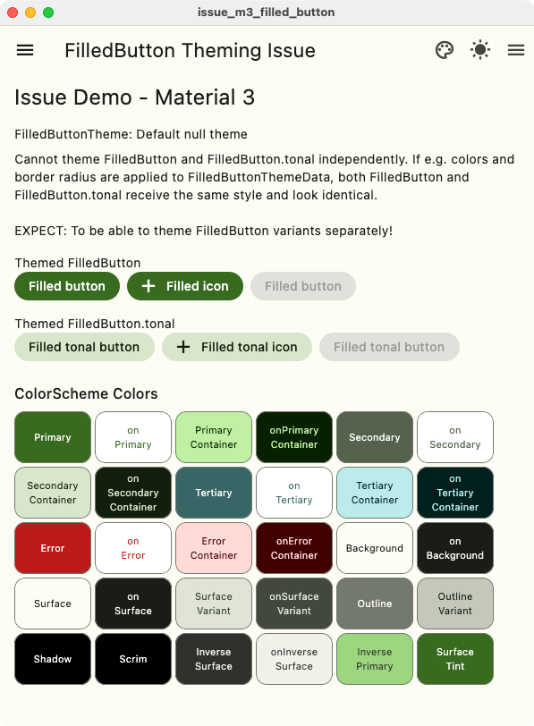
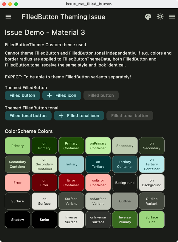
Not possible to theme FilledButton and FilledButton.tonal separately
The new Material 3 buttons FilledButton and FilledButton.tonal cannot be themed separately to use different styles from each other.
This is in conflict with their default themes where these buttons can use different styles and do look different. However, if you use FilledButtonThemeData in ThemeData to try to style the buttons, both variants will become identical since they share the same FilledButtonThemeData. This effectively renders theming of the FilledButton less usable, since e.g. theming its color properties makes the variants look identical.
Background - Variant themes
This is another case of where having variant themes would be useful. This was discussed here with @darrenaustin, including a solution proposal by Darren. Other example cases with similar theme variant challenges are e.g. #115827 and #108539.
Actual and Expected results
Expected to be able to theme the FilledButton and FilledButton.tonal with different styles, since their default themes also have and use different styles.
This is not possible, theming the foregroundColor or backgroundColor of the FilledButton using FilledButtonThemeData makes it impossible to have different themed defaults for FilledButton and FilledButton.tonal as the variants become identical.
| Custom Themed | Default Themed |
|---|---|
 |
 |
 |
 |
Code sample
// MIT License
//
// Copyright (c) 2023 Mike Rydstrom
//
// Permission is hereby granted, free of charge, to any person obtaining a copy
// of this software and associated documentation files (the "Software"), to deal
// in the Software without restriction, including without limitation the rights
// to use, copy, modify, merge, publish, distribute, sublicense, and/or sell
// copies of the Software, and to permit persons to whom the Software is
// furnished to do so, subject to the following conditions:
//
// The above copyright notice and this permission notice shall be included in all
// copies or substantial portions of the Software.
//
// THE SOFTWARE IS PROVIDED "AS IS", WITHOUT WARRANTY OF ANY KIND, EXPRESS OR
// IMPLIED, INCLUDING BUT NOT LIMITED TO THE WARRANTIES OF MERCHANTABILITY,
// FITNESS FOR A PARTICULAR PURPOSE AND NONINFRINGEMENT. IN NO EVENT SHALL THE
// AUTHORS OR COPYRIGHT HOLDERS BE LIABLE FOR ANY CLAIM, DAMAGES OR OTHER
// LIABILITY, WHETHER IN AN ACTION OF CONTRACT, TORT OR OTHERWISE, ARISING FROM,
// OUT OF OR IN CONNECTION WITH THE SOFTWARE OR THE USE OR OTHER DEALINGS IN THE
// SOFTWARE.

import 'package:flutter/material.dart';

// A seed color for M3 ColorScheme.
const Color seedColor = Color(0xff386a20);

// Example theme
ThemeData demoTheme(Brightness mode, bool useFilledButtonTheme) {
  // Make an M3 ColorScheme.from seed
  final ColorScheme scheme = ColorScheme.fromSeed(
    brightness: mode,
    seedColor: seedColor,
  );
  return ThemeData(
    colorScheme: scheme,
    useMaterial3: true,
    filledButtonTheme: useFilledButtonTheme
        ? filledButtonTheme(
            disabledColor: scheme.onSurface,
            foregroundColor: scheme.onTertiaryContainer,
            backgroundColor: scheme.tertiaryContainer,
            radius: 10,
          )
        : null,
  );
}

void main() {
  runApp(const IssueDemoApp());
}

class IssueDemoApp extends StatefulWidget {
  const IssueDemoApp({super.key});

  @override
  State<IssueDemoApp> createState() => _IssueDemoAppState();
}

class _IssueDemoAppState extends State<IssueDemoApp> {
  bool useFilledButtonTheme = true;
  ThemeMode themeMode = ThemeMode.light;
  TextDirection textDirection = TextDirection.ltr;

  @override
  Widget build(BuildContext context) {
    return MaterialApp(
      debugShowCheckedModeBanner: false,
      themeMode: themeMode,
      theme: demoTheme(Brightness.light, useFilledButtonTheme),
      darkTheme: demoTheme(Brightness.dark, useFilledButtonTheme),
      home: Scaffold(
        appBar: AppBar(
          title: const Text('FilledButton Theming Issue'),
          actions: [
            IconButton(
              icon: useFilledButtonTheme
                  ? const Icon(Icons.palette)
                  : const Icon(Icons.palette_outlined),
              onPressed: () {
                setState(() {
                  useFilledButtonTheme = !useFilledButtonTheme;
                });
              },
              tooltip: useFilledButtonTheme
                  ? 'Remove FilledButton Theme'
                  : 'Apply FilledButton Theme',
            ),
            IconButton(
              icon: themeMode == ThemeMode.dark
                  ? const Icon(Icons.wb_sunny_outlined)
                  : const Icon(Icons.wb_sunny),
              onPressed: () {
                setState(() {
                  if (themeMode == ThemeMode.light) {
                    themeMode = ThemeMode.dark;
                  } else {
                    themeMode = ThemeMode.light;
                  }
                });
              },
              tooltip: "Toggle brightness",
            ),
            Builder(builder: (context) {
              return IconButton(
                icon: const Icon(Icons.menu),
                onPressed: () {
                  Scaffold.of(context).openEndDrawer();
                },
              );
            }),
          ],
        ),
        body: HomePage(useFilledButtonTheme: useFilledButtonTheme),
        drawer: const Drawer(
          child: Center(child: Text('Drawer')),
        ),
        endDrawer: const Drawer(
          child: Center(child: Text('End Drawer')),
        ),
      ),
    );
  }
}

class HomePage extends StatelessWidget {
  const HomePage({super.key, required this.useFilledButtonTheme});
  final bool useFilledButtonTheme;

  @override
  Widget build(BuildContext context) {
    final String filledTheme =
        useFilledButtonTheme ? 'Custom theme used' : 'Default null theme';
    return ListView(
      padding: const EdgeInsets.symmetric(horizontal: 16),
      children: [
        const SizedBox(height: 8),
        Text(
          'Issue Demo - Material 3',
          style: Theme.of(context).textTheme.headlineSmall,
        ),
        const SizedBox(height: 16),
        Text('FilledButtonTheme: $filledTheme'),
        const SizedBox(height: 8),
        const Text(
          'Cannot theme FilledButton and FilledButton.tonal independently. '
          'If e.g. colors and border radius are applied to '
          'FilledButtonThemeData, both FilledButton and FilledButton.tonal '
          'receive the same style and look identical.\n\n'
          'EXPECT: To be able to theme FilledButton variants separately!',
        ),
        const SizedBox(height: 16),
        const Text('Themed FilledButton'),
        const FilledButtonShowcase(),
        const SizedBox(height: 16),
        const Text('Themed FilledButton.tonal'),
        const FilledButtonTonalShowcase(),
        const SizedBox(height: 16),
        const ShowColorSchemeColors(),
      ],
    );
  }
}

class FilledButtonShowcase extends StatelessWidget {
  const FilledButtonShowcase({super.key});

  @override
  Widget build(BuildContext context) {
    return Wrap(
      crossAxisAlignment: WrapCrossAlignment.center,
      spacing: 8,
      runSpacing: 8,
      children: <Widget>[
        FilledButton(
          onPressed: () {},
          child: const Text('Filled button'),
        ),
        FilledButton.icon(
          onPressed: () {},
          icon: const Icon(Icons.add),
          label: const Text('Filled icon'),
        ),
        const FilledButton(
          onPressed: null,
          child: Text('Filled button'),
        ),
      ],
    );
  }
}

class FilledButtonTonalShowcase extends StatelessWidget {
  const FilledButtonTonalShowcase({super.key});

  @override
  Widget build(BuildContext context) {
    return Wrap(
      crossAxisAlignment: WrapCrossAlignment.center,
      spacing: 8,
      runSpacing: 8,
      children: <Widget>[
        FilledButton.tonal(
          onPressed: () {},
          child: const Text('Filled tonal button'),
        ),
        FilledButton.tonalIcon(
          onPressed: () {},
          icon: const Icon(Icons.add),
          label: const Text('Filled tonal icon'),
        ),
        const FilledButton.tonal(
          onPressed: null,
          child: Text('Filled tonal button'),
        ),
      ],
    );
  }
}

/// An opinionated [FilledButtonThemeData] theme.
FilledButtonThemeData filledButtonTheme({
  /// The foreground of the FilledButton.
  required final Color foregroundColor,

  /// The background of the FilledButton.
  required final Color backgroundColor,

  /// The disabled base of the FilledButton.
  required final Color disabledColor,

  /// The button corner radius.
  final double? radius,
}) {
  final MaterialStateProperty<Color?> bgColor =
      MaterialStateProperty.resolveWith((Set<MaterialState> states) {
    if (states.contains(MaterialState.disabled)) {
      return disabledColor.withOpacity(0.12);
    }
    return backgroundColor;
  });

  final MaterialStateProperty<Color?> fgColor =
      MaterialStateProperty.resolveWith((Set<MaterialState> states) {
    if (states.contains(MaterialState.disabled)) {
      return disabledColor.withOpacity(0.38);
    }
    return foregroundColor;
  });

  final MaterialStateProperty<Color?> overlayColor =
      MaterialStateProperty.resolveWith((Set<MaterialState> states) {
    if (states.contains(MaterialState.hovered)) {
      return backgroundColor.withOpacity(0.08);
    }
    if (states.contains(MaterialState.focused)) {
      return backgroundColor.withOpacity(0.12);
    }
    if (states.contains(MaterialState.pressed)) {
      return backgroundColor.withOpacity(0.12);
    }
    return null;
  });

  return FilledButtonThemeData(
    style: ButtonStyle(
      foregroundColor: fgColor,
      backgroundColor: bgColor,
      overlayColor: overlayColor,
      shape: radius == null
          ? null
          : ButtonStyleButton.allOrNull<OutlinedBorder>(
              RoundedRectangleBorder(
                borderRadius: BorderRadius.all(
                  Radius.circular(radius),
                ),
              ),
            ),
    ),
  );
// }
}

/// Draw a number of boxes showing the colors of key theme color properties
/// in the ColorScheme of the inherited ThemeData and its color properties.
class ShowColorSchemeColors extends StatelessWidget {
  const ShowColorSchemeColors({super.key, this.onBackgroundColor});

  /// The color of the background the color widget are being drawn on.
  ///
  /// Some of the theme colors may have semi transparent fill color. To compute
  /// a legible text color for the sum when it shown on a background color, we
  /// need to alpha merge it with background and we need the exact background
  /// color it is drawn on for that. If not passed in from parent, it is
  /// assumed to be drawn on card color, which usually is close enough.
  final Color? onBackgroundColor;

  // Return true if the color is light, meaning it needs dark text for contrast.
  static bool _isLight(final Color color) =>
      ThemeData.estimateBrightnessForColor(color) == Brightness.light;

  // On color used when a theme color property does not have a theme onColor.
  static Color _onColor(final Color color, final Color bg) =>
      _isLight(Color.alphaBlend(color, bg)) ? Colors.black : Colors.white;

  @override
  Widget build(BuildContext context) {
    final ThemeData theme = Theme.of(context);
    final ColorScheme colorScheme = theme.colorScheme;
    final bool useMaterial3 = theme.useMaterial3;
    const double spacing = 4;

    // Grab the card border from the theme card shape
    ShapeBorder? border = theme.cardTheme.shape;
    // If we had one, copy in a border side to it.
    if (border is RoundedRectangleBorder) {
      border = border.copyWith(
        side: BorderSide(
          color: theme.dividerColor,
          width: 1,
        ),
      );
      // If
    } else {
      // If border was null, make one matching Card default, but with border
      // side, if it was not null, we leave it as it was.
      border ??= RoundedRectangleBorder(
        borderRadius: BorderRadius.all(Radius.circular(useMaterial3 ? 12 : 4)),
        side: BorderSide(
          color: theme.dividerColor,
          width: 1,
        ),
      );
    }

    // Get effective background color.
    final Color background =
        onBackgroundColor ?? theme.cardTheme.color ?? theme.cardColor;

    // Wrap this widget branch in a custom theme where card has a border outline
    // if it did not have one, but retains in ambient themed border radius.
    return Theme(
      data: Theme.of(context).copyWith(
        cardTheme: CardTheme.of(context).copyWith(
          elevation: 0,
          shape: border,
        ),
      ),
      child: Column(
        crossAxisAlignment: CrossAxisAlignment.start,
        children: <Widget>[
          Padding(
            padding: const EdgeInsets.symmetric(vertical: 8),
            child: Text(
              'ColorScheme Colors',
              style: theme.textTheme.titleMedium,
            ),
          ),
          Wrap(
            alignment: WrapAlignment.start,
            crossAxisAlignment: WrapCrossAlignment.center,
            spacing: spacing,
            runSpacing: spacing,
            children: <Widget>[
              ColorCard(
                label: 'Primary',
                color: colorScheme.primary,
                textColor: colorScheme.onPrimary,
              ),
              ColorCard(
                label: 'on\nPrimary',
                color: colorScheme.onPrimary,
                textColor: colorScheme.primary,
              ),
              ColorCard(
                label: 'Primary\nContainer',
                color: colorScheme.primaryContainer,
                textColor: colorScheme.onPrimaryContainer,
              ),
              ColorCard(
                label: 'onPrimary\nContainer',
                color: colorScheme.onPrimaryContainer,
                textColor: colorScheme.primaryContainer,
              ),
              ColorCard(
                label: 'Secondary',
                color: colorScheme.secondary,
                textColor: colorScheme.onSecondary,
              ),
              ColorCard(
                label: 'on\nSecondary',
                color: colorScheme.onSecondary,
                textColor: colorScheme.secondary,
              ),
              ColorCard(
                label: 'Secondary\nContainer',
                color: colorScheme.secondaryContainer,
                textColor: colorScheme.onSecondaryContainer,
              ),
              ColorCard(
                label: 'on\nSecondary\nContainer',
                color: colorScheme.onSecondaryContainer,
                textColor: colorScheme.secondaryContainer,
              ),
              ColorCard(
                label: 'Tertiary',
                color: colorScheme.tertiary,
                textColor: colorScheme.onTertiary,
              ),
              ColorCard(
                label: 'on\nTertiary',
                color: colorScheme.onTertiary,
                textColor: colorScheme.tertiary,
              ),
              ColorCard(
                label: 'Tertiary\nContainer',
                color: colorScheme.tertiaryContainer,
                textColor: colorScheme.onTertiaryContainer,
              ),
              ColorCard(
                label: 'on\nTertiary\nContainer',
                color: colorScheme.onTertiaryContainer,
                textColor: colorScheme.tertiaryContainer,
              ),
              ColorCard(
                label: 'Error',
                color: colorScheme.error,
                textColor: colorScheme.onError,
              ),
              ColorCard(
                label: 'on\nError',
                color: colorScheme.onError,
                textColor: colorScheme.error,
              ),
              ColorCard(
                label: 'Error\nContainer',
                color: colorScheme.errorContainer,
                textColor: colorScheme.onErrorContainer,
              ),
              ColorCard(
                label: 'onError\nContainer',
                color: colorScheme.onErrorContainer,
                textColor: colorScheme.errorContainer,
              ),
              ColorCard(
                label: 'Background',
                color: colorScheme.background,
                textColor: colorScheme.onBackground,
              ),
              ColorCard(
                label: 'on\nBackground',
                color: colorScheme.onBackground,
                textColor: colorScheme.background,
              ),
              ColorCard(
                label: 'Surface',
                color: colorScheme.surface,
                textColor: colorScheme.onSurface,
              ),
              ColorCard(
                label: 'on\nSurface',
                color: colorScheme.onSurface,
                textColor: colorScheme.surface,
              ),
              ColorCard(
                label: 'Surface\nVariant',
                color: colorScheme.surfaceVariant,
                textColor: colorScheme.onSurfaceVariant,
              ),
              ColorCard(
                label: 'onSurface\nVariant',
                color: colorScheme.onSurfaceVariant,
                textColor: colorScheme.surfaceVariant,
              ),
              ColorCard(
                label: 'Outline',
                color: colorScheme.outline,
                textColor: colorScheme.background,
              ),
              ColorCard(
                label: 'Outline\nVariant',
                color: colorScheme.outlineVariant,
                textColor: colorScheme.onBackground,
              ),
              ColorCard(
                label: 'Shadow',
                color: colorScheme.shadow,
                textColor: _onColor(colorScheme.shadow, background),
              ),
              ColorCard(
                label: 'Scrim',
                color: colorScheme.scrim,
                textColor: _onColor(colorScheme.scrim, background),
              ),
              ColorCard(
                label: 'Inverse\nSurface',
                color: colorScheme.inverseSurface,
                textColor: colorScheme.onInverseSurface,
              ),
              ColorCard(
                label: 'onInverse\nSurface',
                color: colorScheme.onInverseSurface,
                textColor: colorScheme.inverseSurface,
              ),
              ColorCard(
                label: 'Inverse\nPrimary',
                color: colorScheme.inversePrimary,
                textColor: colorScheme.inverseSurface,
              ),
              ColorCard(
                label: 'Surface\nTint',
                color: colorScheme.surfaceTint,
                textColor: colorScheme.onPrimary,
              ),
            ],
          ),
        ],
      ),
    );
  }
}

/// A [SizedBox] with a [Card] and string text in it. Used in this demo to
/// display theme color boxes.
///
/// Can specify label text color and background color.
class ColorCard extends StatelessWidget {
  const ColorCard({
    super.key,
    required this.label,
    required this.color,
    required this.textColor,
    this.size,
  });

  final String label;
  final Color color;
  final Color textColor;
  final Size? size;

  @override
  Widget build(BuildContext context) {
    const double fontSize = 11;
    const Size effectiveSize = Size(86, 58);

    return SizedBox(
      width: effectiveSize.width,
      height: effectiveSize.height,
      child: Card(
        margin: EdgeInsets.zero,
        clipBehavior: Clip.antiAlias,
        color: color,
        child: Center(
          child: Text(
            label,
            style: TextStyle(color: textColor, fontSize: fontSize),
            textAlign: TextAlign.center,
          ),
        ),
      ),
    );
  }
}
Used Flutter version
Channel master 3.7.0-14.0.pre.42,
Flutter doctor
 flutter doctor -v
[!] Flutter (Channel master, 3.7.0-14.0.pre.42, on macOS 13.0.1 22A400 darwin-arm64, locale en-US)
    • Flutter version 3.7.0-14.0.pre.42 on channel master at /Users/rydmike/fvm/versions/master
    • Upstream repository https://github.com/flutter/flutter.git
    • Framework revision 7a5ae7cfc4 (7 hours ago), 2023-01-05 10:43:15 -0500
    • Engine revision a01548f5fa
    • Dart version 3.0.0 (build 3.0.0-85.0.dev)
    • DevTools version 2.20.0
    • If those were intentional, you can disregard the above warnings; however it is recommended to use "git" directly to perform
      update checks and upgrades.

[✓] Android toolchain - develop for Android devices (Android SDK version 33.0.0)
    • Android SDK at /Users/rydmike/Library/Android/sdk
    • Platform android-33, build-tools 33.0.0
    • Java binary at: /Applications/Android Studio.app/Contents/jre/Contents/Home/bin/java
    • Java version OpenJDK Runtime Environment (build 11.0.13+0-b1751.21-8125866)
    • All Android licenses accepted.

[✓] Xcode - develop for iOS and macOS (Xcode 14.2)
    • Xcode at /Applications/Xcode.app/Contents/Developer
    • Build 14C18
    • CocoaPods version 1.11.3

[✓] Chrome - develop for the web
    • Chrome at /Applications/Google Chrome.app/Contents/MacOS/Google Chrome

[✓] Android Studio (version 2021.3)
    • Android Studio at /Applications/Android Studio.app/Contents
    • Flutter plugin can be installed from:
      🔨 https://plugins.jetbrains.com/plugin/9212-flutter
    • Dart plugin can be installed from:
      🔨 https://plugins.jetbrains.com/plugin/6351-dart
    • Java version OpenJDK Runtime Environment (build 11.0.13+0-b1751.21-8125866)

[✓] IntelliJ IDEA Community Edition (version 2022.3.1)
    • IntelliJ at /Applications/IntelliJ IDEA CE.app
    • Flutter plugin version 71.2.6
    • Dart plugin version 223.8214.16

[✓] VS Code (version 1.73.1)
    • VS Code at /Applications/Visual Studio Code.app/Contents
    • Flutter extension version 3.54.0

[✓] Connected device (2 available)
    • macOS (desktop) • macos  • darwin-arm64   • macOS 13.0.1 22A400 darwin-arm64
    • Chrome (web)    • chrome • web-javascript • Google Chrome 108.0.5359.124

[✓] HTTP Host Availability
    • All required HTTP hosts are available