Because it renders incorrectly in the terminal, what tf even is that character? It's character code is 8211, like wtf?#2014
Because it renders incorrectly in the terminal, what tf even is that character? It's character code is 8211, like wtf?#2014imjamesb wants to merge 2 commits intodocker-mailserver:masterfrom imjamesb:patch-1
Conversation
…character? It's character code is 8211, like wtf?
|
Like all others too, you will need to stick to the PR template and give this PR a proper name. Just because you find something ridiculous does not mean rules do not apply. The issue at hand is not related to a terminal, but to the font your terminal uses.
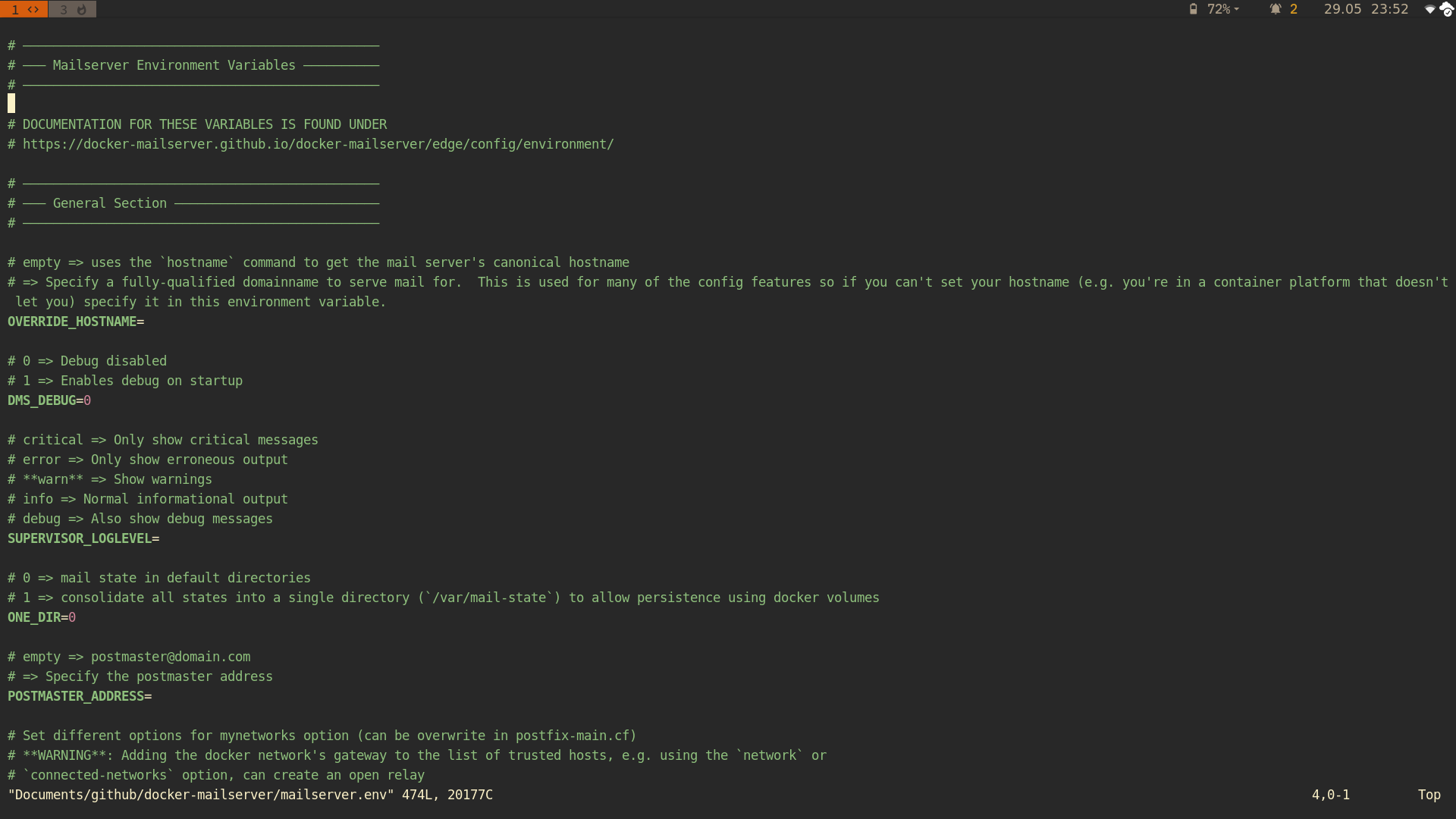
The font your terminal uses is not capable of displaying the en dash, a rather common character which is just a longer dash. I have put them there and prefer them over the normal dash, because, as you can see in the picture, they form a straight line. I know where this is coming from, and it may be a bit fancy, true. I will leave this up to the other @docker-mailserver/maintainers to decide. If they think this really is a valuable change, they should merge it. But I cannot approve nor merge this PR because I prefer the current state. I just double-checked: (Neo)vi(m) is fine as well:
|

|
There's also the em dash, which is said to be a longer variant and to my understanding should always render as full width (1 em in length, as opposed to en which apparently lacks some consistency). There's also other variants for this purpose that could be suitable. Of note, it would seem the Box Drawing glyphs cover this more appropriately than dash glyphs intended primarily for typography? These unicode glyphs have had support since Unicode
|
|
@polarathene I actually wanted to say em dash but hit the "n" instead of the "m" :D The Box Drawings are actually a good idea – why didn't I think of them earlier. |
|
I would stick to plain ASCII, so everyone can enjoy/extend this file, even without a proper font. If the majority is for UTF8 usage, it's fine for me. It doesn't bother me that much 😄 PS: I didn't know, that UTF8 characters were used, until ihack2712 mentioned it. I use PuTTY / ViM and the characters looks like normal dashes for me (Font: consolas). You would only see the difference, if you add a regular dash for comparison.
So when adding a new headline, I would have to keep in mind, to copy/paste an existing headline instead of using my keyboard dash button (to keep all uniformly). |

I would think that you shouldn't have a problem with the Unicode Box Drawing glyphs from 1991. Most OS are meant to have fallback fonts for glyphs a font is missing as well, but perhaps that support is not as good in terminal programs for some reason.
If they were instead em dash I think it would look like a solid line as it's meant to be full width. But the Box Drawing horizontal lines would be more appropriate in that case.
This is a valid point and I don't think most care much how these are styled, only that they render correctly and for contributors are easy to add/modify. I could definitely see potential for mixed glyphs or a need to copy/paste (because who else will know from a glance we're using U+2500 or whatever which also isn't something you'd usually type in a document either 😛 Maybe we should just use the plain hyphen? (I do for a similar block heading style in my own config files, that or |
|
If you‘re going to change it, then please change it in all the documents :) That‘d be my only wish. |
No reason to be redicoulously fancy, I mean this works...