[SPARK-55785][UI] Compact SQL plan visualization with detail side panel#54565
[SPARK-55785][UI] Compact SQL plan visualization with detail side panel#54565yaooqinn wants to merge 2 commits intoapache:masterfrom
Conversation
…il side panel

Improve the SQL execution detail page plan visualization by making DAG nodes compact and adding a detail side panel for on-demand metric viewing.

Changes:
- SparkPlanGraph: Node labels now show only the operator name (no inline metrics), making nodes uniformly small and the graph easier to scan for large queries
- SparkPlanGraph: New makeNodeDetailsJson() generates a JSON blob with full node metrics, stored in a hidden div for JavaScript consumption
- ExecutionPage: Plan viz area split into col-9 (graph) + col-3 (sticky detail panel) using BS5 grid. Panel shows 'Details' initially
- spark-sql-viz.js: On node click, side panel populates with operator name, description, and a metrics table. Existing highlight behavior preserved
- spark-sql-viz.css: Panel styling consistent with plan viz color scheme

Before: All metrics embedded in DAG node labels, making boxes large and the graph hard to navigate for complex queries with many operators.

After: Compact uniform nodes with full metrics accessible via click in a persistent side panel.

Co-authored-by: Copilot <[email protected]>
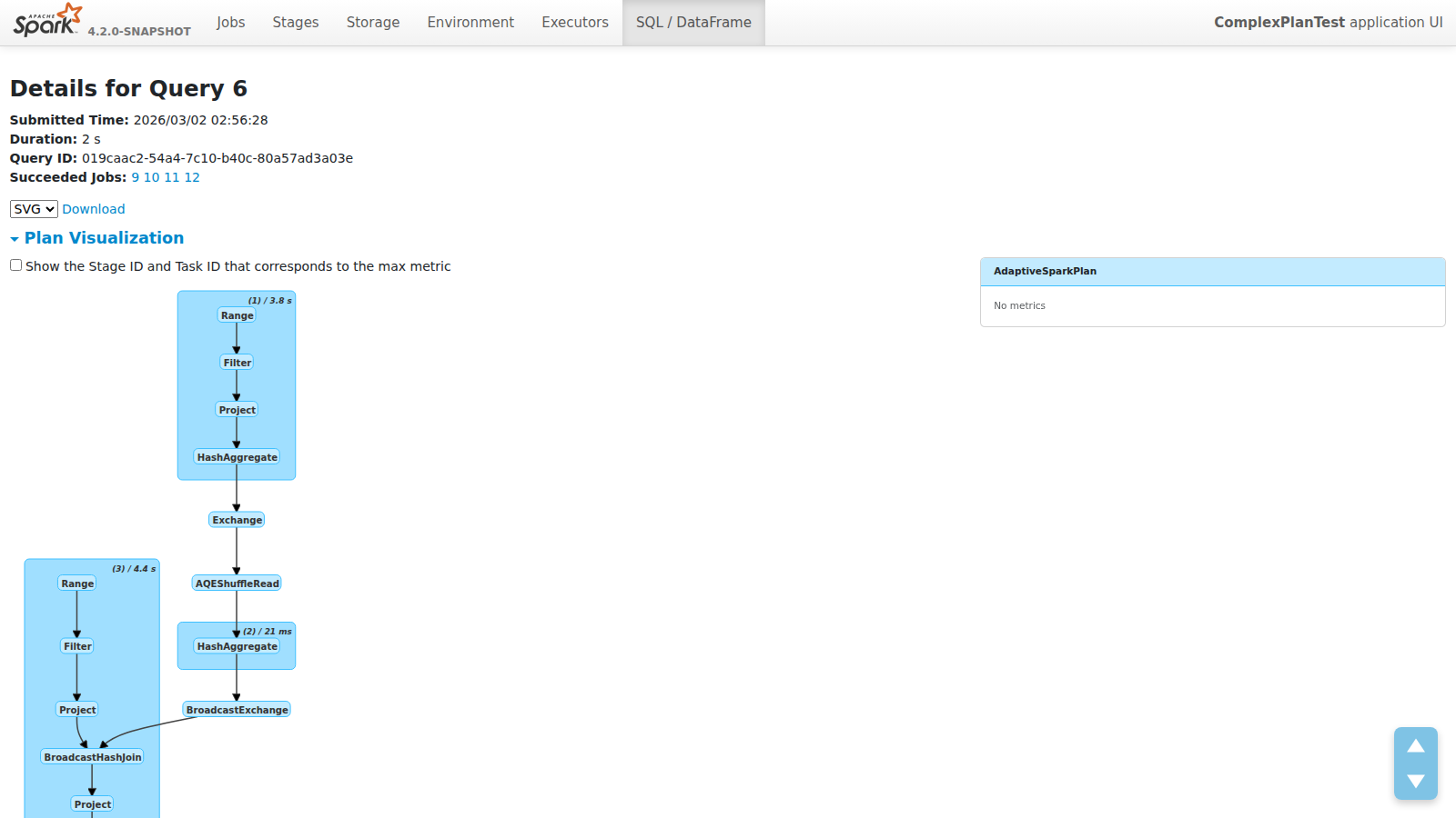
ScreenshotsPlan Overview
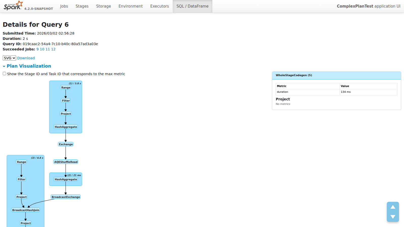
Node Click
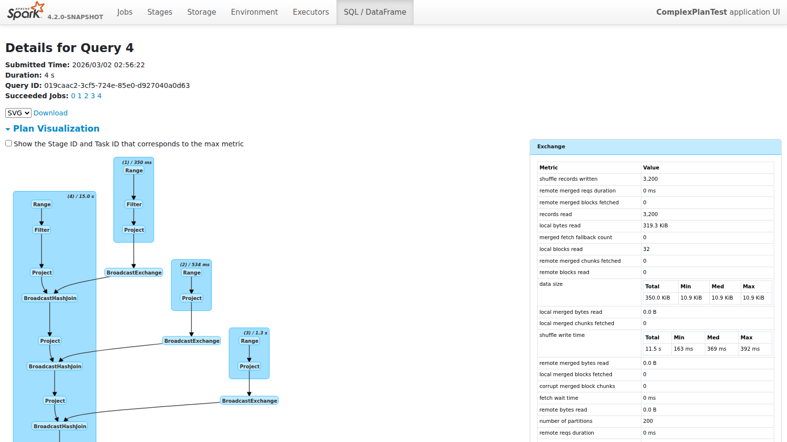
Cluster Click
Complex Plan
|

There was a problem hiding this comment.
Pull request overview
This PR updates Spark SQL’s execution detail “Plan Visualization” to use compact node/cluster labels in the rendered DOT graph, and moves full metric rendering into a clickable right-side details panel driven by server-provided JSON.
Changes:
- Make SparkPlan DOT node labels compact (operator name only) and shorten WholeStageCodegen cluster labels.
- Add
makeNodeDetailsJsonto emit node/cluster metric details for a new right-side details panel. - Update the Plan Visualization page layout + JS/CSS to support node/cluster selection and metric table rendering.
Reviewed changes
Copilot reviewed 5 out of 5 changed files in this pull request and generated 6 comments.
Show a summary per file
| File | Description |
|---|---|
| sql/core/src/main/scala/org/apache/spark/sql/execution/ui/SparkPlanGraph.scala | Generates compact DOT labels and adds node-details JSON for the UI side panel. |
| sql/core/src/main/scala/org/apache/spark/sql/execution/ui/ExecutionPage.scala | Adds a two-column layout with a sticky details panel and embeds node-details JSON in metadata. |
| sql/core/src/main/resources/org/apache/spark/sql/execution/ui/static/spark-sql-viz.js | Implements detail panel rendering, cluster click behavior, and tighter layout spacing. |
| sql/core/src/main/resources/org/apache/spark/sql/execution/ui/static/spark-sql-viz.css | Styles compact labels and the new details side panel. |
| sql/core/src/test/scala/org/apache/spark/sql/execution/ui/SparkPlanGraphSuite.scala | Updates DOT label expectation and adds coverage for node-details JSON prefixes/children. |
💡 Add Copilot custom instructions for smarter, more guided reviews. Learn how to get started.
sql/core/src/main/scala/org/apache/spark/sql/execution/ui/SparkPlanGraph.scala
Show resolved
Hide resolved
sql/core/src/main/scala/org/apache/spark/sql/execution/ui/SparkPlanGraph.scala
Outdated
Show resolved
Hide resolved
sql/core/src/main/scala/org/apache/spark/sql/execution/ui/SparkPlanGraph.scala
Outdated
Show resolved
Hide resolved
sql/core/src/main/resources/org/apache/spark/sql/execution/ui/static/spark-sql-viz.js
Show resolved
Hide resolved
sql/core/src/main/resources/org/apache/spark/sql/execution/ui/static/spark-sql-viz.js
Show resolved
Hide resolved
sql/core/src/test/scala/org/apache/spark/sql/execution/ui/SparkPlanGraphSuite.scala
Outdated
Show resolved
Hide resolved
|
@yaooqinn Thank you for the nice proposal! Let me check in details and will leave my comment tomorrow. |
|
Thank you @sarutak,take you time |
|
@yaooqinn This looks great! I do have one suggestion: with the current change, users can only view metric from one node at a time. What do you think about displaying all nodes connected to the selected node?(highlighted nodes in screenshot) For instance, it would be helpful if users could see the row count right before a filter or join operation. |

In this case, for multi-way join or union, the side table will be a mess. However, your suggestion inspires me that we can add some functionality to the Viz that shows only how a single data/time/memory flow view like |
We can either
|
|
@gengliangwang OK, I will consider that. BTW, the current design referenced databricks' query profiler which also show these data on a side panel |
96a4a1d to
b972b72
Compare
|
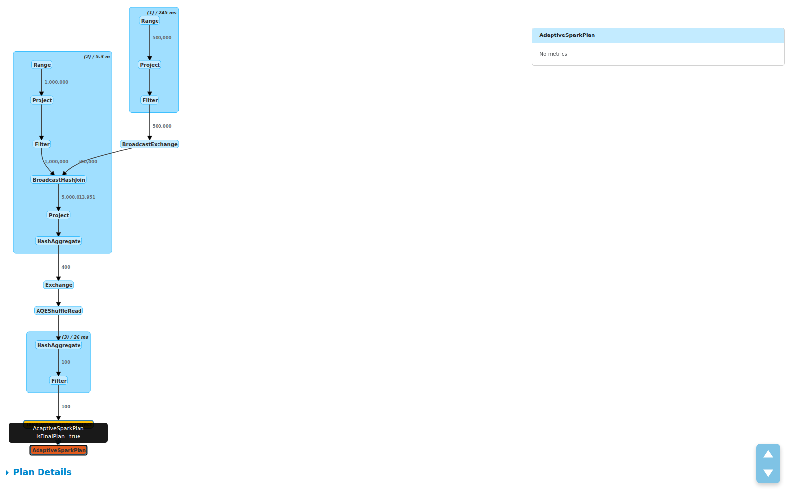
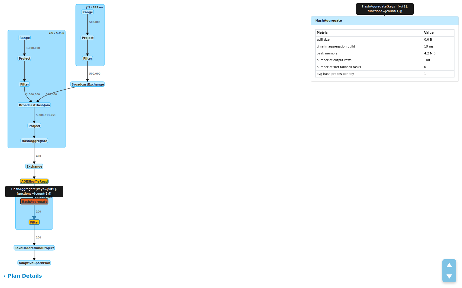
Updated: Edge labels showing row counts between operators
Compact plan visualization with row count labels on edges. The 5B row join explosion is immediately visible.
Full plan view — edge labels show data flow: 1M + 500K inputs → 5B after BroadcastHashJoin → 400 after aggregation → 100 after filter Edge labels highlight:
|

|
Thank you @yaooqinn for proposing a nice feature! I'd like to leave some comments and questions.
|
|
Thanks @sarutak for the thorough review! All 4 points addressed:
|
|
As the appearance was updated by the latest change, could you update the PR description? |
3891dfb to
fb33fae
Compare
Replaces verbose metric-laden DOT node labels with compact operator names
and a clickable detail side panel. Also adds row count labels on edges
to show data flow volume between operators.

Changes:
- SparkPlanGraph: compact node labels (name only), JSON detail data for
  side panel, edge labels showing number of output rows
- spark-sql-viz.js: side panel with metrics table on node click,
  edge highlighting, proper XSS escaping via textContent
- spark-sql-viz.css: side panel styles, edge label styles

Co-authored-by: Copilot <[email protected]>
|
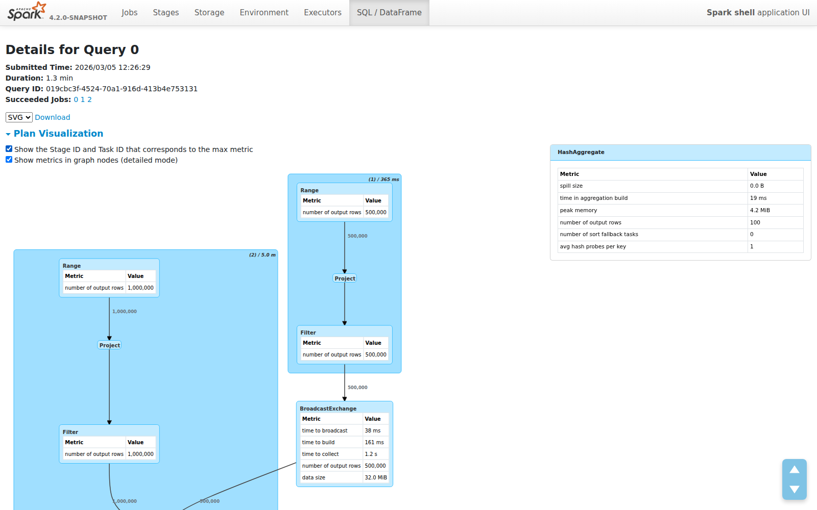
Updated screenshots — all features: 1. Compact mode (default) with edge row counts: 2. Side panel with metrics table on node click: 3. Desc tooltip on panel title hover: 4. Detailed mode — metrics tables embedded in graph nodes (10px font): 5. Detailed mode + Show Stage/Task IDs: |


|
Please take a look at the new design,
|
|
Merged to master, thank you @sarutak |
 gengliangwang
left a comment
gengliangwang
left a comment
There was a problem hiding this comment.
Late LGTM. Thanks for incorporating the suggestions and improvements.
|
Thank you @gengliangwang |
What changes were proposed in this pull request?
Improve the SQL plan visualization on the execution detail page by making node labels compact and adding a clickable detail side panel for metrics.
Key changes:
labelTypeand<b>tags)WholeStageCodegen (1) / duration: total (min, med, max)...to(1) / 9.3smetricTypefrom server JSON to render Total/Min/Med/Max sub-tables (no regex parsing)max-height: 80vh) for large metric setsranksep/nodesep, cluster padding via dagre pre-layoutWhy are the changes needed?
The existing SQL plan visualization bakes all metrics into node labels, making them hard to read for large plans with many operators. The compact layout with on-demand detail panel provides a cleaner overview while keeping full metric details accessible.
Does this PR introduce any user-facing change?
Yes. The SQL execution detail page now shows:
How was this patch tested?
SparkPlanGraphSuitefor new label formatmakeNodeDetailsJsonverifying cluster prefix and children arrayWas this patch authored or co-authored using generative AI tooling?
Yes, co-authored with GitHub Copilot.