Repository navigation
Conversation


Co-Authored-By: Afonso Dutra Nogueira Filho <[email protected]>


|
The following comment was made by an LLM, it may be inaccurate: |


There was a problem hiding this comment.
The change looks correct, but I couldn't check it on screen: there's no browser here. I compiled the new classes with the repo's Tailwind 4.3.3. pointer-coarse: produces @media (pointer: coarse), and because the ! suffix makes the height !important, it wins over the model button's inline height: 28px. The attach IconButton keeps its own sizing CSS with the added class. bun run typecheck in packages/app passes.
Public API: unchanged (styling classes only).
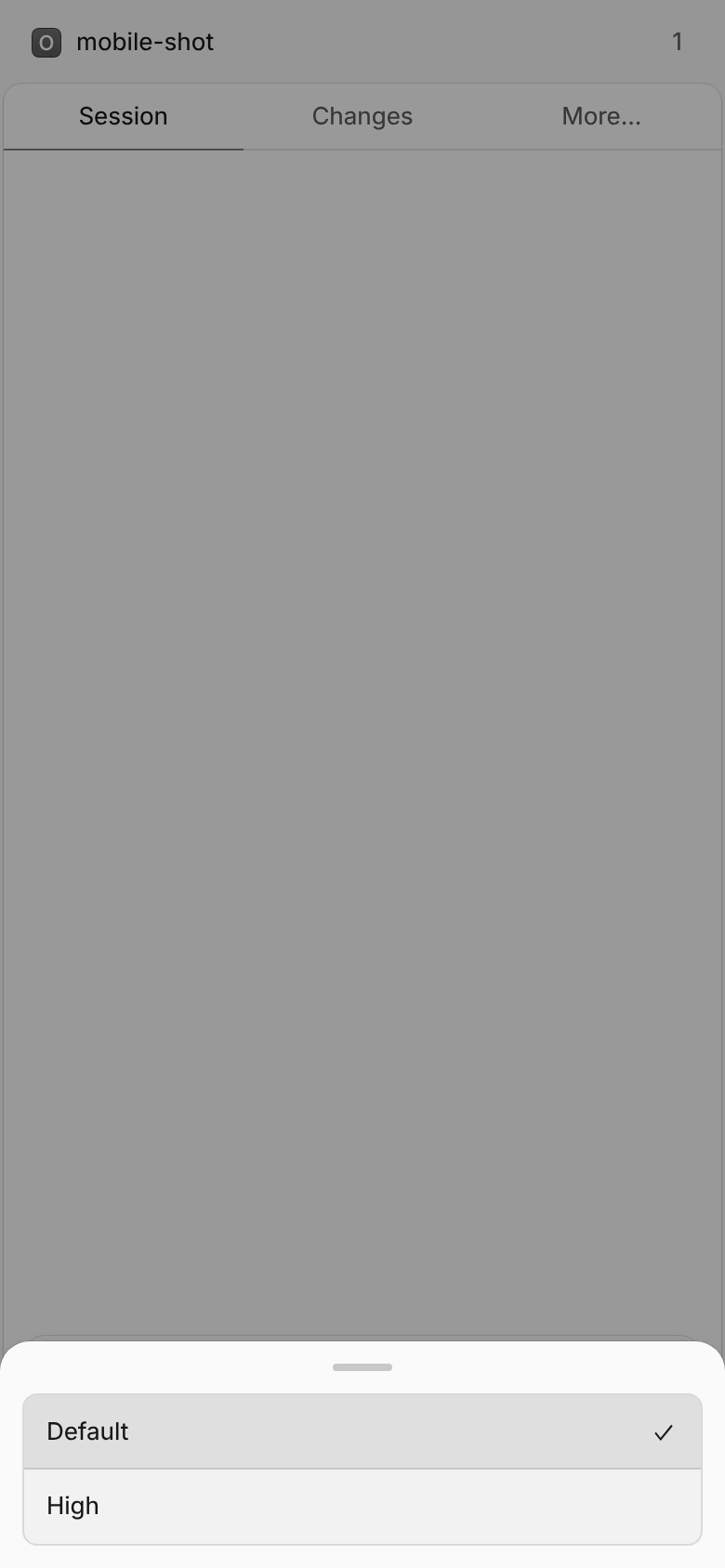
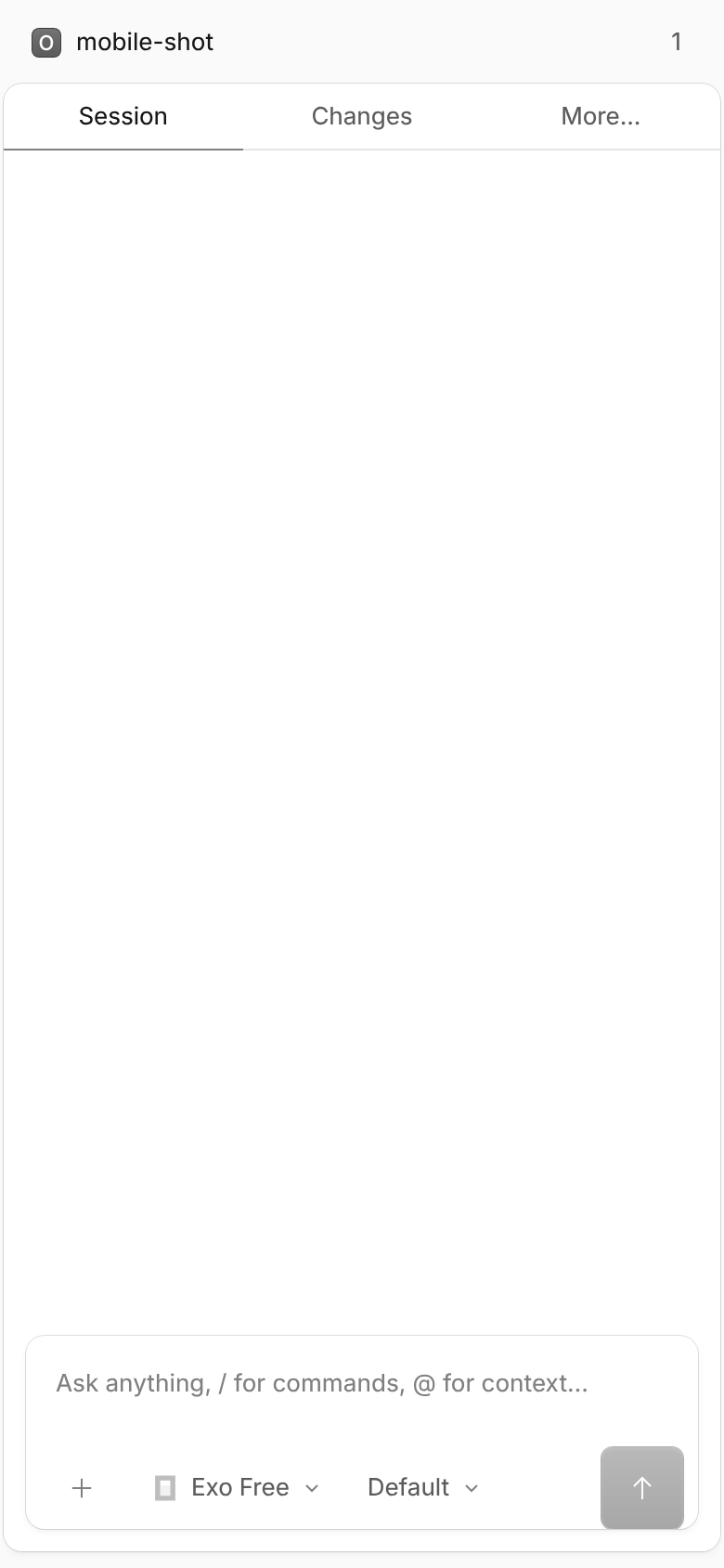
One thing worth checking on a device: the controls bar (flex h-11 items-center px-2 in editor.tsx) is itself 44px tall with no vertical padding. On touch devices the agent, model and variant selects, the attach button and the submit button will fill it edge to edge, and the submit button becomes a 44px filled square. This also applies to wide touch screens such as tablets, not only narrow phones. Could you add before/after screenshots (or a short video) of the composer on a phone, including the variant drawer path, so maintainers can judge the look?
A small correction to the description: inside controlsContent (w-max), the controls never shrink, so min-w-0 doesn't change anything there. The max-w-[140px] cap is what truncates the labels, and that's fine.
Related: #43295
| icon={<Icon name={props.stopping ? "stop" : props.mode === "shell" ? "arrow-undo-down" : "arrow-up"} />} | ||
| variant="submit" | ||
| class="size-7 rounded-md p-[6px]" | ||
| class="size-7 pointer-coarse:size-11! rounded-md p-[6px]" |
There was a problem hiding this comment.
On touch devices this makes the submit button a 44px filled square in a bar that is itself only 44px tall (h-11, no vertical padding), so it fills the bar from top to bottom. The same goes for the 44px selects and the attach button. That may be intended, but it changes the look a lot on phones and tablets. A screenshot would help maintainers judge it. Alternatively, keep the visible size and enlarge only the hit area, e.g. with a padded ::before.
There was a problem hiding this comment.
On size-11 vs a padded ::before hit area: the V1 PR this ports deliberately made the 44px targets visible (WCAG 2.5.5 target size) rather than only enlarging the hit region — the 44px filled submit in a 44px bar is intended. The same applies to pointer-coarse:h-11 on the selects. Keeping the V1 behaviour keeps the port faithful; if maintainers prefer the subtler look, the ::before variant is a small follow-up.
Agreed on min-w-0 — inside controlsContent (w-max) the controls never shrink, so it is inert there; the max-w-[140px] cap is what truncates. Left in place harmlessly; will adjust the description note.
Screenshots of the composer on a phone viewport (incl. the variant drawer) would help — I'll try to attach some.
There was a problem hiding this comment.
Thanks, that makes sense. If the visible 44px targets are intentional, then it's a design call for maintainers, not a bug, and the screenshots are what they'll need to make it. Please include a phone viewport (with the variant drawer) and, if you can, a tablet-width touch viewport. pointer: coarse matches there too, so the bigger controls will also show up on wide screens. Fine to leave min-w-0 in place.
|
Screenshots as requested — composer on a 390×844 mobile viewport with Before (upstream dev) vs after (this branch) — controls bar:
On touch the attach button, agent/model/variant selects and submit all become 44px (WCAG 2.5.5 target size, same as the V1 PR). The submit does fill the 44px Variant drawer (after):
Full session view:
Environment: repo dev servers ( |



|
Automated PR Cleanup Thank you for contributing to opencode. Due to the high volume of PRs from users and AI agents, we periodically close older PRs using automated criteria so maintainers can focus review time on the most active and community-supported contributions. This PR was closed because it matched the following cleanup criteria:
PRs created within the last month are not affected by this cleanup. If you believe this PR was closed incorrectly, or if you are still actively working on it, please leave a comment explaining why it should be reopened. A maintainer can review and reopen it if appropriate. Thanks again for taking the time to contribute. |


Issue for this PR
V2 port of #52940 (the composer controls overflowed and their touch targets were below the 44px minimum on narrow / coarse-pointer viewports).
Type of change
What does this PR do?
V2 rewrote the prompt input as
Composer+ComposerEditorSelect, so this ports the V1 fix onto the new components:ComposerModelControl(packages/app/src/composer/composer.tsx) andComposerEditorSelect(editor/editor.tsx, agent + variant selects):max-w-[220px]→max-w-[140px] sm:max-w-[220px]. On phone viewports the labels truncate to the140pxcap instead of overflowing the row. (min-w-0is also present for the cases where the trigger sits in a shrinking flex context.)composer-attach) and submit (composer-submit) controls gainpointer-coarse:h-11!/pointer-coarse:size-11!(44px touch target only under(pointer: coarse), desktop sizing unchanged).Tooltipwrapper left alone: the controls row already scrolls horizontally (overflow-x-auto), somin-w-0on the trigger itself is what enables truncation.V2 differences vs the V1 diff: submit icon moved into
IconButton(size-7), the variant select gained a mobile drawer path (mobileDrawer), and tooltips don't take aclassprop in V2 — themin-w-0lands on the trigger buttons instead.How did you verify your code works?
bun typecheckinpackages/apppasses (tsgo). Behaviour verified by inspection:pointer-coarse:is a Tailwind 4.3 built-in variant compiling to@media (pointer: coarse);sm:keeps the 220px cap from 640px up.Checklist
Added by the opencode bot (AI-generated).
Related: #43295