Add background color to menu items being hovered#13732
Conversation
|
If I'm not mistaken, it feels a little bit darker than the background used for the inserter/switcher pills. Should we align both? Otherwise, LGTM |
|
You're referring to the hover effect on blocks in the library and switcher right? Yes, eagle eye! That was $light-gray-100, this is $light-gray-200. I have darkened others that use that light gray a little bit:
|


|
Should we add the same hover styles to the block navigation menu? |
|
What's the a11y contrast here? Are we within an acceptable ratio? |
Well within!
|

You mean the block toolbar? |
|
In general, this looks good to me. But I'm noticing that these styles aren't being picked up in the slash inserter:
|

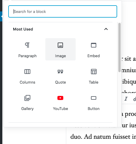
I mean the block hierarchy menu, where we list all the blocks. |
This PR adds some clarity to which menu item you're highlighting. It:

- Adds a background color to a menu item hovered
- Increases the contrast (opacity) of the keyboard shortcut indicator when hovering
- It widens the hit are of the button to go edge to edge

It's a relatively small PR, but it's a really nice improvement to have.
b0fb992 to
334b98a
Compare
|
Great catches, both. Rebased, then fixed the issues:
|

|
Noticed one more tiny thing: The font size dropdown doesn't include this hover state:
Other than that, this looks great though. |

|
You're too quick @jasmussen :P I just noticed that the background is not applied on small breakpoints in the more menu. |
|
Haha ack. I'll make a follow-up PR in a few minutes. |
|
Actually wait, I think that's intentional. I recall a comment in the JS file where it's commented out because of some performance issue. Let me find it. |
|
Interesting 🤔 |
* Add background color to menu items being hovered

This PR adds some clarity to which menu item you're highlighting. It:

- Adds a background color to a menu item hovered
- Increases the contrast (opacity) of the keyboard shortcut indicator when hovering
- It widens the hit are of the button to go edge to edge

It's a relatively small PR, but it's a really nice improvement to have.

* Darken other hover colors to match.

* Address feedback.

* Apply to font size picker too.
This PR adds some clarity to which menu item you're highlighting. It:
It's a relatively small PR, but it's a really nice improvement to have.
Before:
After:
GIF: