The issue
Consider a Columns block containing 2 columns. The Columns block uses flex-wrap: nowrap at a viewport width of 782px and above. Below that, it uses flex-wrap: wrap, which, due to the 32px left margin applied to the 2nd column, would immediately wrap if it weren't for this line applied to the small breakpoint in packages/block-library/src/columns/style.scss:
flex-basis: calc(50% - #{$grid-size-large});By subtracting half of the margin size from the flex-basis calculations of each column, the columns do not wrap needlessly and everything is fine.
Until you decide to use custom column widths. Custom column widths are set using the style JSX attribute and do not take into account the gap between columns, so when your viewport is between 599px and 782px (exclusive), the columns wrap, but their width does not extend to be 100% like it does at 599px and below.
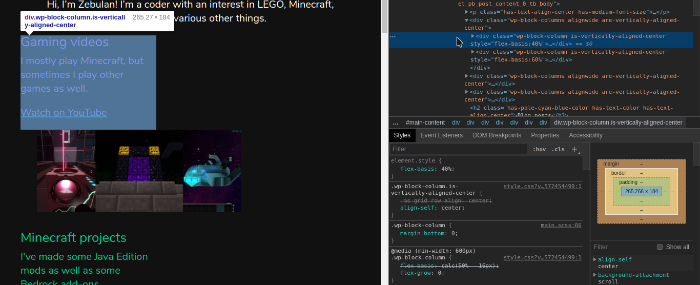
Here is a screenshot showing the effect of this bug, as well as some of the related CSS rules:
Proposed solutions
At first it might seem that the answer is changing the inline style attribute for custom column widths in packages/block-library/src/columns/editor.scss. However, while something like flexBasis: calc(${width}% - 16px) would stop the weird wrapping, it would also cause sets of 3 or more columns to remain side-by-side at widths as small as 600px!
There is also another issue: while 16px works, it's a hardcoded value that should be replaced by the $grid-size-large SCSS variable. But how do you use an SCSS variable in JSX style attributes? Is that even a good idea in the first place?
Looking at the comments in the code and the commit history, I think the intention is that, between the small and medium breakpoints, the Columns block should show a maximum of 2 columns side-by-side, with each column taking up 50% of the available width.
Custom column widths were added later on, and since they use inline styles, they always override the maximum columns rule. Combined with flex wrapping being enabled below the 782px breakpoint, this causes columns with custom column widths to always wrap oddly at this viewport width.
A simpler solution is to use the dreaded !important on the 2 columns rule, forcing columns to all be the same calc(50% - #{$grid-size-large}) width between 599px and 782px viewport widths.
Notably, this would result in odd-numbered last columns taking up half the width of the screen with nothing on the other half. Is this desirable? If not, you could simply add another rule for odd-numbered last columns (e.g. .wp-block-column:last-child:nth-child(odd)) to make them full-width. (Of course, this would also have to use !important.).
One con of this method is that using !important would make theming more difficult; then again, it is already being used by the 1 column rule for viewport widths <= 599px.
How to reproduce
- Insert a Columns block.
- Insert stuff in the first column.
- Insert stuff in the second column.
- Save the post.
- View the post at a viewport width between 599px and 782px (exclusive).
Environment
- WordPress 5.3 RC4
- Gutenberg 6.8.0
Tested on Twenty Nineteen, Twenty Twenty, and Divi. This is not a theme-specific issue.
The issue
Consider a Columns block containing 2 columns. The Columns block uses
flex-wrap: nowrapat a viewport width of 782px and above. Below that, it usesflex-wrap: wrap, which, due to the 32px left margin applied to the 2nd column, would immediately wrap if it weren't for this line applied to the small breakpoint inpackages/block-library/src/columns/style.scss:flex-basis: calc(50% - #{$grid-size-large});By subtracting half of the margin size from the flex-basis calculations of each column, the columns do not wrap needlessly and everything is fine.
Until you decide to use custom column widths. Custom column widths are set using the
styleJSX attribute and do not take into account the gap between columns, so when your viewport is between 599px and 782px (exclusive), the columns wrap, but their width does not extend to be 100% like it does at 599px and below.Here is a screenshot showing the effect of this bug, as well as some of the related CSS rules:

Proposed solutions
At first it might seem that the answer is changing the inline style attribute for custom column widths in
packages/block-library/src/columns/editor.scss. However, while something likeflexBasis: calc(${width}% - 16px)would stop the weird wrapping, it would also cause sets of 3 or more columns to remain side-by-side at widths as small as 600px!There is also another issue: while
16pxworks, it's a hardcoded value that should be replaced by the$grid-size-largeSCSS variable. But how do you use an SCSS variable in JSX style attributes? Is that even a good idea in the first place?Looking at the comments in the code and the commit history, I think the intention is that, between the small and medium breakpoints, the Columns block should show a maximum of 2 columns side-by-side, with each column taking up 50% of the available width.
Custom column widths were added later on, and since they use inline styles, they always override the maximum columns rule. Combined with flex wrapping being enabled below the 782px breakpoint, this causes columns with custom column widths to always wrap oddly at this viewport width.
A simpler solution is to use the dreaded
!importanton the 2 columns rule, forcing columns to all be the samecalc(50% - #{$grid-size-large})width between 599px and 782px viewport widths.Notably, this would result in odd-numbered last columns taking up half the width of the screen with nothing on the other half. Is this desirable? If not, you could simply add another rule for odd-numbered last columns (e.g.
.wp-block-column:last-child:nth-child(odd)) to make them full-width. (Of course, this would also have to use!important.).One con of this method is that using
!importantwould make theming more difficult; then again, it is already being used by the 1 column rule for viewport widths <= 599px.How to reproduce
Environment
Tested on Twenty Nineteen, Twenty Twenty, and Divi. This is not a theme-specific issue.