Repository navigation
Revert buttons are unclear #8259
Description

Describe the issue
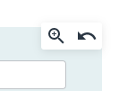
View button and Revert button are too close together. According to the CSS code below, the gap is 4 pixels. So, I sometimes press the wrong button.
.btn { padding: 2px 2px; }
The buttons have around 27 pixels.
Also, I'm unaware reverted it because there is no notice. Perhaps others also have done so. To build a cooperative relationship, this mishandling should be prevented.
I already tried
- I've read and searched the documentation.
- I've searched for similar issues in this repository.
Steps to reproduce the behavior
- Login.
- This occurs when I am looking at History for all strings or the History tab for each string.
- In the screenshot below, I try to press the magnifying glass. But I made a mistake and pressed the arrow button. (Or I just press the arrow button.)
Expected behavior
There is no magnifying glass button when displaying each string. It is self-linked.
Solution 1 : Confirm as an important action. This would be essential.
- Solution 1a : Dialog "Would you like to revert?". It also indicates which string to return to.
- Or, Solution 1b : Simply copy the text into the translation string field. No automatic saving.
Solution 2: Notify : But, this doesn't prevent a wrong press and auto saving.
- Notify that "the string has been reverted". Especially in the case of automatic saving. Otherwise, the user may think pressed "View detail" button. So, does not recognize the occurrence of a problem.
Solution 3 : Button design : But, this doesn't prevent a wrong press and auto saving.
- Widen the gap between View button and Revert button. The gap should be at least 10 pixels. Or/and, If design changes are possible, This button should be at least 36-42 pixels.
- Or/and, Currently two buttons are placed within one border. Use one border for each button.
- Or/and, Currently the picture changes color when focused. Add to this, the background color will also change when focused.
Exception traceback
No response
How do you run Weblate?
weblate.org service
Weblate versions
No response
Weblate deploy checks
No response
Additional context
No response
Activity
[-]Wrong press of Revert button[/-][+]Wrong press Revert button[/+]nijel commentedon Oct 25, 2022
I'd start with solution 3, that should be pretty easy and not as disturbing as confirmation popup.
github-actions commentedon Oct 25, 2022
This issue seems to be a good fit for newbie contributors. You are welcome to contribute to Weblate! Don't hesitate to ask any questions you would have while implementing this.
You can learn about how to get started in our contributors documentation.
ishikajn8126 commentedon Oct 25, 2022
Hey @nijel @maboroshin , is this issue open to work? I'd like to take this up..
maboroshin commentedon Oct 25, 2022
@ishikajn8126 Thanks. This is open! Solution 1 is essential for us.
ishikajn8126 commentedon Oct 27, 2022
Hey @maboroshin i'm not able to reproduce the behaviour
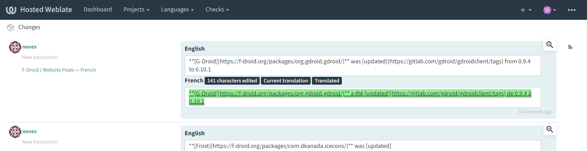
I went to the history tab but i can see only the view button
maboroshin commentedon Oct 27, 2022
@ishikajn8126 Please login.
comradekingu commentedon Oct 27, 2022
@ishikajn8126 I think you are looking at the history of something other than the individual string.
https://hosted.weblate.org/translate/weblate/application/nb_NO/?checksum=76ddb09e484aa37a shows both
maboroshin commentedon Oct 27, 2022
@ishikajn8126 : Here's a good sample.
If you press the arrow button by mistake, revert that string.
ishikajn8126 commentedon Oct 28, 2022
thanks @comradekingu @maboroshin , i got it now
13 remaining items
[-]Revert button is too small[/-][+]Revert buttons are unclear[/+]nijel commentedon Sep 10, 2026
Let's keep this open for unclear button icons.
nicommteam commentedon Sep 10, 2026
"I'll continue with this — will look at improving the clarity of the History/revert button icons (e.g. clearer icon or added label/tooltip distinguishing revert from view)."