Merged
Conversation
Contributor
Author
|
Ready for review. (btw: I was very suprised, that Mapco is one of the most favorite themes, while it had so many UI bugs) After reviewing this PR I will do the same with Ansum theme, that is similar. |
This was referenced Aug 18, 2022
This file contains hidden or bidirectional Unicode text that may be interpreted or compiled differently than what appears below. To review, open the file in an editor that reveals hidden Unicode characters.
Learn more about bidirectional Unicode characters
Sign up for free
to join this conversation on GitHub.
Already have an account?
Sign in to comment
2 participants
Add this suggestion to a batch that can be applied as a single commit.This suggestion is invalid because no changes were made to the code.Suggestions cannot be applied while the pull request is closed.Suggestions cannot be applied while viewing a subset of changes.Only one suggestion per line can be applied in a batch.Add this suggestion to a batch that can be applied as a single commit.Applying suggestions on deleted lines is not supported.You must change the existing code in this line in order to create a valid suggestion.Outdated suggestions cannot be applied.This suggestion has been applied or marked resolved.Suggestions cannot be applied from pending reviews.Suggestions cannot be applied on multi-line comments.Suggestions cannot be applied while the pull request is queued to merge.Suggestion cannot be applied right now. Please check back later.
The Mapco theme is one of the most favorite themes (see #4295), but it has some broke UI
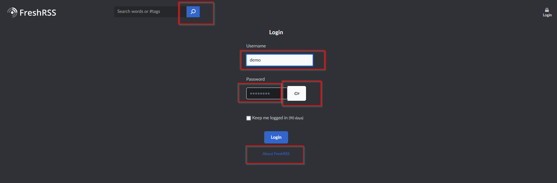
Before (login page)
After (login page):

The form has now the same grey background as in the configuration. Now it can uses the default form components. The width of the form is a bit wider.
The search button is not blue, when the search is not focused (the search button becomes blue, when the mouse hovers or the focus is inside the search input).
Before (registration page):

After (registration page):
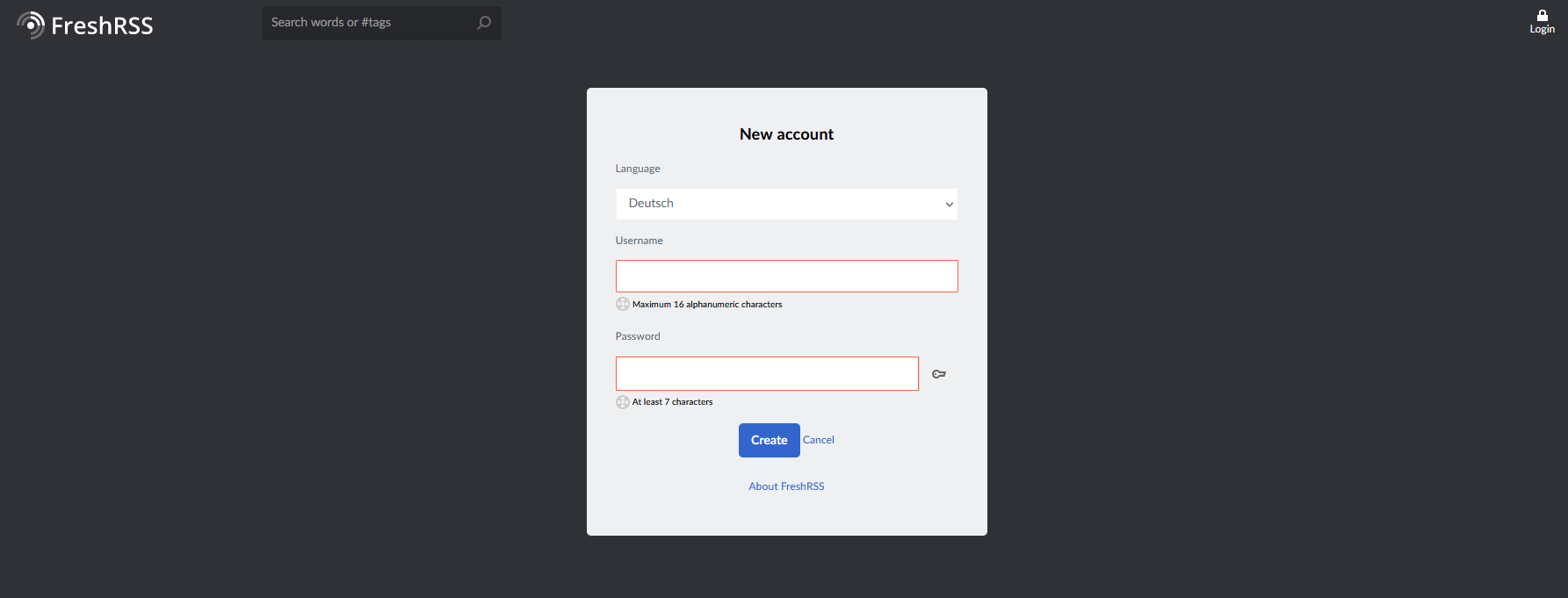
same layout like the login page.
The select box has now the same size like the inputs
Before (configs)

After (configs)

The select box has now the same size like the inputs
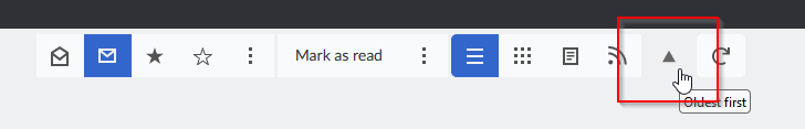
Before (menu buttons)
After (menu buttons)
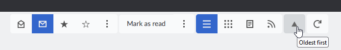
Hover background is set to a darker grey. It is now the same like the other buttons within
.stickChanges proposed in this pull request:
How to test the feature manually:
see before/after screenshots
Pull request checklist: