Improved: Extension manager: new style#4181
Conversation
|
It is a draft PR to collect your first feedback |
|
Looks very nice so far 👍🏻 |
|
|
||
| <?php if (FreshRSS_Auth::hasAccess('admin')) { ?> | ||
| <form id="form-extension" method="post"> | ||
| <input type="hidden" name="_csrf" value="<?= FreshRSS_Auth::csrfToken() ?>" /> |
There was a problem hiding this comment.
Indentation's a bit weird here.
 Frenzie
left a comment
Frenzie
left a comment
Frenzie
left a comment
There was a problem hiding this comment.
Looks good to me in principle. Also note https://codepen.io/Qvcool/pen/bdzVYW
|
wow, you are very very fast :) |
I tried also some different styles, but I do not like this kind of switches, because the status there is not 100% clear (for me. I need to think longer. For me it is a strange UX) |
Zero JavaScript here. The "disable/enable" button got just a new style. The logic behind the button was not changed. |
I'm not really sure what you're talking about? I was saying these do the same thing without introducing svg images. |
Thanks for the explanation. Now I see what you mean. I meant another topic ;) |
|
@Frenzie : It is made with Font Awesome icons. I am not a fan of it.
|

|
Font Awesome is an irrelevant detail. Pretend it says something like Btw, not shown on the screenshots is that these checkbox buttons are currently a bit too jumpy. |
Do you mean this animation? |

|
Sidenote, Netsurf works for me but colorblind people would prefer a regular checkbox. But I'm not sure if or to what extent we should worry about that. ^-^
|

Yes, I'd prefer to do without the horizontal sliding movements. |
It is not a checkbox. It is still the same button as before (click on it and it will reload the page). I would say that Netsurf and color blind people are not a good combination. Disabled extensions have an italic text style. |
It's a sliding checkbox. :-) It could just as well be represented as a regular checkbox or as a fake checkbox that is compatible with Netsurf. For example, if you add an enabled/disabled SVG icon much like the one proposed here (but represented by Unicode for the sake of putting it together in 10 seconds):
Maybe, maybe not, but the point is that it wasn't an issue before. |

|
@Frenzie : Please check with Netsurf: What is not supported by Netsurf? |
|
Curiously, I see references to :before/:after in the source code but the answer seems to be a simple yes to both. Anyway, there's no need to worry too much about it, but @Alkarex reminded us recently that we've been forgetting to test in Netsurf and friends. ^_^ There is a standard way to work around the issue with Something like (spitballin', I'd say it's better to use for example an inner span with some text to diff --git a/p/themes/base-theme/template.css b/p/themes/base-theme/template.css
index 28756c87..1c41cb8d 100644
--- a/p/themes/base-theme/template.css
+++ b/p/themes/base-theme/template.css
@@ -335,6 +335,18 @@ a.btn {
background-color: #eee;
}
+.switch {
+ background-image: url('../icons/disabled.svg');
+}
+.switch.active {
+ background-image: url('../icons/enabled.svg');
+}
+@supports selector(.switch::before) {
+ .switch, .switch.active {
+ background-image: none;
+ }
+}
+
.switch.active::before {
background-image: url('../icons/enabled.svg');
background-position: center center; |
|
I know |
|
Like I said, just showing the general concept. It's fugly as written in that poc regardless of contrast, lol. |
|
That's very strange indeed, since I posted a screenshot from 3.10 as well. Oh well. :-) |
|
Does it make sense to display the system extensions to non-admin users? (screenshot from "before the PR") There are 2 possible improvements:
|
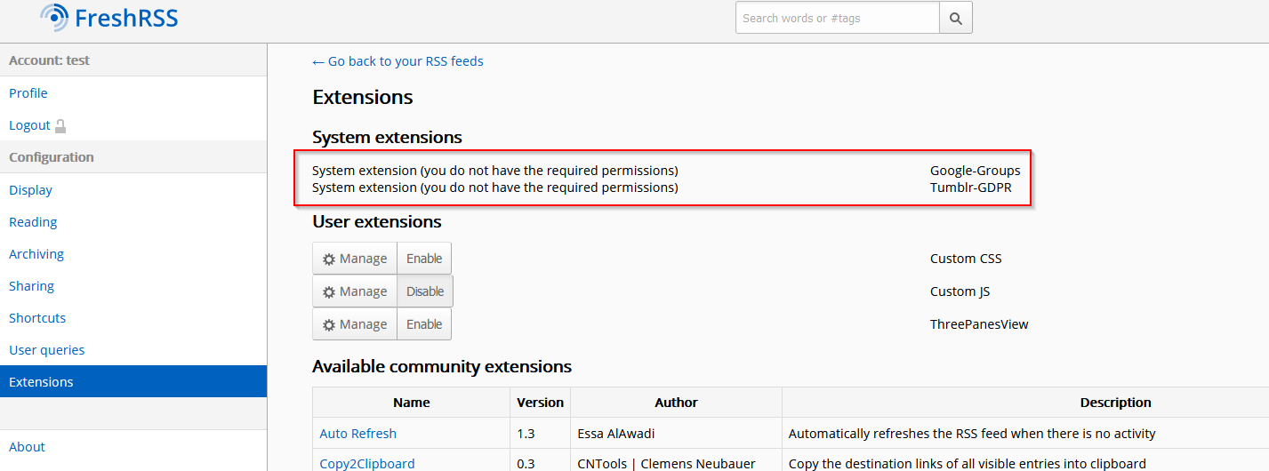
I chosed 2 |
3 participants
Before:

It has some issues:
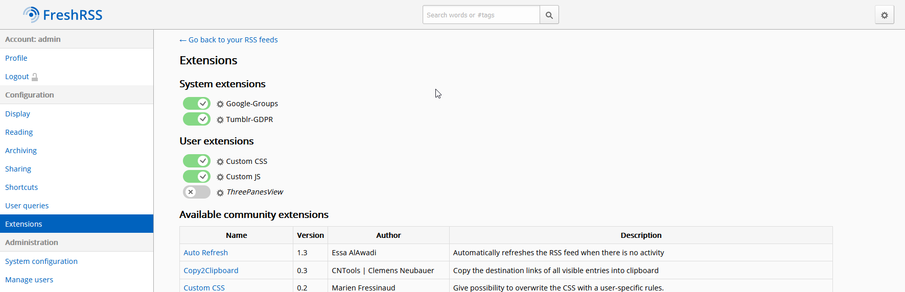
After:
Other themes:
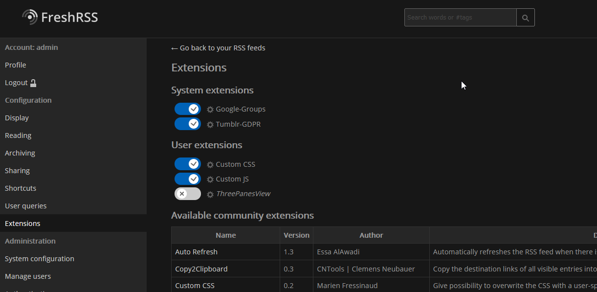
Alternative dark theme
Dark theme

Changes proposed in this pull request:
How to test the feature manually:
Pull request checklist: