Improve showing notification banner#4023
Merged
Alkarex merged 21 commits intoFreshRSS:edgefrom Feb 4, 2022
Merged
Conversation
Frenzie
reviewed
Dec 4, 2021
Contributor
Author
|
shit. this changes should become another PR and not within this PR :/ |
This file contains hidden or bidirectional Unicode text that may be interpreted or compiled differently than what appears below. To review, open the file in an editor that reveals hidden Unicode characters.
Learn more about bidirectional Unicode characters
Sign up for free
to join this conversation on GitHub.
Already have an account?
Sign in to comment
3 participants
Add this suggestion to a batch that can be applied as a single commit.This suggestion is invalid because no changes were made to the code.Suggestions cannot be applied while the pull request is closed.Suggestions cannot be applied while viewing a subset of changes.Only one suggestion per line can be applied in a batch.Add this suggestion to a batch that can be applied as a single commit.Applying suggestions on deleted lines is not supported.You must change the existing code in this line in order to create a valid suggestion.Outdated suggestions cannot be applied.This suggestion has been applied or marked resolved.Suggestions cannot be applied from pending reviews.Suggestions cannot be applied on multi-line comments.Suggestions cannot be applied while the pull request is queued to merge.Suggestion cannot be applied right now. Please check back later.
Part 1:
While I reproduced #3686 I saw that the time to read the notification is to short (4 seconds).
Changes proposed in this pull request:
How to test the feature manually:

Part 2
Before:
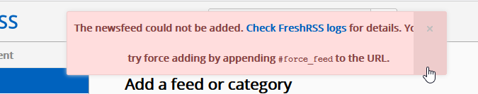
The text inside of the notification could be hidden behind the close button and the grey button could be invisible over the text. And the line-height is strange.
After:

No text anymore behind the close button.
While hovering the grey icon will become white

I checked all themes and improved it in some little cases (f.e. readable links)
Pull request checklist: