

In this previous Blog post, you have seen an example on how to manipulate GOES-16 Data using GDAL, GMT and ImageMagick together in order to create a final product. All of them are freely available tools.
Now, let’s see how to start manipulating GOES-16 data with Python.
After all, GOES-16 data will be available through GNC-A in NetCDF4, and there are multiple tools to work with this format, as seen at this link. Python is another option.
Here are some simple steps to plot a GOES-16 image with Python:
1-) Download a GOES-R simulated image sample at this link. For this example we have put the file at C:\VLAB\
2-) Download and install the Anaconda software at this link.
Anaconda is an open data science platform powered by Python. For this test we have chosen the Python 3.7 version in a 64 bit machine. The installation in both Windows or Linux is pretty straighforward.
3-) After installing Anaconda, open the Windows command prompt or the Linux terminal and insert and execute the following comand:
conda install -c conda-forge netcdf4=1.2.7

Note: You need to choose Yes (‘y’) + Enter when asked if you want to proceed with the installation.
This will install the NetCDF 4 library for Python and its dependencies, which is required to manipulate the GOES-16 NetCDF’s.
Note: If you can’t use the “conda” command in the command prompt, you do not have Anaconda added to the “Path” variable in your “Environments Variables” (Control Panel -> System -> Advanced System Settings -> Environment Variables). It should be added automatically during the Anaconda install, but if it is not, add these manually to the “Path” variable:
C:\Users\User_Name\Anaconda3\Library\bin and C:\Users\User_Name\Anaconda3\Scripts. Just be sure to change “User_Name” to your Windows user name.
4-) Start the Spyder development environment. It is installed with the Anaconda package.

5-) Paste the following code in the Spyder Editor:
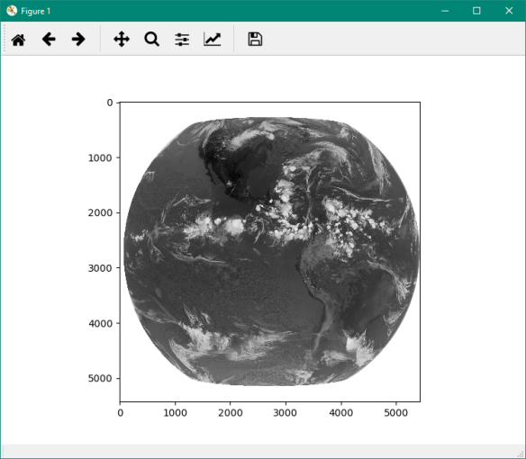
# Required libraries
import matplotlib.pyplot as plt
from netCDF4 import Dataset

# Path to the GOES-R simulated image file
path = 'C:\VLAB\OR_ABI-L2-CMIPF-M4C13_G16_s20161811455312_e20161811500135_c20161811500199.nc'

# Open the file using the NetCDF4 library
nc = Dataset(path)

# Extract the Brightness Temperature values from the NetCDF
data = nc.variables['CMI'][:]

# Show data
plt.imshow(data, cmap='Greys')
6-) Execute the program by clicking at the “Play” icon in the upper menu or hitting “F5”:

7-) That’s it! You will see the plot of the GOES-R simulated Channel 13. This same script will work with the real data you’re going to receive in your GNC-A station.
Note: If the new window with the image is not showing automatically (showing a small pic at the console, instead), you may go to Tools > preferences > IPython console > Graphics > Graphics backend > Backend: Automatic and restart Spyder. When executing a script, a new window will be opened with your plot visualization.
Isn’t this great? Now the possibilities are endless… For example, we can use the “Numpy” Python library (installed by default with Anaconda), in order to perform calculations with the Brightness Temperature values from this band and many many other things.
In the next post of this series we will show you how to put a basemap and how to use custom color tables! Stay tuned!


