The Archers of Count von Goghstein – WIP

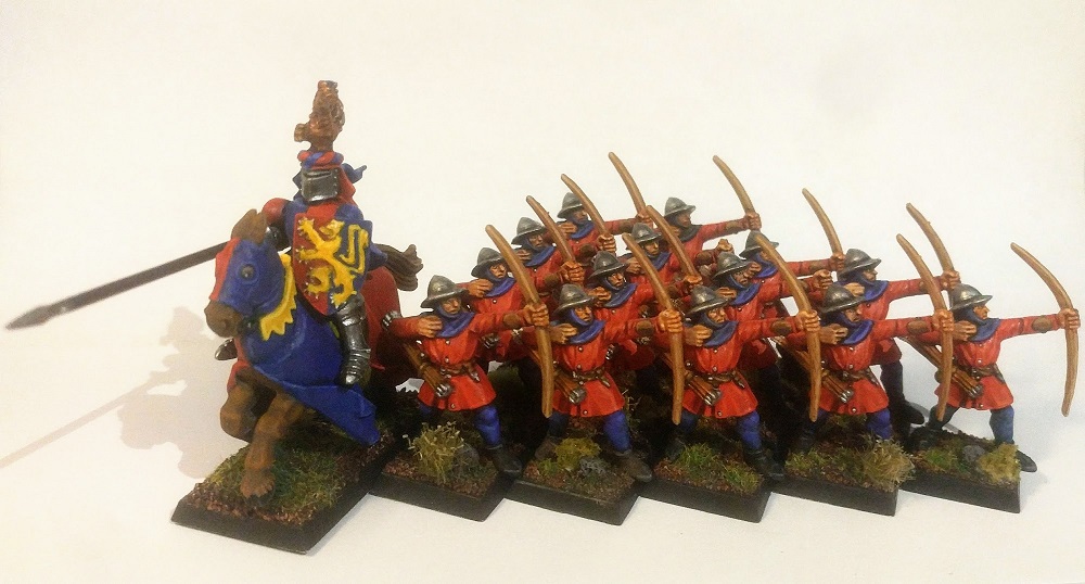
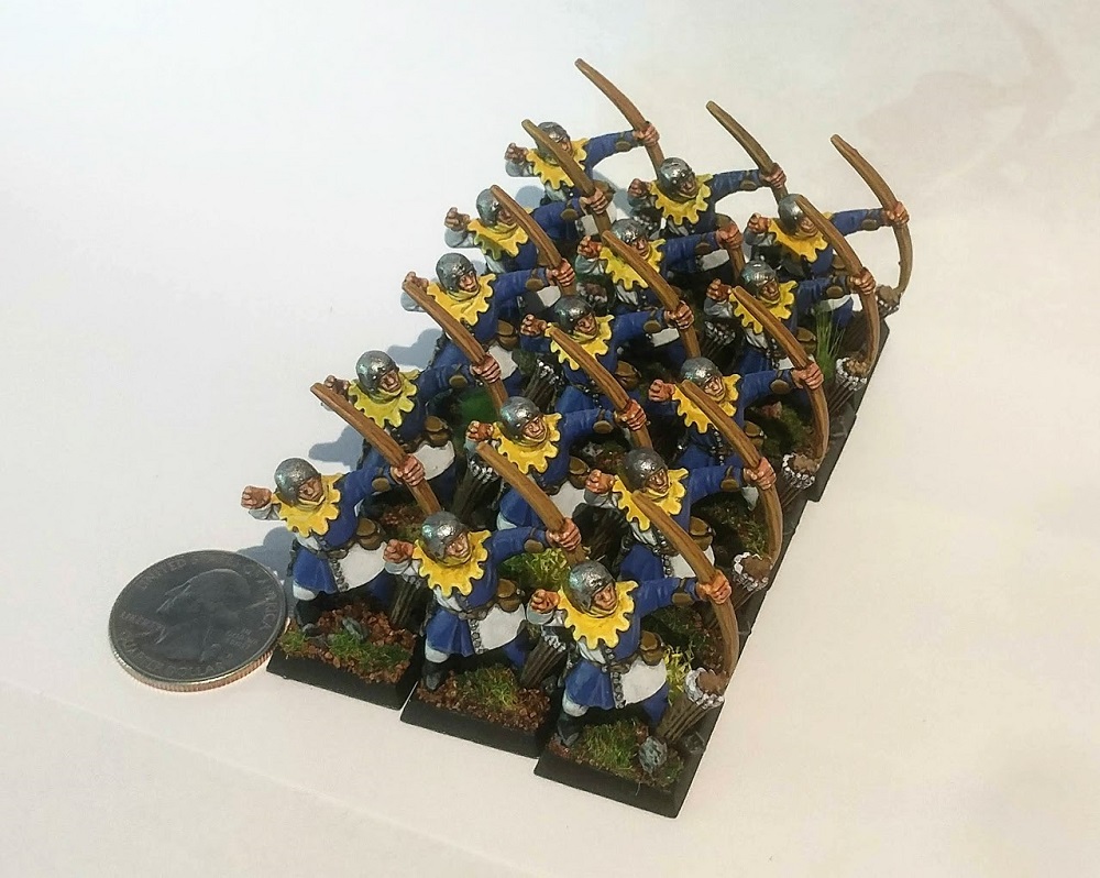
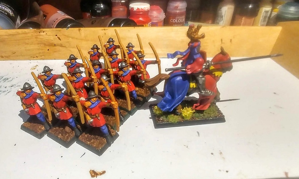
I’ve had a bunch of Undead sitting around for ages, so it’s time to make some progress. After my test scheme inspired by Van Gogh’s “Vase with Asters and Phlox” painting, I’ve decided to run with it for the rest of my skeletons. The overall approach is to have exaggerated shadows, a very limited color palette focused around red, and to be relatively fast and tabletop quality.

Work in progress.

Next steps are:

  • Review for missed details
  • Heavy rust on metal
  • Tone down yellow in arrow shafts (brown glaze?)
  • Basing

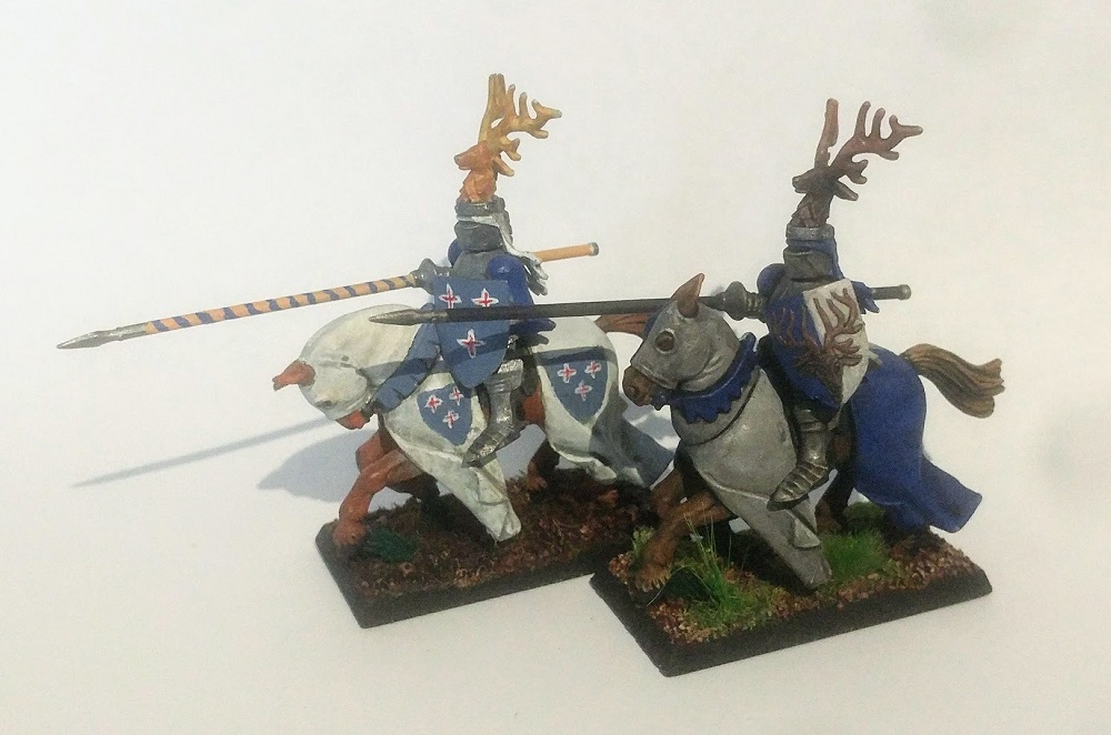
Rebasing these Runewars figs was a huge pain. They had to be clipped off their thick-ass bases and squeezed to sorta fit on 20x20mm squares. They won’t rank up properly, so I’ll need to make some decorative spacers to fill out a movement tray. And the details! So many different little bits and bobs and folds.

Just for my own records, here’s what I did:

Primer: Zenithal, but in a funky order – reddish-brown first from the side, then white from the top, then black from the bottom

Bone: Wraithbone layered

Cloth: Red Gore glazes w/ Carroburg Crimson + Nuln Oil wash

Black Leather: Black + Xereus Purple, Mechanicus Grey edge highlight

Bows: Scorched Brown, Mournfang Brown

Arrows: Snakebite Leather (original). Feathers: Wraithbone, White Scar

Metal: Black, Chainmail Metal

Base:

Flock/Grass:

Christening the The Iron(y) Fleet

A friend of mine gave me a fleet of Armada dwarf ships in a cruel and successful attempt to lure me into yet another wargame system that I’ll play like twice a year.

As always, I started off with a “quick” painting strategy. Black -> Drybrush dark gray highlight -> All over metallic drybrush -> Black wash. Pick out a couple details in gold. Clear plastic base. Done! Yeah, they’ll look like dull bricks, but they’d be done in like 30 min each.

But then I started picking out more and more details (and there are a lot in these teeny tiny sculpts!).

I thought “What if I edge highlighted every single armor plate? And had blackened cotton coming out the smokestacks? And magnetized bases? And sculpted waves on the bases? And…”

Feeling unsure, I showed my basic vs enhanced versions to some people, and all agreed the result was worth the extra time. Stupid, stupid, stupid.

Here’s the test ship. I’m now on track for 2+ hrs per ship.

Paint Log

Primer: Black

Undercoat: Createx 002 Wicked Black airbrush

Armor: Light drybrush dark gray highlight -> all over Boltgun Metal drybrush -> Boltgun Metal edge highlight

Gold Detail: Brazen Brass

Unit ID Colors: Various

Wash: Nuln Oil (matte)

Stone: Progressively lighter grays drybrushed with some colored washes in-between for variation

Base: Sculpted using cheap airdrying clay mixed with PVA, water, and a tiny amount of sanded grout. I… can’t remember the colors I used on the water. Sigh…

Centaur de France

I spent part of my Bastille Day basing this model. You know what’s great? Having friends with 3d printers who just randomly send you cool models, and then having other friends who are waaaaaay faster at hobbying than you and are happy to paint it for you. That’s right, all I did for this model was base it to match the rest of my Nature army! That is some top tier General Sloth laziness.

I especially love the face work. Nice job on the eyes and lips, Matt!

Oops, don’t look at the tufts. Looks like they need touch ups.

The mini comes from the Iain Lovecraft Feywood series. I just don’t understand the tits & ass elf chicks in bikinis thing (seriously, guys, there’s this thing called “The Internet” that has all the titillation you will ever need), but the rest of the line is pretty good.

Van Gogh Nuts

I recently watched this Vince Venturella video about mining Vincent Van Gogh’s “Vase with Asters and Phlox” for miniature painting inspiration. I’ve been in a bit of a rut using the same recipes that I’ve been using for years, and I have a huge pile of skeletons in need of a new paint scheme, so I decided to give it a go.

It’s not meant to be a literal translation, just exploring some of the ideas in Van Gogh’s painting. I cranked up my shadows in ways that are wildly unrealistic but evocative. I stuck with a mostly monochromatic palette – there’s red in everything. And I tried to use paint-as-texture using hatching & stippling to separate the cloth from the rust. Add a dash of blanchitsu grunginess

All of this in a somewhat speedpainty-ish mode, since I have a boatload of undead to go. I’ve got a few ideas to make it better and faster.

Loooooongbowmen

Alternatively called “Archers of Loaf” but I wasn’t sure anyone would get a 1990s indie rock band reference.

Second batch of miniatures that I started 25 years ago is now finished. My goal was to finish all the retouching in 10 hrs, but it took me 15.

To recap: These are 5th edition Warhammer Fantasy Battles Bretonnians that I got in the starter set around 1996. Then-Private Sloth slapped down some base colors and that was that. I think in the 2000s I put down a flesh wash and some sand but didn’t finish them.

I have a lot of projects in various states of completion and it drives me crazy. Units abandoned from games that never caught on with my friends, models that just didn’t perform as well as I’d hoped, or projects that were just too challenging or boring and so I got burnt out.

My goal during the 2020 pandemic is to get at least some of these projects finished to a tabletop or tabletop+ standard, but also to do it as quickly as possible. I still have a really hard time turning off my completionist brain that wants to paint and detail ALL THE THINGS, but I’m getting better.

I think I’m going to work on the knights next. Here are a couple I started 25 years ago. That’s… gonna be a lot of retouching.

Paint Log

I might get some command models for these archers, so for my records here’s a paint log:

Primer: White

Skin: ??? -> Flesh wash -> Dwarf Flesh -> blackline wash

Shirt: Blood Red -> Carroburg Crimson wash -> Blood Red -> + Yellow

Pants: That ancient 1990s Citadel dark blue with no label, and the less dark but equally ancient Citadel mid-tone blue with no label

Shoes: Abaddon Black -> + Mechanicus Standard Grey

Helm: Boltgun Metal -> Nuln Oil Gloss wash -> Boltgun Metal -> Chainmail

Leather: Scorched Brown -> Mournfang Brown -> Snakebite Leather

Bow: Snakebite Leather? -> Agrax Earthshade wash -> micron pen Brown grain -> very thin glaze Balor Brown

Arrows: ???

Base: Amsterdam Burnt Umber -> + Amsterdam Burnt Sienna -> + Americana Sand

Flock/Grass: Woodland Scenics Turf -> Static Grass -> Army Painter Woodland Tuft -> various flowers, clump foliage, and debris

Darken the Skies

Finished the rest of the Bretonnian archers! I cannot tell you how excited I am about this. I started them 25 years ago, with just a basic base coat, and I finally went back and finished them to my current tabletop standard. I normally don’t paint blocks of infantry because I just get bored out of my mind, it turns out I just need a couple decades in between layers.

I had one fun little experiment – testing out bows. The third one here was the winner:

I used a brown Micron pen to draw in some wood grain lines, and then gave it an ultra-thin glaze with a light tan to blend it in. Micron pens are totally cheating.

And now to do it all over again with the second unit…

Then and Now: Bretonnian Archers

I started these miniatures waaaaay back in 1996, in the 5th edition Warhammer Fantasy Battles starter. But I only did a basic paint job, and then I sort of fell out of the wargaming & painting hobby other than the occasional RPG miniature. I finally got back into it in a big way around 2015.

The model on the right is more-or-less my original paint job.

The model on the left (with the broken bow – I like to use damaged models as test pieces) is what happens with an extra hour of highlighting and shading.

I didn’t actually notice much difference until I put them side-by-side! I have like 40 of these fuckers, so I dunno if I’ll commit to doing this for all of them, but it’s nice to see what the extra effort yields.

Give These People Air!

Gyaaaaaah!

Well, air elementals, at any rate.

I ran a horde of (unpainted) air elementals a couples times in KoW 3e. They were… OK. They need Brew of Strength to be a threat. They are good flank/rear harassers but you really want a Surge source nearby for shenanigans. Once you pay for BoS and a character with Surge, and then go through the trouble to keep them close, you start to really it’s a pretty hefty investment for debatable ROI.

Or I just suck, which is totally an option. Either way, I dunno how much these will see play. If anyone else has had good experiences with them I’d love to hear it!

These are Pathfinder Battles Deep Cuts Air Elementals and come as translucent plastic which, on paper, is a cool idea for something made of air, but on the table they just look like hunks of… translucent plastic.

Original Pathfinder Battles Deep Cuts Air Elementals
(not my pic but I forgot the source)

So I was thinking of ways to give them more color and texture and variation and came up with “swirling dust and leaves and debris”. I used tile grout, thinned washes, flock, and various dried herbs. If I were to do it again I would go lighter on the grout, smooth out the transitions, and carry the dust and leaves higher up on the body. But all in all I’m pretty happy.

Burning Sensation

I hate painting fire.

I did the model on the left, and my buddy Matt P did the one on the right.

Left: Reaper metal Fire Elemental SKU: 02779, and Right: Mantic resin Fire Elemental

This Reaper model has been a massive pain in my ass for years. I’ve tried painting it multiple times and it’s never looked right. It’s got all these little recesses that have been hard to prime, the paint scrapes off the tiny little flames super easily, and then there’s painting fire. Fucking fire.

I tried painting yet again. Better, I think.

The biggest challenge is unlike the Mantic model with long flowing tendrils of flame, the Reaper Fire Elemental is absolutely covered in tiny little flames. In previous versions I tried to do blending and gradations on a per-flame basis, but it just creates a pointillist mess.

Pointillism | crayola.com

So for this overhaul, I wanted to treat the whole elemental as one big flame and keep the gradations on any one flame pretty subtle. The face got lost, however, so I went back and redid the face as its own flame, which really makes it pop. I’m pretty happy with it.

Quarriors! Come out and plaaAAaay!

Been off painting for a bit but got the 28mm itch again. I also wanted to try some new techniques and refine some old ones, while making headway against my overflowing backlog of unpainted minis.

Earth elementals are about as simple as you can get, perfect for practice, and would help me get past my latest painting block, so I decided to get two birds stoned at once, as Ricky would say.

Pathfinder Battles Deep Cuts Unpainted Miniatures: Medium Earth Elementals

I tried a bunch of different things, like wet-on-wet, layering, layering then glazing, stippling and crosshatching, dotting, and drybrushing. They might all look very similar but they took pretty different avenues to get there!

Original models

The biggest stretch for me was pushing noon shadows – much of the shading in these pics aren’t actual shadows from the lighting but painted on. I’ve never really tried to do that before, and it was fun and really helps convey mass.

After a rocky start where I really struggled with highlighting, I took a photo of the minis under a bright lamp and then cranked up the lights and darks to extremes to help me visualize how the shadows worked.

The big takeaway isn’t going to surprise anyone: simple drybrushing and washes is massively faster than any of the other approaches I tried, but the hit in quality wasn’t too bad. The ‘best’ model took around 4 hrs, but the worst only took around 1.5 hrs, and wasn’t that much worse.

The other takeaway is that what looks good up close and what looks good from 3′ away are two different things. An early version had some some really great, naturalistic stone coloration and highlighting that looked awesome point blank. But on the table it was just “muddy”, busy, and hard to read. The more exaggerated highlights are cartoony up close, but really pop on the table.

Lastly, tile grout makes a great dirt texture! The models are monopose and monochromatic, so to add some variety I sprinkled on patches of tile grout and flock on two of them. Helps sell the narrative of them bursting from the ground.

When social distancing ends, I’m not sure what game I’ll play first, but I’m pretty sure it’s going to involve earth elementals!

*Tip of the the hat to Ron for the title!