Struggling with headers that disappear when users scroll, losing navigation and branding opportunities? This comprehensive guide shows you how to create a professional sticky header in Elementor that enhances user experience while maintaining visual appeal.
A sticky header improves navigation and maintains brand consistency. This guide covers creating an Elementor sticky header, modifying its color on scroll, and shrinking the logo dynamically for a seamless user experience.
Key Features Covered:
- Transparent Sticky Header: Keeps navigation visible with a sleek design.
- Sticky Header Color Change on Scroll: Enhances readability with dynamic background adjustments.
- Shrinking Logo on Scroll: Reduces header height while preserving branding.
- Navigation & Button Modifications: Improves visibility and user interaction.
These steps help create a fully optimized sticky header that enhances UX without third-party plugins.
Prerequisites Checklist & Initial Setup
- An Elementor Advanced Solo– Required for Theme Builder functionality and custom CSS

- Enabled Container Feature- Access via Elementor > Settings > Features

- Basic CSS Knowledge – Comfortable editing custom CSS
- Mobile Responsiveness – You’ll need to add media queries manually; however, if you purchase the template, you won’t have to worry about it.

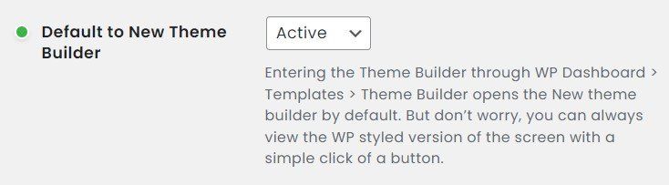
- Optional: Activate the Default to New Theme Builder.

- Consider using Autoprefixer for vendor browser prefixes, so the CSS supports all browsers.

Step 1: Create an Elementor Template
- Access Theme Builder: Navigate to Appearance > Theme Builder in your WordPress dashboard.

After you click the Theme Builder, you will see the template parts you have created.
- Add New Header: Click the “Add New” button (+) and select “Header.”
After you choose the header template, it will lead to the Elementor Block. From there, you can choose the prebuilt templates or Elementor’s blocks, create the template from scratch, or buy it from my Gumroad store.

- Structure and Widgets: Choose “Row” as the structure, drag and drop the desired widgets, such as the Site Logo, WordPress Menu, and Search Icon, into the container, and start configuring it to your requirements.
- Select the structure:

- Place all the widgets inside the container/ wrapper:

- Add a CSS variable to min-height: By clicking the pencil icon, add the CSS variable
var(--max__height)for the min-height properties so we can update the value dynamically.Why use CSS variables instead of fixed values?
This approach enables dynamic updates across all components, making maintenance easier when you need to adjust timing or colors later.
- Item settings:

- Change the item’s direction to a row ( so it stacks all the items horizontally),
- Justify Content to space-between (to distribute items in line evenly),
- Align Items to the center to place all the items in the center, and
- Set the Gap value to 20px. It will look something like this after you apply all the settings.

- Select the structure:
- Assign CSS Classes: Assign unique CSS classes to the container and widgets for better control and styling. If you do not know how to assign CSS classes, follow the Official Elementor Tutorials – How to Use the Selector In The Custom CSS Tab.
I have assigned 6 CSS classes to the container and widgets
1.parent__container: Use for setting up CSS variable andsticky-header-containerfor styling the header or Parent Container.
2.site-logofor the Site Logo widget.
3.sticky-btnfor Elementor Button widget
4.site-navfor WordPress Navigation Menu widget &
5.site-logo-redfor the site logo to be implemented, proceed to Step 4: Implementing the Advanced Logo Swap on Scroll.

- Click the “Header settings” tab to set the HTML tag to header for better accessibility.
Step 1. Click the header settings icon to open its settings.
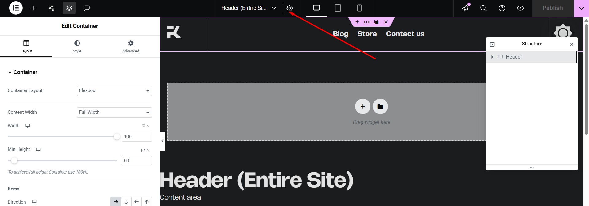
Step: 2. Change the HTML tag from div to header
Step 2: Defining Global CSS Variables for Dynamic Control
This CSS variable will be the same on all the steps.
/*
* Modified: 06th July - Add a Negative Margin on the bottom of the header to pull up the content above
* Define custom properties for the parent container
*/
.parent__container {
--site-transition: 350ms linear; /* Transition duration and timing function */
--bg-color__before: #00000000; /* Initial background color (transparent) */
--bg-color__color: #fff;
--bg-color__after: #000; /* Background color after scroll (black) */
--max__height: 140px; /* Maximum height of the container */
--min__height: 100px; /* Minimum height of the container */
--min-height: var(--max__height); /* Set the initial minimum height to the maximum height */
--hamburger-menu: #000;
--hamburger-menu-sticky: #fff;
background-color: var(--bg-color__before); /* Apply initial background color */
/* If you already added a negative margin on your header, you can ignore margin-block-end & margin-bottom CSS rules*/
margin-block-end: -120px;
margin-bottom: -120px;
}
Step 3: Building the Sticky Header with Dynamic Effects
Making the Header Transparent by Default
- Background Color: By default, Elementor sets the background color to transparent (the default behaviour of the div HTML tag), allowing the header to remain transparent. ( In this demo, I use negative margins on the bottom of the header to pull the header section)To access these settings, click the Header (container), then click the Style tab, and set the background to default.
Warning:
Sometimes a theme includes a background color by default. If you have this issue, you can use the Chrome Dev tools’ inspect elements, and you will find the CSS responsible and remove it in the theme’s settings, or overwrite it with!importantCSS rule.
Customizing Elementor Sticky Header Effects
- Creating transparent sticky headers: Under Motion Effects, set the Sticky option to “Top” and adjust the Effects Offset to your preference. This will enable a sticky effect.

Enabling the sticky header triggers a dynamic effect where the initial transparent background transitions to an opaque color state once the scroll position leaves the top of the viewport.
Changing header background color on scroll
- Transparent to Color background & add Box Shadow: As you scroll down, the header smoothly changes from transparent to white and gets a soft shadow, making it stand out more clearly on the page
Shrinking the Header’s Height When Sticky
- Step 4: Add CSS to Shrink Header Height: simply changing the value from
--max__heighttovar(--min__height)will reduce the height of the header from 140px to 100px. This is the power of CSS variables.
/*
* Define transition properties for the sticky header container
*/
.sticky-header-container {
transition:
background-color var(--site-transition), /* Transition for background color */
backdrop-filter var(--site-transition), /* Transition for backdrop filter */,
min-height var(--site-transition),
box-shadow var(--site-transition); /* Transition for box-shadow */
}
/*
* Apply styles when the elementor sticky effects are active
* Elementor Sticky Header change color on Scroll & Shrink sticky Header
*/
.elementor-sticky--effects.sticky-header-container {
--bg-color__before: var(--bg-color__after); /* Change initial background color to the after color */
--max__height: var(--min__height); /* Change max height to min height when sticky */
box-shadow: hsl(0deg 0% 0% / 14%) 0 2px 40px; /* Apply a box shadow */
/*
* If you're using backdrop filter CSS properties, remove background color CSS properties and box-shadow CSS rule
* backdrop-filter: blur(10px);
* enable one of them
* mix-blend-mode: difference;
* mix-blend-mode: normal;
* mix-blend-mode: multiply;
*/
}
Applying a Scale Effect to the Logo

Apply CSS to reduce the width of the site logo when the sticky header shrinks.
/*
* Site Logo widget
* Using the transform CSS property is much better than the width properties for scaling in terms of performance
*/
.site-logo img{
transform: scale(1);
transform-origin: center;
transform-origin: left;
transition:
transform var(--site-transition),
transform-origin var(--site-transition);
box-shadow: none!important
}
.elementor-sticky--effects .site-logo img{
transform: scale(.9);
transform-origin: left;
}
Modifying Button Colors for Readability

Modify the button color based on the user’s scroll position
/*
* Change Button Background color and Text when sticky effects are applied
*/
/*Global CSS variable for elementor Button*/
.elementor-button {
--_button-bg: #000; /* Default background color for button */
--_button-text: #fff; /* Default text color for button */
--_button-bg-sticky: #fff; /* Background color for button when sticky */
--_button-text-sticky: #000; /* Text color for button when sticky */
--_fw-600: 300;
}
.sticky-btn .elementor-button {
border-radius: 0; /* Remove border radius */
border: none; /* Remove border */
font-weight: var(--_fw-600, 300); /* Font weight with a fallback to 300 */
transition: background-color var(--site-transition); /* Transition for background color */
}
.sticky-btn .elementor-button-text {
color: var(--_button-text); /* Set text color */
transition: color var(--site-transition); /* Transition for text color */
}
.sticky-btn .elementor-button {
background-color: var(--_button-bg, #000); /* Set background color with a fallback to black */
}
/* Styles for the button when sticky effects are applied */
.elementor-sticky--effects .sticky-btn .elementor-button {
--_button-bg: var(--_button-bg-sticky); /* Set background color to sticky background color */
}
.elementor-sticky--effects .sticky-btn .elementor-button-text {
--_button-text: var(--_button-text-sticky); /* Set text color to sticky text color */
}
Adjusting Navigation Link Styles

/*
* Navigation Related
*/
.site-nav .elementor-nav-menu--main .elementor-item {
/*
* Add your own color
*/
--_nav__before: var(--bg-color__after); /* Initial navigation item color, set to the background color after scroll */
--_nav__before_hover: #000; /* Navigation item color on hover */
--_fw-600: 300; /* Default font weight */
--_font-size: 1.25rem; /* Responsive font size */
font-weight: var(--_fw-600); /* Apply the font weight */
font-size: var(--_font-size); /* Apply the responsive font size */
text-decoration: none; /* Remove text decoration */
color: var(--_nav__before); /* Set the initial color */
/*
* Transitions for color, font size, and font weight
*/
transform: scale(1);
transform-origin: center;
transition:
color var(--site-transition),
transform var(--site-transition);
}
/*
* Sticky state for the main navigation menu items
*/
.elementor-sticky--effects .site-nav .elementor-nav-menu--main .elementor-item {
--_nav__before: #fff; /* Change navigation item color to white when sticky */
transform: scale(.9);
}
/*
* Hover state for the main navigation menu items
*/
.site-nav .elementor-nav-menu--main .elementor-item:hover {
--_nav__before: var(--_nav__before_hover); /* Change color on hover */
transform: scale(.9);
}
Styling the Mobile Hamburger Menu for Sticky State
/*
* WordPress Menu Toggle Style
* Style for the menu toggle button
* Dropdown style and sub-menu is not included
*/
.site-nav .elementor-menu-toggle {
transition: background-color var(--site-transition); /* Transition for background color */
border-radius: 0; /* Remove border radius */
}
/* Menu Toggle when focus state */
/* Add transition for color */
.site-nav .elementor-menu-toggle {
transition:
color var(--site-transition)
outline var(--site-transition); /* Transition for color */
outline: 2px solid var(--hamburger-menu);
}
.elementor-sticky--effects .site-nav .elementor-menu-toggle{
--hamburger-menu: var(--hamburger-menu-sticky)
}
/* Style for the menu toggle button when focused */
.site-nav .elementor-menu-toggle:focus {
outline: 2px solid var(--hamburger-menu); /* Outline color when focused */
}
/* Style for the menu toggle button when focused and sticky effects are applied */
.elementor-sticky--effects .site-nav .elementor-menu-toggle:focus {
outline: 2px solid var(--bg-color__color); /* Outline color when focused and sticky */
}
/*
* Hamburger and close icon fill color state
* Style for the SVG icons inside the menu toggle button
*/
.site-nav .elementor-menu-toggle .e-font-icon-svg {
fill: var(--hamburger-menu); /* Set the fill color */
color: var(--hamburger-menu); /* Set the color */
transition:
fill var(--site-transition),
color var(--site-transition);
}
/*
* Styles for the SVG icons when sticky effects are applied
*/
.elementor-sticky--effects .site-nav .elementor-menu-toggle .e-font-icon-svg {
--hamburger-menu: var(--hamburger-menu-sticky); /* Change fill and color when sticky */
}
/*
* Dropdown Menu
*/
.site-nav .elementor-nav-menu--dropdown{
background-color: var(--hamburger-menu-sticky);
padding: 50px 0;
transition: background-color var(--site-transition);
box-shadow: var(--shadow);
}
.elementor-sticky--effects .site-nav .elementor-nav-menu--dropdown{
--hamburger-menu-sticky: var(--hamburger-menu);
}
/*
* Dropdown Menu items
*/
.site-nav .elementor-nav-menu--dropdown a{
color: var(--hamburger-menu);
transition: color var(--site-transition);
font-size: 1rem;
}
.elementor-sticky--effects .site-nav .elementor-nav-menu--dropdown a{
--hamburger-menu: #fff;
}
Step 4: Implementing the Advanced Logo Swap on Scroll
Utilize CSS techniques to swap the logo with a different one when the sticky header appears.
Add a new container widget

Reposition the old Logo with a newer one (interact with before and after)


Add a new image widget inside the container (created in 2)

Apply a unique CSS class to the new image and set the position

Click the new image widget’s handle > advanced under the layout tab > set the position to absolute so the image is removed from the DOM, and it will stack with the site logo widget.
Apply custom CSS to change the logo on the scroll.
/*
* Original logo styles
*/
.site-logo{
transform: scale(1);
opacity: 1;
transition:
transform var(--site-transition),
opacity var(--site-transition);
}
.site-logo-red{
opacity: 0;
transition:
transform var(--site-transition),
opacity var(--site-transition);
}
.elementor-sticky--effects .site-logo{
opacity: 0;
transform: scale(.91);
}
.elementor-sticky--effects .site-logo-red{
opacity: 1;
transform: scale(.91);
}

Final CSS Code for Your Sticky Header
/*
* Define your own background color for default and sticky
* CSS Blend-mode rule is not included
* Elementor Sticky Header changes color on Scroll
* Change the color from transparent to white
* Modified: 06th July - Add a Negative Margin on the bottom of the header to pull up the content above
*/
/* Define custom properties for the parent container */
.parent__container {
--site-transition: 250ms ease-in-out; /* Transition duration and timing function */
--bg-color__before: #00000000; /* Initial background color (transparent) */
--bg-color__after: #000; /* Background color after scroll (white) */
--max__height: 110px; /* Maximum height of the container */
--min__height: 110px; /* Minimum height of the container */
--min-height: var(--max__height); /* Set the initial minimum height to the maximum height */
--hamburger-menu: #000;
--hamburger-menu-sticky: #fff;
background-color: var(--bg-color__before); /* Apply initial background color */
/* If you already added a negative margin on your header, you can ignore margin-block-end & margin-bottom CSS rules*/
}
/* Define transition properties for the sticky header container */
.sticky-header-container {
transition:
background-color var(--site-transition), /* Transition for background color */
backdrop-filter var(--site-transition), /* Transition for backdrop filter */
box-shadow var(--site-transition), /* Transition for box shadow */
min-height var(--site-transition);
}
/* Apply styles when the elementor sticky effects are active */
.elementor-sticky--effects.sticky-header-container {
--bg-color__before: var(--bg-color__after); /* Change initial background color to the 'after' color */
box-shadow: hsl(0deg 0% 0% / 14%) 0 2px 40px; /* Apply a box shadow */
/*
If you're using backdrop filter CSS properties, remove background color CSS properties and box-shadow CSS rule
backdrop-filter: blur(10px);
*/
/*
* Enable one of them -
* mix-blend-mode: difference;
* mix-blend-mode: normal;
* mix-blend-mode: multiply;
*/
}
/*
* Elementor Sticky Header change color on Scroll & Shrink sticky Header
*/
.elementor-sticky--effects.sticky-header-container {
--max__height: var(--min__height); /* Change max height to min height when sticky */
--bg-color__before: var(--bg-color__after); /* Change background color to the 'after' color when sticky */
box-shadow: hsl(0deg 0% 0% / 14%) 0 2px 40px; /* Apply a box shadow when sticky */
/*
* If using backdrop filter CSS properties, uncomment the line below
* backdrop-filter: blur(10px);
* If using WebKit-specific box shadow, uncomment the line below
* -webkit-box-shadow: hsl(0deg 0% 0% / 14%) 0 2px 40px;
*/
}
/*
* Site Logo widget
* Using the transform CSS property is much better than width properties to scale in terms of performance
*/
.site-logo img,
.site-logo{
transform: scale(1);
transform-origin: center;
transform-origin: left;
transition:
transform var(--site-transition),
transform-origin var(--site-transition);
box-shadow: none!important
}
.elementor-sticky--effects .site-logo img,
.elementor-sticky--effects .site-logo{
transform: scale(.9);
transform-origin: left;
}
/*
* Button
*/
.elementor-button {
--_button-bg: #000; /* Default background color for button */
--_button-text: #fff; /* Default text color for button */
--_button-bg-sticky: #fff; /* Background color for button when sticky */
--_button-text-sticky: #000; /* Text color for button when sticky */
}
.sticky-btn .elementor-button {
border-radius: 0; /* Remove border radius */
border: none; /* Remove border */
font-weight: var(--_fw-600, 300); /* Font weight with a fallback to 300 */
transition: background-color var(--site-transition); /* Transition for background color */
}
.sticky-btn .elementor-button-text {
color: var(--_button-text); /* Set text color */
transition: color var(--site-transition); /* Transition for text color */
}
.sticky-btn .elementor-button {
background-color: var(--_button-bg, #000); /* Set background color with a fallback to black */
}
/* Styles for the button when sticky effects are applied */
.elementor-sticky--effects .sticky-btn .elementor-button {
--_button-bg: var(--_button-bg-sticky); /* Set background color to sticky background color */
}
.elementor-sticky--effects .sticky-btn .elementor-button-text {
--_button-text: var(--_button-text-sticky); /* Set text color to sticky text color */
}
/*
* Navigation Related
*/
.site-nav .elementor-nav-menu--main .elementor-item {
/*
* Add your own color
*/
--_nav__before: var(--bg-color__after); /* Initial navigation item color, set to the background color after scroll */
--_nav__before_hover: #000; /* Navigation item color on hover */
--_fw-600: 300; /* Default font weight */
--_font-size: 1.25rem; /* Responsive font size */
font-weight: var(--_fw-600); /* Apply the font weight */
font-size: var(--_font-size); /* Apply the responsive font size */
text-decoration: none; /* Remove text decoration */
color: var(--_nav__before); /* Set the initial color */
/* Transitions for color, font size, and font weight */
transform: scale(1);
transform-origin: center;
transition:
color var(--site-transition),
transform var(--site-transition);
}
/* Sticky state for the main navigation menu items */
.elementor-sticky--effects .site-nav .elementor-nav-menu--main .elementor-item {
--_nav__before: #fff; /* Change navigation item color to white when sticky */
transform: scale(.9);
}
/* Hover state for the main navigation menu items */
.site-nav .elementor-nav-menu--main .elementor-item:hover {
--_nav__before: var(--_nav__before_hover); /* Change color on hover */
transform: scale(.9);
}
/*
* WordPress Menu Toggle Style
* Style for the menu toggle button
* Dropdown style and sub-menu is not included
*/
.site-nav .elementor-menu-toggle {
transition: background-color var(--site-transition); /* Transition for background color */
border-radius: 0; /* Remove border radius */
}
/* Menu Toggle when focus state */
/* Add transition for color */
.site-nav .elementor-menu-toggle {
transition:
color var(--site-transition)
outline var(--site-transition); /* Transition for color */
outline: 2px solid var(--hamburger-menu);
}
.elementor-sticky--effects .site-nav .elementor-menu-toggle{
--hamburger-menu: var(--hamburger-menu-sticky)
}
/* Style for the menu toggle button when focused */
.site-nav .elementor-menu-toggle:focus {
outline: 2px solid var(--hamburger-menu); /* Outline color when focused */
}
/* Style for the menu toggle button when focused and sticky effects are applied */
.elementor-sticky--effects .site-nav .elementor-menu-toggle:focus {
outline: 2px solid var(--bg-color__color); /* Outline color when focused and sticky */
}
/*
* Hamburger and close icon fill color state
* Style for the SVG icons inside the menu toggle button
*/
.site-nav .elementor-menu-toggle .e-font-icon-svg {
fill: var(--hamburger-menu); /* Set the fill color */
color: var(--hamburger-menu); /* Set the color */
transition:
fill var(--site-transition),
color var(--site-transition);
}
/* Styles for the SVG icons when sticky effects are applied */
.elementor-sticky--effects .site-nav .elementor-menu-toggle .e-font-icon-svg {
--hamburger-menu: var(--hamburger-menu-sticky); /* Change fill and color when sticky */
}
/*
* Dropdown Menu
*/
.site-nav .elementor-nav-menu--dropdown{
background-color: var(--hamburger-menu-sticky);
padding: 50px 0;
transition: background-color var(--site-transition);
box-shadow: var(--shadow);
}
.elementor-sticky--effects .site-nav .elementor-nav-menu--dropdown{
--hamburger-menu-sticky: var(--hamburger-menu);
}
/*
* Dropdown Menu items
*/
.site-nav .elementor-nav-menu--dropdown a{
color: var(--hamburger-menu);
transition: color var(--site-transition);
font-size: 1rem;
}
.elementor-sticky--effects .site-nav .elementor-nav-menu--dropdown a{
--hamburger-menu: #fff;
}
/*
* Original logo styles
*/
.site-logo{
transform: scale(1);
opacity: 1;
transition:
transform var(--site-transition),
opacity var(--site-transition);
}
.site-logo-red{
opacity: 0;
transition:
transform var(--site-transition),
opacity var(--site-transition);
}
.elementor-sticky--effects .site-logo{
opacity: 0;
transform: scale(.91);
}
.elementor-sticky--effects .site-logo-red{
opacity: 1;
transform: scale(.91);
}
Conclusion:
Creating a sticky header in Elementor is a straightforward process with the right guidance. By following these steps and exploring advanced options, you can enhance your website’s navigation and user experience.
Additional Resources:
- Elementor Hide Sticky Header on Scroll Down – Show on Scroll Up Elementor Codes
- Sticky On Scroll Up
- How to Create a Shrinking Sticky Header With Elementor
- Transparent Sticky header with free plugins
If you love it, don’t forget to share or comment.
If you’ve trouble setting up the template or difficult to follow or unable to do it yourself, you can purchase my template from Gumroad at a reasonsble price.
If you love the content and want to support me, you can import this exact template for your projects by purchasing it from my store @10 USD.
I have created a demo link where you can experience the sticky header in action.