Search the Community
Showing results for tags 'logos'.
-
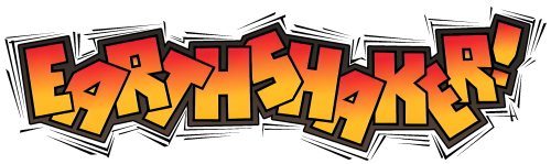
Prior to the second lockdown in the UK, I finally got around to setting up my new MAME collection in Launchbox. To my delight, most of the automatically downloaded logos were super clean and looked perfect. High-fives all around. In the back of my mind, I’d wanted to add my favourite ZX Spectrum, Amiga, and Atari ST games to Launchbox. When the second lockdown hit and I was stuck at home, I had no excuse not to. I got over the technical hurdle of getting the older emulators running, but quickly noticed that many logos were missing or low quality. No surprise, since these systems are pretty niche and old. Being an art director in TV, film, and games for 20-odd years, this sort of thing triggered my artistic OCD. Luckily, I still have physical copies of many of the games, so I began scanning and cleaning logos. Before long, the project snowballed into other consoles like PlayStation, PSP, and GameCube. Misaligned discs, bad cut-outs, or ones that didn’t spin properly really bugged me, so I fixed those too. Here’s a rough breakdown of the work I’ve done by platform. When I get the time, I’ll share some of the disc templates in case they’re useful. ZX Spectrum I did a lot of work here, scanning original artwork and digitally cleaning logos to make them consistent. I also adjusted spacing so that the “visual mass” of each logo felt balanced in Launchbox. Notable examples: Robocop 1–3, R-Type, Overlander, Jet Set Willy. Atari ST and Amiga Generally in better shape, but common problems were low resolution, blurriness, and bad alpha edges from cut-outs. Many were designed for light backgrounds, so I created versions that work on dark backgrounds. Good examples: Venus Flytrap, X-Out, the Lotus series. SNES and Mega Drive (Genesis) Mostly solid, but I made a few tweaks here and there. PS1, PS2, GameCube This took the most time. I centred and cleaned disc artwork, often scanning from my own copies (e.g. Wipeout, Destruction Derby). Where possible, I pulled high-res box/disc scans online. I couldn’t cover every region, but aimed to ensure at least one decent disc per title, prioritising PAL/European editions. In total: around 75 GameCube, 165 PS1, and 265 PS2 discs. PS1 needed the most work due to inconsistent print quality. Game Boy and Game Boy Advance Game Boy media was generally fine, but GBA logos varied a lot in quality and spacing. I worked through about 400 GBA logos. I’ll probably do another pass on the ZX Spectrum, Amiga, and Atari ST logos, as I’m not sure I uploaded everything. Now that lockdown’s ending, I’ll ease off for a while. But I thought I’d share the obsessive work that’s been keeping me busy.

-

Version 2.1.0
20,327 downloads
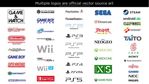
This is a giant collection of platform logos drawn digitally by hand. This took well over 500 hours of work over 15 months. While console logos exist all over the internet, this collection aims to bring them to a higher level of polish and accuracy. The default logos in BigBox will now come from this set. It was extremely tedious to ensure a very high level of accuracy across thousands of files. So Many Versions! Each included platform has multiple logo variants. Basically, many consoles had different logos for different regions and time periods. There are also smaller variations such as with or without a trademark (tm). There are black and white versions for each of these. With all of these it can add up to over 50 small variations for one platform! This would be impossible to navigate so I’ve split them up into smaller categories. For each format (Normal, Large and SVG) there are Light and Dark folders. For either of those there are: “Color”, “Black & White” and “Just White” (or Just Black respectively). If you wanted to use a minimalistic dark theme, you could use the “Just White” versions for a contemporary look. If you wanted logos for a standard dark theme then you could use “Light - Color”. Official Versions Included Besides the many hand drawn logos, I’ve also curated multiple logos that are the OFFICIAL renderings. Meaning, vector art ripped from official sources such as websites and pdf manuals. Finding official source art in the wild is pretty uncommon and required many hours of digging. Most of the source art was not in color so most of these colors are still generated by me. Some of the platforms with official logos include: Sadly, some of these wasted a lot of my time because I drew them and later found the official versions. The Drawing Process: My process for drawing a logo required many steps. I first did research on each logo. Then I would dig deep for the best references I could find. One rule I had was to never trust any image. I would compare multiple sources and make sure the source I chose was not fan made or some modern re-release that changed the logo. If a better source was found that showed differences from what I drew I would redraw it again (it sucked). I redrew the NEO GEO logo about 5 times before I was finally happy with it. Generally, source art would include box art images, adverts, brochures, and manual scans. Archive.org and Manualslib.com were a huge help for a lot of these scans. I would then use the pen tool in Adobe Illustrator and go to town! Sometimes if my source was really amazing, I could finish the whole logo in an hour and a half or so. Other times it would take much, much longer. Getting the correct color was always challenging and required intelligent guesswork. For example, with the classic Konami logo, I brought in 20 images. Gathered the color from all of those and found the average color for the red and orange. Then I’d tweak it slightly more, usually to improve saturation. When it came to fonts, I would always search for it but rarely found exact matches. If the font was found I’d obviously use it, but If not I’d have to hand draw it. However, a couple of the smaller taglines/subtitles do use a very close match. Hand drawing those fonts would do more harm than good. While drawing a logo I took great care to make things as visually pleasing as possible. Every little section of each letter of each logo was considered. Curves were carefully made to be smooth with as few anchor points as possible. Letters align with each other and angled letters all share the same angle. Hand drawing fonts is very tricky. Many logos were substantially harder than I’d anticipated. The Sega Saturn US logo for instance, drove me insane. It took over 40 hours to draw (not to mention wasted time from failed attempts months earlier). I used Adobe Illustrator to mimic every highlight, tiny color shift, shading and glow. When I was working on this logo, I’d come home from my graphic design day job and then spend 4 hours on it, which would only finish part of one letter. As I worked, I’d have a couple copies of the logo in the same file and a couple times it bottomed out 32GB of ram! Unique Versions This collection brings a few unique logos to the table. I’m just going to list a few. I created multiple new arcade and pinball logos, although previous arcade logos are here too. I highly polished the Daphne logo as it needed some love. I drew a detailed version of the TeknoParrot logo which seems to be uncommon in high resolution. I also created Sega system 16 and 32 arcade logos based on the exact font used in the Sega 32X and Sega CD (Copperplate Gothic Std 31AB stretched horizontally to 130%). The Capcom logos have stylized alternate versions based on a gradated version Capcom rarely uses. There are several other unique logos I could list here. White Outline - Default Versions Since these logos are replacing the default logos in BigBox, Faeran smartly requested that I create versions with white outlines around the outside. That way logos could be seen against any background color. I only made the outline versions for the options I gave to Faeran. I don’t plan on making outline versions for the rest of the variations. That said, the versions I did make are included here. The outline versions don’t look quite as nice in my opinion but they serve a very functional and important purpose. Solid black logos for some systems, like the PSP, would not be visible in certain themes without a white outline. However, theme creators or those wanting to add logos to a single theme, I would still recommend the non-outline versions for the cleanest look. Conclusion I included every platform and version that I wanted to. There are some more obscure ones I could draw but I didn’t see the need to seeing as how I've created 22,000 files as is. If I knew how much work this was going to take, I would've never gotten myself into this (lol). I hope that you guys get a lot of enjoyment out of these. I’m glad I made them and it feels really good to finally be able to upload them. I made these originally for LaunchBox but they can be used elsewhere. I will always appreciate credit if you use them. Needless to say, I don’t own the rights to the logos and these are NEVER to be sold in any way. Thanks Special thanks to Juketstu and Faeran for their valuable feedback. Also, huge thanks again to Faeran and the LaunchBox team for using these as the new defaults for BigBox! If you like what you see here, please also check out my LaunchBox / BigBox logo collection & Pineapple Graphics' Photoreal Controller Vectors:- 86 comments
- 33 reviews
-
- 164
-

-

-

-

-
- platform clear logo
- platform logo
- (and 6 more)
-
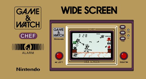
A little like Jonny Severn and SirCamel, I've been cleaning up box art for years now (I've hit 10,277 successful submissions to date....somehow). I don't have photoshop or anything fancy, just a few old art packages, some good free websites for enlarging images, creating transparencies and finding out what fonts are used - AND perseverance!). My biggest submission project to date has been the reconstructed Nintendo Game & Watch boxes (all previously uploaded to the Db) - which started as a challenge to myself to see how far I could push / punish PowerPoint - but my OCD drove me to recreate all the boxes inc. as many regional variations as I could (I'll upload one here as example). I don't have a lot of time - so I cannot take on any requests....but hope what I do upload helps someone out there to either use as is or take to the next level if they have Photoshop. First uploads: The Last Ninja - C64 Cassette version (front, back and spine) N64 Box Spines (28x USA Boxes, 2x EUROPE) Nintendo G&W (Chef - front, back, L+R spine, T+B spine) I'll keep posting as and when I complete anything...but as this is simply a hobby...no guarantees when
-
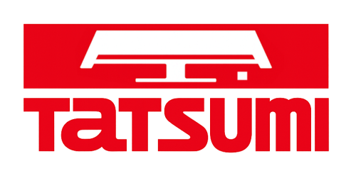
Tatsumi Arcade Logo View File I recreated a hard to find Tatsumi logo used during the 80's arcade era. It can be found online but in poor quality. Hope it comes in handy for someone. Submitter Orionsangel Submitted 03/16/2026 Category Platform Clear Logos
-
Version 1.0.0
1 download
I recreated a hard to find Tatsumi logo used during the 80's arcade era. It can be found online but in poor quality. Hope it comes in handy for someone. -
Version 1.0.0
1,924 downloads
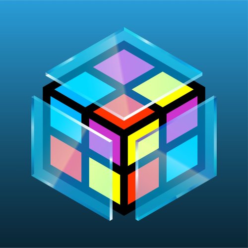
While I am not the original creator of the LaunchBox / BigBox logos, I have the best versions available in this collection. After roughly 30 hours, I have redrawn and perfected the recognizable cube shape and have multiple variants for multiple use cases. All previously used versions are available here, as well as new versions that are slightly different. All my drawings use perspective correct line work making these the best versions of these logos. They come in three sizes Small (1920x1080 max), Large (3840x2160 max) and SVG which is a vector file type. A lot of the BigBox logos can’t be properly saved in SVG format so I included vector PDFs for all logos as well. The LaunchBox logo had some uneven shapes which I corrected. In addition, I noticed the entire LaunchBox logo is not a perfect cube. Its sides are actually rectangles. I never noticed this until now. Once I saw it, I created a separate perspective correct version. I created a further revised version as well, with thicker lines, consistent line widths and punchier colors. The same standard goes for the BigBox logos. The thicker LB logo also has a glass BigBox variant which took a solid amount of work to get right. I really tried to make the glass thick enough to not be too busy and easily visible large or small. I went back and forth on every shade of every gradient until I felt it looked pretty good against dark and light backgrounds. The only versions that are official are the original taller designs. I wanted to improve them as much as I could while still keeping all of the artist’s intent. Feel free to use these how you’d like. I’ll always appreciate credit. If you like what you see here, please also check out my extensive platform logo collection:- 7 comments
- 1 review
-
- 30
-
-
-
-
-
- launchbox logo
- bigbox logo
- (and 9 more)
-
Playlist & Category Logos w/ Icons View File These are logos I had whipped up in Photoshop for my setup. I figured I'd post them in case anyone would like to also use them or find them useful. Credit: The "Recently Played" logo is originally by user Kondorito, I had just reused the graphic to be consistent with the other logos in this pack. Their original forum post can be found here: Submitter drmalouf Submitted 09/07/2025 Category Playlist Clear Logos
-

Version 1.0.0
66 downloads
These are logos I had whipped up in Photoshop for my setup. I figured I'd post them in case anyone would like to also use them or find them useful. Credit: The "Recently Played" logo is originally by user Kondorito, I had just reused the graphic to be consistent with the other logos in this pack. Their original forum post can be found here: -

Version 1.0.0
1,211 downloads
I've spent years recreating the Nintendo G&W boxes....it started as an exercise to see how far I could push PowerPoint - but became an obsession. I've now completed the fronts, backs, logo's and spines. I've included 6 files: 59 G&W Box - Front - Reconstructed: "Good to Go" - Just drop in your LB folder 59 G&W Box - Back - Reconstructed: "Good to Go" - Just drop in your LB folder 59 G&W Clear Logo's: "Good to Go" - Just drop in your LB folder 59 G&W Box - Spine: "Good to Go" - Just drop in your LB folder (noting that BigBox seems to incorrectly handle the depth, so I've proportionally "squished" these so they appear correct) Full G&W Logo's (all the logo's and variants I recreated) Full G&W Reconstructed Fronts and Backs (all the front and backs I recreated - including various 1st / 2nd / 3rd artwork issues and the UK, France, Germany, Belgium (I believe), Australia and Argentina artworks) For the "Super Mario Bros: Special Edition" - please see the comments as I've adding the case and logo there (to save re-uploading the whole 7z again)- 12 comments
-
- 20
-
-
-
-
-
- game and watch
- artwork
- (and 2 more)
-
.thumb.jpg.2d98d67aae3f388af4fa4f64874d0618.jpg)
Version 2.2.0
647 downloads
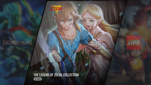
This video is in 4K, unedited, so you can see what it really looks like ! Here are the backgrounds I used to customize @faeran's beautiful VisioN theme ! It mainly features backgrounds for playlists, but also a few for platforms and platform categories. Most of the backgrounds relate to 305 game collections. Some are taken directly from faeran's theme, but the vast majority are new and, as far as possible, directly related to the games in question. All are cropped for the “platform wheel 1” display of faeran's VisioN theme on a 16/9 screen (once again, thanks to him for his themes and this one in particular) . The backgrounds are not, for the most part, in 4k but are of sufficient quality for this type of display. The preview screenshots show them and the logos I used with the theme (screenshots on 16/9 4K screen, unretouched). I've also added the corresponding logos to the archive. What's inside : 389 backgrounds + 389 logos ! - 324 playlist backgrounds grouped into 305 game collections and 19 arcade playlists + 324 logos - 57 platform backgrounds + 57 logos - 8 category backgrounds (in the broadest sense, also includes "Favorite Games", "Recently Played"...) + 8 logos I hope you'll like it ! All platform logos are from @RetroHumanoid's Refried Theme Platform Logo Set, as well as a few logos for the collections. Some platform category logos also come from his Retro Neon Platform Category Logo Set. I hope he doesn't mind. If he wishes, I can of course remove the logos concerned from the archive, which is simply a copy of the custom theme I use. Also a big thank you to him for his work ! Credits for the video soundtrack : - Turrican Soundtrack Anthology Vol.2 (Chris Huelsbeck) : The Final Fight - The Amiga Works (Allister Brimble) : Project X - Giana Sisters : Twisted Dreams - Rise of The Owlverlord (Chris Huelsbeck & Fabian Del Priore) : Rise of The Owlverlord- 5 comments
- 2 reviews
-
- 16
-
-
-
-
- playlists
- collections
- (and 3 more)
-
Version 1.0.3
3,308 downloads
Hi all, First time contributor. Thought I'd share my Main Menu platform logo set I put together. I created these using the logo template from y2guru and a lot of artwork/logo's taken from Hyperspin Themes. Full credit and thanks to all those original theme creators. Most of the main systems have a couple of versions to choose from, one using box art as a background and the other a game character. Enjoy!! -
Backgrounds for playlists (305+), platforms and platform categories for faeran's VisioN theme View File (The video is in 4K, unedited, so you can see what it really looks like.) Here are the backgrounds I used to customize @faeran's beautiful VisioN theme ! It mainly features backgrounds for playlists, but also a few for platforms and platform categories. Most of the backgrounds relate to 305 game collections. Some are taken directly from faeran's theme, but the vast majority are new and, as far as possible, directly related to the games in question. All are cropped for the “platform wheel 1” display of faeran's VisioN theme on a 16/9 screen (once again, thanks to him for his themes and this one in particular) . The backgrounds are not, for the most part, in 4k but are of sufficient quality for this type of display. The preview screenshots show them and the logos I used with the theme (screenshots on 16/9 4K screen, unretouched). I've also added the corresponding logos to the archive. What's inside : 389 backgrounds + 389 logos ! - 324 playlist backgrounds grouped into 305 game collections and 19 arcade playlists + 324 logos - 57 platform backgrounds + 57 logos - 8 category backgrounds (in the broadest sense, also includes "Favorite Games", "Recently Played"...) + 8 logos I hope you'll like it ! All platform logos are from @RetroHumanoid's Refried Theme Platform Logo Set, as well as a few logos for the collections. Some platform category logos also come from his Retro Neon Platform Category Logo Set. I hope he doesn't mind. If he wishes, I can of course remove the logos concerned from the archive, which is simply a copy of the custom theme I use. Also a big thank you to him for his work ! Credits for the video soundtrack : - Turrican Soundtrack Anthology Vol.2 (Chris Huelsbeck) : The Final Fight - The Amiga Works (Allister Brimble) : Project X - Giana Sisters : Twisted Dreams - Rise of The Owlverlord (Chris Huelsbeck & Fabian Del Priore) : Rise of The Owlverlord Submitter JaredN Submitted 07/24/2024 Category Playlist Backgrounds
-
Version 1.0.0
5,954 downloads
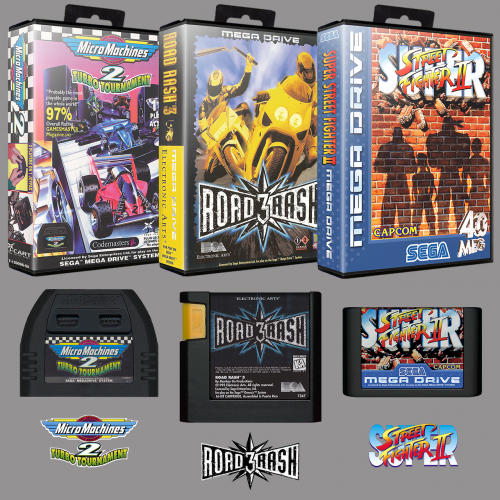
This is a complete Collection of 3D Boxes, 2D Carts and Logos for the Sega Mega Drive Europe Region. The set is named after the 2019 No-Intro Rom set. As a result of the naming convention used with No-Intro there will be some duplicate artwork with slightly different naming. The concept behind these No-Intro named packs is that the user can either have seperate systems with an entire library of artwork for each system or choose a region they would prefare and simply overwrite the region artwork that is not wanted as the artwork and roms will have the same names (for example: Japan, Europe), doing this will leave a library of artwork with a complete region and only the exclusives would be left for the region that was overwritten. There are three different versions of 3D Boxes to choose from: Normal, With Plastic Cover, With Plastic Cover and Sheen. This Project was a collaboration between myself and @aorin1. I made the Boxes and the Carts and Aorin collected and made many of the Logos so they match the European Box Logos exactly. Aorin also had a lot of input in other parts of the project. Though some of the naming may seem a bit strange in some instances LaunchBox and Emumovies will download the correct information and videos for all games. LIST OF GAMES COVERED: NORMAL: WITH PLASTIC COVER WITH PLASTIC COVER AND SHEEN CARTS: LOGOS: AN ART PACK FOR THE SEGA MAGA DRIVE JAPAN REGION CAN BE DOWNLOADED HERE: AN ART PACK FOR THE SEGA GENESIS USA REGION CAN BE DOWNLOADED HERE: -
Hey all, quick introduction: I'm THK, section admin to the HS forum's artwork section and contributing member. Once HyperBase was announced I thought the system logos looked a bit low res and set out to make everything high res and vector. Many more systems were added then the list I originally went by and I've redrawn a big chunk of arcade manufacturer/publisher logos whilst I was at it. Now I haven't come across them here and since no centralized site/community for creating FE related artwork has yet come to fruition, I'd though I'd share them here with you all. As I'm totally new to this site, I have yet to read up on uploading policies here, so for now, here's a google drive link (Still WIP, not everything is complete and some minor things might still have to be fixed) I've redrawn as much as possible in .ai (drag & drop into PS to set the desired size or run a batch) and there's also 1000px wide .png previews included (for purposes of showing them off in the WIP threads and for ppl who don't want to deal with .ai) Feel free to use these in other created FE media and wheel sets. And feel free to give me some credit when using these for all my hard work Credit/thanks to SpotUp for contributing to this set (a few of his still to be added) and SubZero for his Arcade Classics logo.
- 19 replies
-
- 9
-
-
- vector logos
- logos
- (and 6 more)
-
 So I have collected, to the best of my knowledge, all of the ESRB rating tags from the beginning in high resolution. I have noticed that some of the covers don't use the original ESRB rating tags, and thought the reason is because they can be hard to find in high resolution. As such, I am providing them here as a photoshop file and a JPEG (saved with 100% quality) for anyone who wants to use them to make either custom or reconstructed covers. ESRB Ratings.psd
-
Version 1.0.2
587 downloads
I've spent a couple of months recreating / upscaling the Pinball Logo's....it started as an exercise to see if I could get to grips with Photoshop - but became an obsession. I've now completed the logo's for the games in my collection. I've included 2 files: Pinball - Clear Logo: "Good to Go" - Just drop in your LB folder Pinball Logo's Recreated: Includes variations ...and as of 6th August Pinball Front + Back AI upscaled flyers Pinball Video Snaps -
Version 1.0.4
818 downloads
As I own a European Dreamcast, this started as a project to get the EU covers sorted out so that BigBox would look good. There are a lot of good quality scans in the LB db and online, but most of the backs have the spines attached and a notch where the back slotted into the EU case. As we don't yet have an EU case (deeper than the NA and JP cases with a notch where the hinge is) - I decided to split the spines out and fill in the notches. This isn't limited to just EU, I have also tidied up the North American "Exclusives" that the EU didn't get, and included some notable Japanese games that are English "friendly" Specifics: (noting that for the default EU, NA and JP cases to work by region, you'll need to set the region within the games metadata first) European Where necessary, front covers have been tweaked to remove damage and roughly colour matched Backs have had their top/bottom right "notches" filled in Spines have been separated out and edges cleaned up A lot of logo's created / modified to match the EU fronts Shenmue and Shenmue II became a sub-project to get their spines to accurately reflect the box end showing the 2x cases inside (thanks to @goofers for your template assistance). I've included a separate 7z with the other end of the Shenmue cases if you prefer the flat edge version i.e. not the 2x jewel cases inside end (hopefully one day we'll be able to assign left / right / top / bottom images to boxes and then you can use both). If you do want to replicate the look - override the default case to a box, force the Box background colour [ R:65 G:106 B:160 ] and uncheck the "draw image logo" top side option...oh, and don't convert the front / back Shenmue / Shenmue II box images to jpg (from png) otherwise you'll lose the transparency effect of the cut outs ...and finally - I've modified the LB Platform Dreamcast logo to have a blue pixel to reflect the EU console model look North American Not a lot done with the fronts or backs Spines cleaned up - or where the resolution was low - recreated in PowerPoint A few logo's created / modified Japanese Fronts and backs colour matched. Some AI upscaled Spines cleaned up - or where the resolution was low - recreated in PowerPoint A few logo's created / modified Japanese game specifics: Mobile Suit Gundam: Federation vs. Zeon DX - should have the default case over-ridden to a Jewel case with Solid Spine Cosmic Smash / Karous / Triggerheart Exelica / Under Defeat - all should have the default case over-ridden to a DVD case Last Hope: Pink Bullets - should have the default case over-ridden to a DVD case and force the background colour [ R:235 G:67 B:158 ] Ad-hoc Updates For the odd update - such as the updated "NBA Showtime: NBA on NBC" logo - I've added it to the screenshots to save re-uploading the whole Clear Logo 7z (plus saves everyone from having to download the file again for one new logo) 15th August - added Nightmare Creatures II updated logo to the screenshots 16th August - added a separate 7z file for "Golf Shiyouyo: Kouryaku Pack" as (I believe) you would need this game to access the "Golf Shiyouyo: Course Data Shuu: Adventure-hen" course data disc EU Games List: NA Games List: JP Games List:- 4 comments
-
- 16
-
-
-
-
-
Version 1.2.2
5,431 downloads
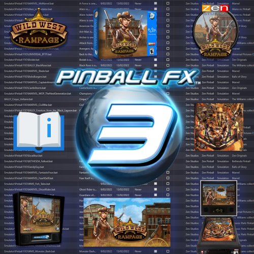
Pinball: Love your Pinnies?? well your come to the right place.. The first Pinball maschine dates back to the 1930s, Now there at our finger tips. Ahhh.. Yeah gotta love it! 😍 Easy to setup Pinball FX3 Media and Metadata WHATS IN THE DOWNLOAD..? Clear Logos 3D Boxs Docklet Wheel Art 3D Carts Marquees Pinball Cabinets Gameplay Screenshots Video Snaps Table .bat files PDF Manuals PinballFX3.xml File Easy How To Guild -
Version 1.0.0
151 downloads
RingEdge Sega - Carbon Logos-
- 2
-
-
- ringedge sega
- carbon
- (and 2 more)
-
Version 1.0.0
300 downloads
American Laser Games - Logos Carbon -------------------------------------------------------- Daphne/Laserdisc is separate -
v2 Platform Logos Professionally Redrawn + Official Versions, New BigBox Defaults View File This is a giant collection of platform logos drawn digitally by hand. This took well over 500 hours of work over 15 months. While console logos exist all over the internet, this collection aims to bring them to a higher level of polish and accuracy. The default logos in BigBox will now come from this set. It was extremely tedious to ensure a very high level of accuracy across thousands of files. So Many Versions! Each included platform has multiple logo variants. Basically, many consoles had different logos for different regions and time periods. There are also smaller variations such as with or without a trademark (tm). There are black and white versions for each of these. With all of these it can add up to over 50 small variations for one platform! This would be impossible to navigate so I’ve split them up into smaller categories. For each format (Normal, Large and SVG) there are Light and Dark folders. For either of those there are: “Color”, “Black & White” and “Just White” (or Just Black respectively). If you wanted to use a minimalistic dark theme, you could use the “Just White” versions for a contemporary look. If you wanted logos for a standard dark theme then you could use “Light - Color”. Official Versions Included Besides the many hand drawn logos, I’ve also curated multiple logos that are the OFFICIAL renderings. Meaning, vector art ripped from official sources such as websites and pdf manuals. Finding official source art in the wild is pretty uncommon and required many hours of digging. Most of the source art was not in color so most of these colors are still generated by me. Some of the platforms with official logos include: Sadly, some of these wasted a lot of my time because I drew them and later found the official versions. The Drawing Process: My process for drawing a logo required many steps. I first did research on each logo. Then I would dig deep for the best references I could find. One rule I had was to never trust any image. I would compare multiple sources and make sure the source I chose was not fan made or some modern re-release that changed the logo. If a better source was found that showed differences from what I drew I would redraw it again (it sucked). I redrew the NEO GEO logo about 5 times before I was finally happy with it. Generally, source art would include box art images, adverts, brochures, and manual scans. Archive.org and Manualslib.com were a huge help for a lot of these scans. I would then use the pen tool in Adobe Illustrator and go to town! Sometimes if my source was really amazing, I could finish the whole logo in an hour and a half or so. Other times it would take much, much longer. Getting the correct color was always challenging and required intelligent guesswork. For example, with the classic Konami logo, I brought in 20 images. Gathered the color from all of those and found the average color for the red and orange. Then I’d tweak it slightly more, usually to improve saturation. When it came to fonts, I would always search for it but rarely found exact matches. If the font was found I’d obviously use it, but If not I’d have to hand draw it. However, a couple of the smaller taglines/subtitles do use a very close match. Hand drawing those fonts would do more harm than good. While drawing a logo I took great care to make things as visually pleasing as possible. Every little section of each letter of each logo was considered. Curves were carefully made to be smooth with as few anchor points as possible. Letters align with each other and angled letters all share the same angle. Hand drawing fonts is very tricky. Many logos were substantially harder than I’d anticipated. The Sega Saturn US logo for instance, drove me insane. It took over 40 hours to draw (not to mention wasted time from failed attempts months earlier). I used Adobe Illustrator to mimic every highlight, tiny color shift, shading and glow. When I was working on this logo, I’d come home from my graphic design day job and then spend 4 hours on it, which would only finish part of one letter. As I worked, I’d have a couple copies of the logo in the same file and a couple times it bottomed out 32GB of ram! Unique Versions This collection brings a few unique logos to the table. I’m just going to list a few. I created multiple new arcade and pinball logos, although previous arcade logos are here too. I highly polished the Daphne logo as it needed some love. I drew a detailed version of the TeknoParrot logo which seems to be uncommon in high resolution. I also created Sega system 16 and 32 arcade logos based on the exact font used in the Sega 32X and Sega CD (Copperplate Gothic Std 31AB stretched horizontally to 130%). The Capcom logos have stylized alternate versions based on a gradated version Capcom rarely uses. There are several other unique logos I could list here. White Outline - Default Versions Since these logos are replacing the default logos in BigBox, Faeran smartly requested that I create versions with white outlines around the outside. That way logos could be seen against any background color. I only made the outline versions for the options I gave to Faeran. I don’t plan on making outline versions for the rest of the variations. That said, the versions I did make are included here. The outline versions don’t look quite as nice in my opinion but they serve a very functional and important purpose. Solid black logos for some systems, like the PSP, would not be visible in certain themes without a white outline. However, theme creators or those wanting to add logos to a single theme, I would still recommend the non-outline versions for the cleanest look. Conclusion I included every platform and version that I wanted to. There are some more obscure ones I could draw but I didn’t see the need to seeing as how I've created 22,000 files as is. If I knew how much work this was going to take I would've never gotten myself into this (lol). I hope that you guys get a lot of enjoyment out of these. I’m glad I made them and it feels really good to finally be able to upload them. I made these originally for LaunchBox but they can be used elsewhere. I will always appreciate credit if you use them. Needless to say, I don’t own the rights to the logos and these are NEVER to be sold in any way. Thanks Special thanks to Juketstu and Faeran for their valuable feedback. Also, huge thanks again to Faeran and the LaunchBox team for using these as the new defaults for BigBox! If you like what you see here, please also check out my LaunchBox / BigBox logo collection & Pineapple Graphics' Photoreal Controller Vectors: Submitter Dan Patrick Submitted 03/20/2022 Category Platform Clear Logos
- 3 replies
-
- 1
-
-
- platform clear logo
- platform logo
- (and 6 more)
-
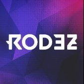
pinball Pinball FX3 - Easy to setup Pinball FX3 Media and Metadata
ROD3Z posted a topic in Game Media
Pinball FX3 - Easy to setup Pinball FX3 Media and Metadata View File Pinball: Love your Pinnies?? well your come to the right place.. The first Pinball maschine dates back to the 1930s, Now there at our finger tips. Ahhh.. Yeah gotta love it! 😍 Easy to setup Pinball FX3 Media and Metadata WHATS IN THE DOWNLOAD..? Clear Logos 3D Boxs Docklet Wheel Art 3D Carts Marquees Pinball Cabinets Gameplay Screenshots Video Snaps Table .bat files PDF Manuals PinballFX3.xml File Easy How To Guild Submitter ROD3Z Submitted 02/14/2022 Category Game Media -
Version 1.0.0
279 downloads
Sega Naomi - Logos Carbon -
Version 1.0.0
308 downloads
Sammy Atomiswave - Logos Carbon


.jpg.c34715768d1077039c51858f7a0851f5.jpg)
.jpg.71b38e1aee9ac249d80a359f48aaa2e0.jpg)


.thumb.jpg.2d98d67aae3f388af4fa4f64874d0618.jpg)


