The data analysis activity involves the collection, transformation, and organization of data with the goal of drawing conclusions, making predictions, and guiding the decision-making process based on information. The “Google Data Analytics Professional Certificate” can be obtained upon completion of the course available on the Coursera platform. The course aims to introduce students to the main activities and tools of the data analysis process. At the end of the course, students are encouraged to undertake a project to apply the acquired knowledge. This article is the outcome of this analysis and aims to showcase what was done and the thought process employed.
The data analysis process outlined in the certification consists of six stages: Ask, Prepare, Process, Analyze, Share, and Act. Each of these stages assists the analyst in seeking the correct information and performing necessary procedures in a structured manner, ultimately aiming to find a solution to the problem. This article is organized following these stages of the process.
Ask
The first stage of the analysis process has two major objectives: first, to define the problem to be solved, and second, to ensure that the expectations of all stakeholders are aligned. To accomplish these objectives, it is necessary to understand the context and address as many uncertainties as possible, clarifying the work to be performed. In this case study, the project is for a company called Cyclistic, a bike-sharing company based in Chicago.
In 2016, Cyclistic successfully launched a bike-sharing service. Since then, the program has expanded to a fleet of 5,824 bikes, which are georeferenced and locked at a network of 692 stations throughout Chicago. Bikes can be unlocked from one station and returned to any other station in the system at any time.
So far, Cyclistic’s marketing strategy has relied on building general awareness and appealing to broad consumer segments. A key facilitator of this approach has been the flexibility of their pricing plans: single ride passes, day passes, and annual memberships. Customers purchasing single-ride passes or day passes are referred to as occasional riders. Customers buying annual memberships are Cyclistic members.
Cyclistic’s financial analysts have determined that annual members are significantly more profitable than occasional riders. While the pricing flexibility helps Cyclistic attract more customers, Lily Moreno, the marketing director, believes that maximizing the number of annual members will be crucial for future growth. Instead of creating a marketing campaign targeting all new customers, Moreno thinks there’s a good chance to convert occasional riders into members. She notes that occasional riders are already aware of the Cyclistic program and have chosen Cyclistic for their mobility needs.
Moreno has set a clear goal: to develop marketing strategies aimed at converting occasional riders into annual members. However, to achieve this, the marketing analytics team needs a better understanding of the differences between annual members and occasional riders. They also need insights into why occasional riders would purchase memberships and how digital media could impact their marketing tactics. Moreno and her team are eager to analyze Cyclistic’s historical bike trip data to identify trends.
The questions that need to be answered and will guide the future marketing campaigns are as follows:
- How do annual members and occasional riders use Cyclistic’s service differently?
- Why would occasional riders purchase annual memberships?
- How can Cyclistic use digital media to influence occasional riders to become members?
This project involves analyzing historical data to address the first of these three questions. Our objective is:
To understand how annual members and occasional riders use Cyclistic’s services differently in order to design a marketing strategy focused on converting occasional riders into annual members.
Our analysis, conclusions, and recommendations will be presented to the marketing director, Lily Moreno, and the Cyclistic executive team.
Prepare
In this stage, we will collect and store the necessary data to address the problem defined in the first stage. To achieve this, we need to understand what data is required, where it is stored, how it is organized, and assess the credibility of the data or identify any biases. After collecting the data, we must organize it logically so that both we and other team members can understand and use it. This organization may involve issues related to standardizing nomenclature, file structure, and sorting and filtering data.
Cyclistic has been collecting data related to user trips since 2013, and there have been modifications to the collected information during this period. For this analysis, we will use a subset of this data, limiting the selection to the most recent data. We have the option to use data collected over an entire year or just a single quarter. As the goal is to understand user behavior differences, we cannot dismiss the potential effect that different seasons might have. For this reason, we will use data collected during the months of November 2022 to October 2023. Regarding the credibility of the data, it has been generated and collected by the company’s own system, representing original data for each ride. These are current data, providing a very high degree of reliability for the analysis.
The data collection was conducted by downloading files available at the following address: https://divvy-tripdata.s3.amazonaws.com/index.html. For this analysis, the following files were collected: 202211-divvy-tripdata.zip, 202212-divvy-tripdata.zip, 202301-divvy-tripdata.zip, 202302-divvy-tripdata.zip, 202303-divvy-tripdata.zip, 202304-divvy-tripdata.zip, 202305-divvy-tripdata.zip, 202306-divvy-tripdata.zip, 202307-divvy-tripdata.zip, 202308-divvy-tripdata.zip, 202309-divvy-tripdata.zip, 202310-divvy-tripdata.zip. Each of the 12 files contains information related to trips taken for one month, covering the period from November 2022 to October 2023.
After collecting the data, organization was carried out at the folder and file levels. A copy of each file was made with the goal of reducing the chances of corrupting or modifying a file with the original information, thereby avoiding potential data loss. With the copies completed, the folder structure was organized based on the year and month of the information contained in each file.
/ trips

    /2022/11/202211-divvy-ripdata.csv

    /2022/12/202212-divvy-tripdata.csv

    /2023/01/202301-divvy-tripdata.csv

    /2023/02/202302-divvy-tripdata.csv

    /2023/03/202303-divvy-tripdata.csv

    /2023/04/202304-divvy-tripdata.csv

    /2023/05/202305-divvy-tripdata.csv

    /2023/06/202306-divvy-tripdata.csv

    /2023/07/202307-divvy-tripdata.csv

    /2023/08/202308-divvy-tripdata.csv

    /2023/09/202309-divvy-tripdata.csv

    /2023/10/202310-divvy-tripdata.csv

    /2023/11/202311-divvy-tripdata.csv

    /2023/12/202312-divvy-tripdata.csv
Each file was structured with information about the rides conducted during a month. All files contained the following information:
| ride_id | unique identifier for the ride |
| rideable_type | type of vehicle used |
| started_at | date and time of the ride’s start |
| ended_at | date and time of the ride’s end |
| start_station_name | name of the station where the ride started |
| start_station_id | identifier of the station where the ride started |
| end_station_name | name of the station where the ride ended |
| end_station_id | identifier of the station where the ride ended |
| start_lat | latitude of the ride’s starting point |
| start_lng | longitude of the ride’s starting point |
| end_lat | latitude of the ride’s ending point |
| end_lng | longitude of the ride’s ending point |
| member_casual | indication of the user type (member or casual) |
After collecting, organizing, and understanding the information contained in the files, we proceed to the next stage, “process.”
Process
In this stage, we begin processing the collected information. This is where data is manipulated, cleaned, removed, enriched, and transformed to be ready for the analysis phase. The processing phase must be conducted carefully because if done improperly, it can result in analyses with incorrect data, leading to less accurate conclusions and, consequently, misguided recommendations and actions.
The first step in processing the information was the choice of the tool. The total number of entries to be analyzed is a crucial factor, as some tools, such as spreadsheet systems, have limitations regarding the amount of data they can handle. The 12 combined files have a total of 5,652,827 recorded rides, so the chosen tools must be capable of working with this volume of information. The two main tool options with the power to handle this amount of information are databases, using SQL for processing and analysis, and programming languages like Python and R.
We chose to use the R Studio tool, an integrated development environment for the R programming language, to perform the analysis. This choice was made for two reasons: the first is its ability to handle large volumes of information, and the second is that R was the programming language introduced during the certification course. Therefore, this was an excellent opportunity to gain more experience with this tool.
After selecting the tool, we initiated the data processing. As it is a programming language, R allowed us to create a function with all the processing steps, making the procedures easily replicable for any dataset with the same format as the ones already collected. The steps taken for data cleaning were as follows:
1. The first step was to reduce the dataset to only the information relevant for the analysis. Therefore, we chose to remove some of the existing columns that would not contribute to the process. This reduced the total number of columns from 13 to 5, retaining the following columns:
| ride_id | unique identifier for the ride |
| rideable_type | type of vehicle used |
| started_at | date and time of the ride’s start |
| ended_at | date and time of the ride’s end |
| member_casual | indication of the user type (member or casual) |
2. The second step was to handle missing information and decide what to do with it. In the dataset that was retained, no information was missing, so there was no need to perform any removal or filling of missing data. After these two initial steps, the total number of collected entries remained at 5,652,827, with no loss of data.
3. The third step was to check if there were any errors in the remaining data. All data related to the categories “rideable_type” and “member_casual” were correct and belonged to one of the predefined categories. The data related to the start and end dates and times of the rides needed correction because there were entries where the end date and time preceded the start. To address these cases, it was decided to reverse the values. After this process, all start dates and times of the rides preceded the end dates and times.
With the selected, cleaned, and corrected data, we initiated the process of enriching the information. Using the existing information, we performed calculations and processes to extract and add new details to the dataset. The added information was the duration of each ride. To achieve this, we calculated the difference in minutes between the start and end dates and times of the rides, and we saved this information in a new field called “trip_in_minutes.”
The next stage of the process involved identifying outliers that could impact the data analysis. Upon finding them, we chose to remove them from the dataset under analysis. To identify entries outside the norm, we used the “quantile” function, encompassing 97.5% of the data regarding the new “trip_in_minutes” column. The returned value was 60 minutes, indicating that 97.5% of the recorded rides in this dataset had a duration less than 60 minutes. With this information, we filtered the data, retaining only rides with a duration equal to or less than 60 minutes. This step proved essential to avoid future distortions, as there were rides with durations of up to 98,489 minutes or a total of more than 68 days of use. Data like this should be investigated to understand if they resulted from any special cases or errors in the information recording process, but for this analysis, they were removed.
Analyze
Analysis is the process used to understand and make sense of the collected data. The goal of the analysis is to identify trends, patterns, and relationships in the data to accurately answer the questions being raised.
To initiate the analysis process, we first sought to understand the portion of users or how much they represented in relation to the total number of rides in our dataset. For this, we calculated the total number of rides per user type and generated a graph to visualize the information more simply. As this is a visualization where we aim to understand the representation of a part in relation to the whole, we chose a “pie” chart. The result can be seen below:
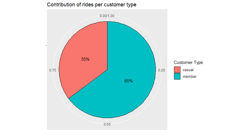
The chart above demonstrates that in relation to the total number of rides during the data period, 65% were conducted by users who are already Cyclistic members, while only 35% were from occasional riders. Considering that our goal is to understand how the usage of these two groups differs, recognizing that the distribution in the total number of rides over a year is not equal is an indicative sign that there is indeed a difference in how each group utilizes the service. An important point to highlight is that, for data security and protection reasons, we do not have information on each individual user. Therefore, we cannot compare the usage rate for each of the groups. For instance, if there are more “member” users, it is expected that they will also represent the majority in the number of rides. Hence, while this is an indicator of a difference between the groups, this initial analysis does not answer the questions raised initially.
The second analysis was related to the total ride duration for each group and how it relates to the overall total. Similarly, to the previous analysis, this is a representation of a part of a whole, and for this reason, the same type of chart was used.
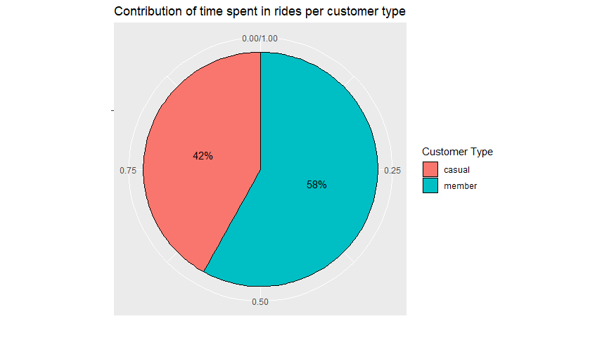
Analyzing the chart above, we can observe that the distribution does not follow the same pattern as the first analysis. Despite the total number of rides representing only 36% for occasional riders, the total duration of these rides accounts for 42%, indicating that occasional riders, on average, use the service for a longer duration in their rides. To confirm this indication, we calculated the average ride duration for each group, and the result was as follows:
| Customer Type | Average ride time in minutes |
|---|---|
| Casual | 14.8 minutes |
| Member | 11.1 minutes |
Indeed, what was indicated by the previous chart proved to be true. On average, occasional riders take rides with a duration 33% longer than that of member users. Here, we can generate various hypotheses, such as longer routes for occasional riders or the use of the service for recreation and leisure by occasional riders, while member users may use it for short-distance transportation. To answer these questions and gain a deeper understanding of the differences in behavior, we need to delve further into the data and continue our analysis.
The next step was to analyze information related to the distribution of rides over time. We aim to answer questions such as: Are there differences in the times users most frequently use the service throughout the day? On which days of the week is the service most utilized, and does this vary by user type? Is there a particular time of the year when users use the service more frequently? Analyses were conducted on the data to better understand these relationships.
We began by analyzing the largest available period. Within this period, we sought to understand how rides were distributed across months and whether this distribution varied by user type. We chose to present this series of values that change over time using a bar chart.

As depicted, we can observe that both types of users exhibit similar behavior, with higher usage in the months of June, July, and August and lower usage in January, February, and December. This behavior could be explained by factors such as temperature, as June, July, and August have higher temperatures in Chicago compared to the colder months of January, February, and December. Since this is an outdoor activity, it is expected that usage decreases when the temperature is lower. However, we can note a consistently substantial number of member users utilizing the service in every month of the year.
The next analysis focused on the days of the week, aiming to understand the distribution of rides throughout the week. Similarly, we opted to use a bar chart for this representation.

Contrary to the distribution of rides throughout the months of the year, where both types of users exhibited very similar behavior, the distribution over the days of the week has an inverse pattern. The days with the highest usage by member users are the days with the least usage by casual riders, and vice versa. Notably, casual riders have higher usage during weekends (Saturday and Sunday), while members have higher usage on weekdays. This difference may indicate a distinction in the purposes of service usage for each user group. Members might use the service for daily commuting, such as going to and from work or school, whereas casual riders seem to use the service more for leisure on days when there is no demand for these other activities.
After analyzing usage throughout a week, we took a step further and decided to examine the scenario within a single day. We already know that member usage is higher during the week, while casual riders use the service more on weekends. We want to explore the distribution within a single day to identify the primary usage hours. One hypothesis is that member users use the service for commuting to work or school, and this might be reinforced if the peak usage times for this subset of users are near the start and end of these activities.
To verify if there were differences, we generated a graph with the ride start times for each user type.

Analyzing the graph, we can observe that two specific times stand out for member users, coinciding with the typical start and end times of work and school activities, thus reinforcing our assumption. In contrast, casual riders exhibit a different pattern, with usage gradually increasing throughout the day and peaking in the afternoon. As we identified that the usage distribution changes throughout the days of the week, we chose to perform this comparison for each day individually.

The first comparison was made for weekdays, Monday through Friday, and as we can observe, the behavior is very similar to the overall graph. Member users have usage peaks near the start and end times of work and school, while casual riders show a gradual increase in usage throughout the day, peaking in the afternoon.

The second comparison was made for the weekend, Saturday and Sunday. As we can observe, the behavior of the two groups became very similar, indicating a change in behavior by member users on weekends, while the group of casual riders maintained the pattern of other days. Another interesting point to note is that the volume, the total number of rides, during the weekend was basically the same for both groups.
Through these analyses, we identified differences in how users from different groups use the service. We can highlight the following points
- Casual riders have rides that are, on average, 33% longer than those of members.
- Casual riders use the service much more during the summer months and much less during the other months, while members, despite using it more during the warmer months, have a more consistent distribution throughout the year.
- Casual riders use the service more on weekends, while members use it more during the week.
- Casual riders use the service more evenly throughout the day, with peak usage during the afternoon, while members have two peaks of usage near the start and end times of work and school.
With this information, we can move on to the next stage of the process, sharing the findings.
Share
The sharing of what was learned during the analysis stage is when we inform stakeholders about our discoveries and the recommendations, we are making to address the initial questions. This stage of the process can be carried out in various ways, such as giving a presentation, sharing a report, or providing the files used in the analysis.
In this study, we chose to write this article, explaining step by step what was done and the decisions made, along with the R file that was used. Both this article in PDF format and the other materials are available at the following address: https://github.com/Drieger/cyclistic-data-analysis
Act
The last stage of the process is to implement what has been suggested and monitor the results to verify if the decisions and strategies created based on the analysis are proceeding as expected. As we cannot put these suggestions into practice, this section will be limited to presenting three possible suggestions for further study and implementation based on the analysis
- Introduce service subscriptions with benefits for usage during warmer periods, allowing casual riders to become members for a shorter period of the year, such as offering 3-month subscription plans.
- Create incentives and benefits for those who use the service outside peak hours, enabling the introduction of different tariffs or rental modalities for these users.
- Introduce membership plans specifically for weekend usage. As we observed that casual riders use the service more on weekends, having a subscription option just for these days could encourage more users to become members.
- These suggestions can then be studied by the marketing and business teams to explore how they can be practically implemented.
Conclusion
We have gone through all the stages of the data analysis process suggested by the “Google Data Analytics Professional Certificate.” In this project, we delved into the work performed by a professional in the field: we understood the problem to be solved, identified, and collected the data, organized, cleaned, and processed them. We moved on to the analysis, exploring hypotheses and understanding the stories the data were telling us. We described and shared our process, conclusions, and made suggestions for actions to achieve the company’s objectives, allowing them to make informed decisions based on the presented data.
This was just an initial analysis of the proposed project. Due to privacy constraints, we had access to a limited set of information. It would still be possible to explore an even larger dataset to gain a better understanding of the differences in usage among different user groups. Demographic information, details about ride routes, weather-related data, or city events could further contribute and enhance the analysis process.
dashboard data data-analytics data-visualization data analysis data analytics power bi r r studio technology
