Beskrivelse
Makes your TwentyTen themed site have a responsive and fluid layout. Making it ideal for for viewing across a whole range of devices and screen sizes (i.e iPhones, Android, iPads).
Uses CSS and media queries to enable the fluidity and responsiveness.
Skærmbilleder

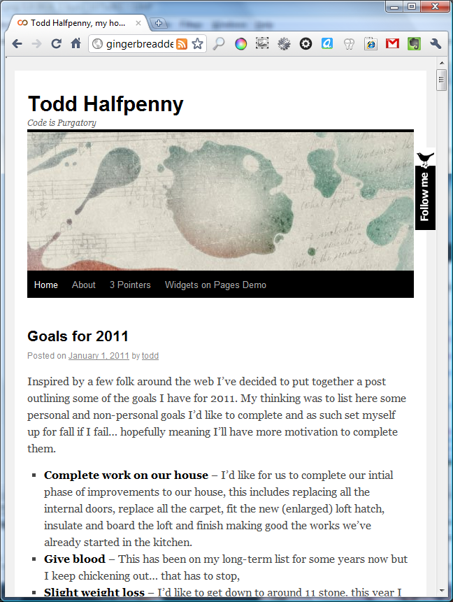
Normal browser
Narrow Browser
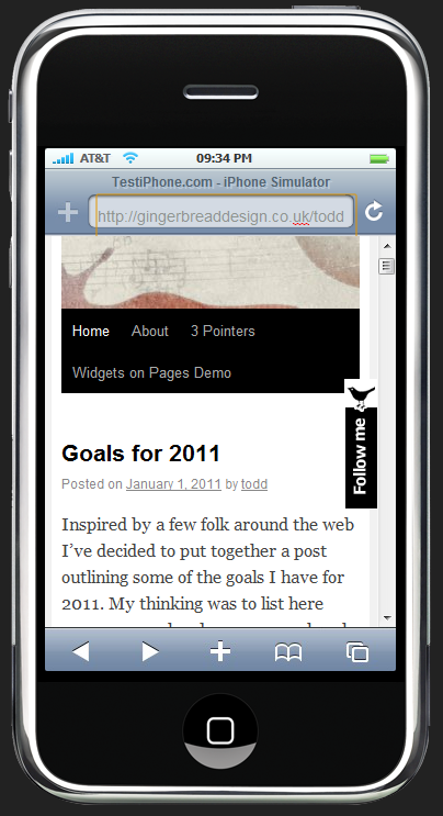
iPhone Browser
Installation
- Install the plugin from within the Dashboard or upload the directory
responsive-twentytenand all its contents to the/wp-content/plugins/directory - Activate the plugin through the ‘Plugins’ menu in WordPress
- Voila!
FAQ
- Why is this not a child theme
-
The WordPress.org theme repository doesn’t support the submission of child themes yet. This is meant to be on it’s way some time soon… but in the meantime a similar result can be gotten with this plugin.
Anmeldelser
Bidragsydere & udviklere
“Responsive TwentyTen” er open source-software. Følgende personer har bidraget til dette plugin.
Bidragsydere
Oversæt “Responsive TwentyTen” til dit eget sprog.
Interesseret i udvikling?
Gennemse koden, tjek SVN repository, eller abonner på udviklerloggen via RSS.
Ændringslog
0.0.3
- Fix for image scaling to keep ratio instead of squashing.
0.0.2
-
Images centered now when screen size gets small
-
Images with captions also now re-sized
0.0.1
First Release.