
Let’s say I told you we can get the results below with just one HTML element and five CSS properties for each. No SVG, no images (save for the background on the root that’s there just to make clear that our one HTML element has some transparent parts), no JavaScript. What would you think that involves?
Well, this article is going to explain just how to do this and then also show how to make things fun by adding in some animation.
CSS-ing the Gradient Rays
The HTML is just one <div>.
<div class='rays'></div>In the CSS, we need to set the dimensions of this element and we need to give it a background so that we can see it. We also make it circular using border-radius:
.rays {
  width: 80vmin; height: 80vmin;
  border-radius: 50%;
  background: linear-gradient(#b53, #f90);
}
And… we’ve already used up four out of five properties to get the result below:
See the Pen by thebabydino (@thebabydino) on CodePen.
So what’s the fifth? mask with a repeating-conic-gradient() value!
Let’s say we want to have 20 rays. This means we need to allocate $p: 100%/20 of the full circle for a ray and the gap after it.

Here we keep the gaps in between rays equal to the rays (so that’s .5*$p for either a ray or a space), but we can make either of them wider or narrower. We want an abrupt change after the ending stop position of the opaque part (the ray), so the starting stop position for the transparent part (the gap) should be equal to or smaller than it. So if the ending stop position for the ray is .5*$p, then the starting stop position for the gap can’t be bigger. However, it can be smaller and that helps us keep things simple because it means we can simply zero it.

repeating-conic-gradient() works (live).$nr: 20; // number of rays
$p: 100%/$nr; // percent of circle allocated to a ray and gap after
.rays {
/* same as before */
mask: repeating-conic-gradient(#000 0% .5*$p, transparent 0% $p);
}Note that, unlike for linear and radial gradients, stop positions for conic gradients cannot be unitless. They need to be either percentages or angular values. This means using something like transparent 0 $p doesn’t work, we need transparent 0% $p (or 0deg instead of 0%, it doesn’t matter which we pick, it just can’t be unitless).

There are a few things to note here when it comes to support:
- Edge doesn’t support masking on HTML elements at this point, though this is listed as In Development and a flag for it (that doesn’t do anything for now) has already shown up in
about:flags.

The Enable CSS Masking flag in Edge. conic-gradient()is only supported natively by Blink browsers behind the Experimental Web Platform features flag (which can be enabled fromchrome://flagsoropera://flags). Support is coming to Safari as well, but, until that happens, Safari still relies on the polyfill, just like Firefox (or Edge when it also supports masking in the next version). Update: starting with Chrome 69,conic-gradient()isn’t behind a flag anymore – it now works in any up to date Blink browser, regardless of the flag being enabled or not.

The Experimental Web Platform features flag enabled in Chrome. - WebKit browsers still need the
-webkit-prefix formaskproperties on HTML elements. You’d think that’s no problem since we’re using the polyfill which relies on -prefix-free anyway, so, if we use the polyfill, we need to include -prefix-free before that anyway. Sadly, it’s a bit more complicated than that. That’s because -prefix-free works via feature detection, which fails in this case because all browsers do supportmaskunprefixed… on SVG elements! But we’re usingmaskon an HTML element here, so we’re in the situation where WebKit browsers need the-webkit-prefix, but -prefix-free won’t add it. So I guess that means we need to add it manually:$nr: 20; // number of rays $p: 100%/$nr; // percent of circle allocated to a ray and gap after $m: repeating-conic-gradient(#000 0% .5*$p, transparent 0% $p); // mask .rays { /* same as before */ -webkit-mask: $m; mask: $m; }I guess we could also use Autoprefixer, even if we need to include -prefix-free anyway, but using both just for this feels a bit like using a shotgun to kill a fly.
Adding in Animation
One cool thing about conic-gradient() being supported natively in Blink browsers is that we can use CSS variables inside (we cannot do that when using the polyfill). And CSS variables can now also be animated in Blink browsers with a bit of Houdini magic (we need the Experimental Web Platform features flag to be enabled for that, even though we don’t need it for native conic-gradient() support anymore starting with Chrome 69+).
In order to prepare our code for the animation, we change our masking gradient so that it uses variable alpha values:
$m: repeating-conic-gradient(
      rgba(#000, var(--a)) 0% .5*$p,
      rgba(#000, calc(1 - var(--a))) 0% $p);
We then register the alpha --a custom property:
CSS.registerProperty({
  name: '--a',
  syntax: '<number>',
  initialValue: 1,
  inherits: true
})
Note that the spec now requires that inherits should be explicitly specified, even though it was optional before. So if any Houdini demos that don’t specify it are broken, this is at least one of the reasons why.
And finally, we add in an animation in the CSS:
.rays {
  /* same as before */
  animation: a 2s linear infinite alternate;
}

@keyframes a { to { --a: 0 } }
This gives us the following result:

Meh. Doesn’t look that great. We could however make things more interesting by using multiple alpha values:
$m: repeating-conic-gradient(
      rgba(#000, var(--a0)) 0%, rgba(#000, var(--a1)) .5*$p,
      rgba(#000, var(--a2)) 0%, rgba(#000, var(--a3)) $p);
The next step is to register each of these custom properties:
for(let i = 0; i < 4; i++) {
  CSS.registerProperty({
    name: `--a${i}`,
    syntax: '<number>',
    initialValue: 1 - ~~(i/2),
    inherits: true
  })
}
And finally, add the animations in the CSS:
.rays {
  /* same as before */
  animation: a 2s infinite alternate;
  animation-name: a0, a1, a2, a3;
  animation-timing-function:
    /* easings from easings.net */
    cubic-bezier(.57, .05, .67, .19) /* easeInCubic */,
    cubic-bezier(.21, .61, .35, 1); /* easeOutCubic */
}

@for $i from 0 to 4 {
  @keyframes a#{$i} { to { --a#{$i}: #{floor($i/2)} } }
}
Note that since we’re setting values to custom properties, we need to interpolate the floor() function.

It now looks a bit more interesting, but surely we can do better?
Let’s try using a CSS variable for the stop position between the ray and the gap:
$m: repeating-conic-gradient(#000 0% var(--p), transparent 0% $p);We then register this variable:
CSS.registerProperty({
  name: '--p',
  syntax: '<percentage>',
  initialValue: '0%',
  inherits: true
})
And we animate it from the CSS using a keyframe animation:
.rays {
  /* same as before */
  animation: p .5s linear infinite alternate
}

@keyframes p { to { --p: #{$p} } }
The result is more interesting in this case:

But we can still spice it up a bit more by flipping the whole thing horizontally in between every iteration, so that it’s always flipped for the reverse ones. This means not flipped when --p goes from 0% to $p and flipped when --p goes back from $p to 0%.
The way we flip an element horizontally is by applying a transform: scalex(-1) to it. Since we want this flip to be applied at the end of the first iteration and then removed at the end of the second (reverse) one, we apply it in a keyframe animation as well—in one with a steps() timing function and double the animation-duration.
 $t: .5s;

.rays {
  /* same as before */
  animation: p $t linear infinite alternate,
    s 2*$t steps(1) infinite;
}

@keyframes p { to { --p: #{$p} } }

@keyframes s { 50% { transform: scalex(-1); } }
Now we finally have a result that actually looks pretty cool:

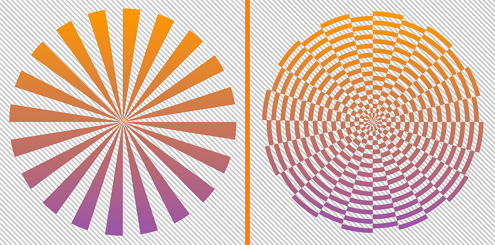
CSS-ing Gradient Rays and Ripples
To get the rays and ripples result, we need to add a second gradient to the mask, this time a repeating-radial-gradient().

repeating-radial-gradient() works (live).$nr: 20;
$p: 100%/$nr;
$stop-list: #000 0% .5*$p, transparent 0% $p;
$m: repeating-conic-gradient($stop-list),
repeating-radial-gradient(closest-side, $stop-list);
.rays-ripples {
/* same as before */
mask: $m;
}Sadly, using multiple stop positions only works in Blink browsers with the same Experimental Web Platform features flag enabled. And while the conic-gradient() polyfill covers this for the repeating-conic-gradient() part in browsers supporting CSS masking on HTML elements, but not supporting conic gradients natively (Firefox, Safari, Blink browsers without the flag enabled), nothing fixes the problem for the repeating-radial-gradient() part in these browsers.
This means we’re forced to have some repetition in our code:
$nr: 20;
$p: 100%/$nr;
$stop-list: #000, #000 .5*$p, transparent 0%, transparent $p;
$m: repeating-conic-gradient($stop-list),
    repeating-radial-gradient(closest-side, $stop-list);

.rays-ripples {
  /* same as before */
  mask: $m;
}
We’re obviously getting closer, but we’re not quite there yet:

To get the result we want, we need to use the mask-composite property and set it to exclude.
mask-composite is only supported in Firefox 53+ for now, though WebKit browsers have very good support (since Chrome 1.0 and Safari 4.0) for a similar non-standard property, -webkit-mask-composite, that helps us get the same result for a value of xor and Edge should join in when it finally supports CSS masking on HTML elements. Do note however that Edge is going to support both mask-composite and -webkit-mask-composite with the standard values, even though anyone using -webkit-mask-composite to target WebKit browsers is probably going to use it with the non-standard ones as it doesn’t even work in WebKit browsers otherwise.
$lyr1: repeating-conic-gradient($stop-list);
$lyr0: repeating-radial-gradient(closest-side, $stop-list);

.xor {
  /* same as before */
  -webkit-mask: $lyr1, $lyr0;
  -webkit-mask-composite: xor;
          mask: $lyr1 exclude, $lyr0
}
Note that the non-standard -webkit-mask-composite cannot be used within the -webkit-mask shorthand in the same way we use the standard mask-composite within the mask shorthand for Firefox.

mask-composite and Chrome 1.0+/ Safari 4.0+ with non-standard -webkit-mask-composite).If you think it looks like the rays and the gaps between the rays are not equal in browsers not supporting conic-gradient() natively, you’re right. This is due to a polyfill issue.
Adding in Animation
Since the standard mask-composite only works in Firefox for now and Firefox doesn’t yet support conic-gradient() natively, we cannot put CSS variables inside the repeating-conic-gradient() (because Firefox still falls back on the polyfill for it and the polyfill doesn’t support CSS variable usage). But we can put them inside the repeating-radial-gradient() and even if we cannot animate them with CSS keyframe animations, we can do so with JavaScript!
Because we’re now putting CSS variables inside the repeating-radial-gradient(), but not inside the repeating-conic-gradient() (as we want better browser support and Firefox doesn’t support conic gradients natively, so it falls back on the polyfill, which doesn’t support CSS variable usage), we cannot use the same $stop-list for both gradient layers of our mask anymore.
But if we have to rewrite our mask without a common $stop-list anyway, we can take this opportunity to use different stop positions for the two gradients:
// for conic gradient
$nc: 20;
$pc: 100%/$nc;
// for radial gradient
$nr: 10;
$pr: 100%/$nr;
The CSS variable we animate is an alpha --a one, just like for the first animation in the rays case. We also introduce the --c0 and --c1 variables because here we cannot have multiple positions per stop and we want to avoid repetition as much as possible:
$lyr1: repeating-conic-gradient(#000 0% .5*$pc, transparent 0% $pc);
$lyr0: repeating-radial-gradient(closest-side,
          var(--c0), var(--c0) .5*$pr,
          var(--c1) 0, var(--c1) $pr);

body {
  --a: 0;
  /* layout, backgrounds and other irrelevant stuff */
}

.xor {
  /* same as before */
  --c0: #{rgba(#000, var(--a))};
  --c1: #{rgba(#000, calc(1 - var(--a)))};
  -webkit-mask: $lyr1, $lyr0;
  -webkit-mask-composite: xor;
          mask: $lyr1 exclude, $lyr0
}
The alpha variable --a is the one we animate back and forth (from 0 to 1 and then back to 0 again) with a little bit of vanilla JavaScript. We start by setting a total number of frames NF the animation happens over, a current frame index f and a current animation direction dir:
const NF = 50;

let f = 0, dir = 1;
Within an update() function, we update the current frame index f and then we set the current progress value (f/NF) to the current alpha --a. If f has reached either 0 of NF, we change the direction. Then the update() function gets called again on the next refresh.
(function update() {
  f += dir;

  document.body.style.setProperty('--a', (f/NF).toFixed(2));

  if(!(f%NF)) dir *= -1;

  requestAnimationFrame(update)
})();
And that’s all for the JavaScript! We now have an animated result:

linear (live demo, Firefox 53+ with standard mask-composite and Chrome 1.0+/ Safari 4.0+ with non-standard -webkit-mask-composite).This is a linear animation, the alpha value --a being set to the progress f/NF. But we can change the timing function to something else, as explained in an earlier article I wrote on emulating CSS timing functions with JavaScript.
For example, if we want an ease-in kind of timing function, we set the alpha value to easeIn(f/NF) instead of just f/NF, where we have that easeIn() is:
function easeIn(k, e = 1.675) {
  return Math.pow(k, e)
}
The result when using an ease-in timing function can be seen in this Pen (Firefox 53+ with standard mask-composite and Chrome 1.0+/ Safari 4.0+ with non-standard -webkit-mask-composite). If you’re interested in how we got this function, it’s all explained in a lot of detail in the previously linked article on timing functions.
The exact same approach works for easeOut() or easeInOut():
function easeOut(k, e = 1.675) {
  return 1 - Math.pow(1 - k, e)
};

function easeInOut(k) {
  return .5*(Math.sin((k - .5)*Math.PI) + 1)
}
Since we’re using JavaScript anyway, we can make the whole thing interactive, so that the animation only happens on click/tap, for example.
In order to do so, we add a request ID variable (rID), which is initially null, but then takes the value returned by requestAnimationFrame() in the update() function. This enables us to stop the animation with a stopAni() function whenever we want to:
 /* same as before */

let rID = null;

function stopAni() {
  cancelAnimationFrame(rID);
  rID = null
};

function update() {
  /* same as before */

  if(!(f%NF)) {
    stopAni();
    return
  }

  rID = requestAnimationFrame(update)
};
On click, we stop any animation that may be running, reverse the animation direction dir and call the update() function:
addEventListener('click', e => {
  if(rID) stopAni();
  dir *= -1;
  update()
}, false);
Since we start with the current frame index f being 0, we want to go in the positive direction, towards NF on the first click. And since we’re reversing the direction on every click, it results that the initial value for the direction must be -1 now so that it gets reversed to +1 on the first click.
The result of all the above can be seen in this interactive Pen (working only in Firefox 53+ with standard mask-composite and Chrome 1.0+/ Safari 4.0+ with non-standard -webkit-mask-composite).
We could also use a different alpha variable for each stop, just like we did in the case of the rays:
$lyr1: repeating-conic-gradient(#000 0% .5*$pc, transparent 0% $pc);
$lyr0: repeating-radial-gradient(closest-side,
           rgba(#000, var(--a0)), rgba(#000, var(--a1)) .5*$pr,
           rgba(#000, var(--a2)) 0, rgba(#000, var(--a3)) $pr);
In the JavaScript, we have the ease-in and ease-out timing functions:
const TFN = {
  'ease-in': function(k, e = 1.675) {
    return Math.pow(k, e)
  },
  'ease-out': function(k, e = 1.675) {
    return 1 - Math.pow(1 - k, e)
  }
};
In the update() function, the only difference from the first animated demo is that we don’t change the value of just one CSS variable—we now have four to take care of: --a0, --a1, --a2, --a3. We do this within a loop, using the ease-in function for the ones at even indices and the ease-out function for the others. For the first two, the progress is given by f/NF, while for the last two, the progress is given by 1 - f/NF. Putting all of this into one formula, we have:
(function update() {
  f += dir;

  for(var i = 0; i < 4; i++) {
    let j = ~~(i/2);

    document.body.style.setProperty(
      `--a${i}`,
      TFN[i%2 ? 'ease-out' : 'ease-in'](j + Math.pow(-1, j)*f/NF).toFixed(2)
    )
  }

  if(!(f%NF)) dir *= -1;

  requestAnimationFrame(update)
})();
The result can be seen below:

mask-composite and Chrome 1.0+/ Safari 4.0+ with non-standard -webkit-mask-composite).Just like for conic gradients, we can also animate the stop position between the opaque and the transparent part of the masking radial gradient. To do so, we use a CSS variable --p for the progress of this stop position:
$lyr1: repeating-conic-gradient(#000 0% .5*$pc, transparent 0% $pc);
$lyr0: repeating-radial-gradient(closest-side,
           #000, #000 calc(var(--p)*#{$pr}),
           transparent 0, transparent $pr);
The JavaScript is almost identical to that for the first alpha animation, except we don’t update an alpha --a variable, but a stop progress --p variable and we use an ease-in-out kind of function:
/* same as before */

function easeInOut(k) {
  return .5*(Math.sin((k - .5)*Math.PI) + 1)
};

(function update() {
  f += dir;

  document.body.style.setProperty('--p', easeInOut(f/NF).toFixed(2));

  /* same as before */
})();
mask-composite and Chrome 1.0+/ Safari 4.0+ with non-standard -webkit-mask-composite).We can make the effect more interesting if we add a transparent strip before the opaque one and we also animate the progress of the stop position --p0 where we go from this transparent strip to the opaque one:
$lyr1: repeating-conic-gradient(#000 0% .5*$pc, transparent 0% $pc);
$lyr0: repeating-radial-gradient(closest-side,
           transparent, transparent calc(var(--p0)*#{$pr}),
           #000, #000 calc(var(--p1)*#{$pr}),
           transparent 0, transparent $pr);
In the JavaScript, we now need to animate two CSS variables: --p0 and --p1. We use an ease-in timing function for the first and an ease-out for the second one. We also don’t reverse the animation direction anymore:
const NF = 120,
      TFN = {
        'ease-in': function(k, e = 1.675) {
          return Math.pow(k, e)
        },
        'ease-out': function(k, e = 1.675) {
          return 1 - Math.pow(1 - k, e)
        }
      };

let f = 0;

(function update() {
  f = (f + 1)%NF;

  for(var i = 0; i < 2; i++)
    document.body.style.setProperty(`--p${i}`, TFN[i ? 'ease-out' : 'ease-in'](f/NF);

  requestAnimationFrame(update)
})();
This gives us a pretty interesting result:

mask-composite and Chrome 1.0+/ Safari 4.0+ with non-standard -webkit-mask-composite).
This is awesome Ana!! You keyboard clicks are too loud though. Thank you for this!
Awesome! Waiting for a more browser support.
Never heard of these properties until I encountered your article, but the possibilities they offer are quite exciting and powerful! I look forward to using and seeing these properties more on the web as support for them improves.
Awesome, but…
My. Head. Hurts.
:-)
Thanks! Adding support for this to CSS HTML Validator… by the way, “transparent 0 $p” does work.
As usual Ana you have produced another trailblazing article overflowing with cool examples and technical data that will inspire web design innovators in the near future. The importance of your work and articles cannot be overestimated in these times of new emerging web technologies. Thank you most sincerely.