Opis
Makes your TwentyTen themed site have a responsive and fluid layout. Making it ideal for for viewing across a whole range of devices and screen sizes (i.e iPhones, Android, iPads).
Uses CSS and media queries to enable the fluidity and responsiveness.
Slike ekrana

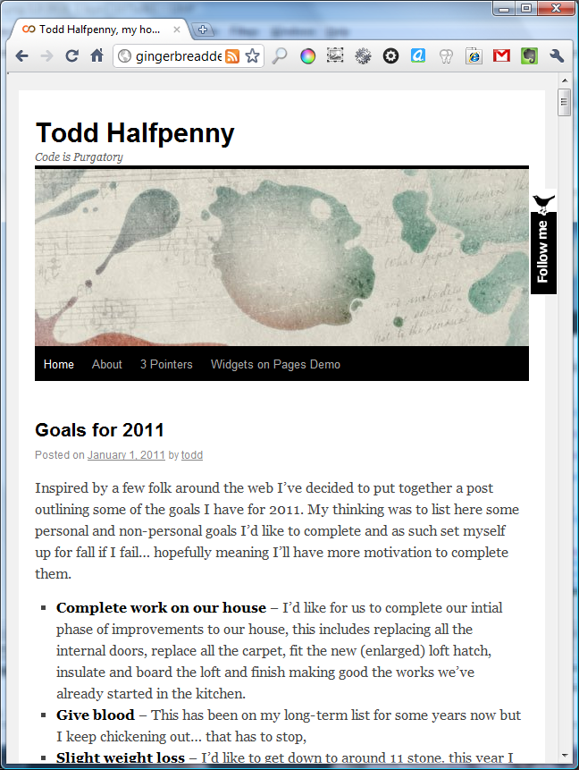
Normal browser
Narrow Browser
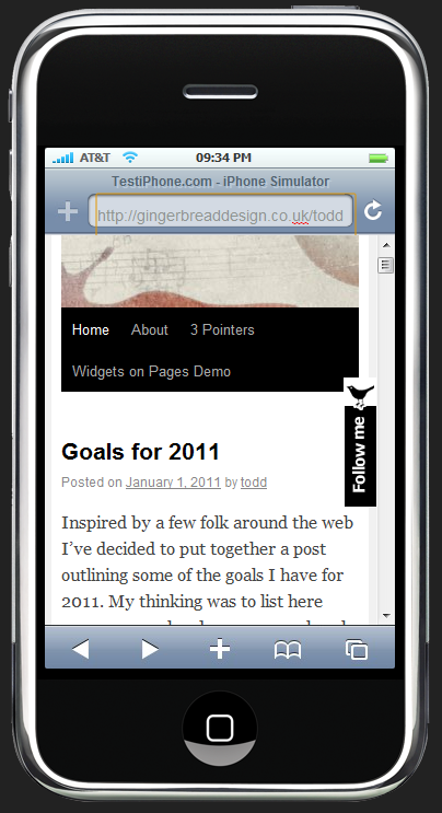
iPhone Browser
Instalacija
- Install the plugin from within the Dashboard or upload the directory
responsive-twentytenand all its contents to the/wp-content/plugins/directory - Activate the plugin through the ‘Plugins’ menu in WordPress
- Voila!
ČPP
- Why is this not a child theme
-
The WordPress.org theme repository doesn't support the submission of child themes yet. This is meant to be on it's way some time soon… but in the meantime a similar result can be gotten with this plugin.
Recenzije
Saradnici i programeri
“Responsive TwentyTen” is open source software. The following people have contributed to this plugin.
Doprinositelji
Prevedi “Responsive TwentyTen” na vaš jezik.
Zainteresirani za razvoj?
Pregledajte kôd, pogledajte SVN spremišteili se pretplatite na dnevnik razvoja od RSS.
Zapis promijena
0.0.3
- Fix for image scaling to keep ratio instead of squashing.
0.0.2
-
Images centered now when screen size gets small
-
Images with captions also now re-sized
0.0.1
First Release.