This patch release focuses on fixes and small improvements across the builder, components, forms, and multilingual setups.
Bricks
Changelog
History of all Bricks releases. Wanna have a say in what's next? Submit your idea.
This release focuses on bug fixes and improvements across the builder, components, filters, and interactions.
We’ve focused on refining the parts of the builder you use every day, while also introducing a few meaningful new capabilities.
This version lets you paste HTML & CSS directly into the builder where it is automatically converter into native Bricks elements, classes, and variables, helping you speed up your workflow even further.
You’ll find major query filter improvements, new motion features like real Bricks-native parallax plus perspective and scale3d transforms, and a more powerful Image Gallery experience with Load More and Infinite Scroll.
Alongside those bigger additions, we’ve continued to polish the builder experience with usability improvements such as Pin control groups, accessibility refinements, and a wide range of fixes for WooCommerce, WPML, search, classes, components, and other real-world workflows.
Lets dive a bit deeper into the highlights of this release …
HTML & CSS to Bricks
We’ve introduced a powerful new way to accelerate your workflow in Bricks. Copy HTML and CSS from any source and paste it into the builder. Bricks detects the code in your clipboard and converts it into native elements, classes, and variables.
Element Mapping
- Standard HTML elements are transformed into their native Bricks element counterparts.
- CSS styles (such as margin, padding, width, and max-width) are automatically mapped to the corresponding Bricks UI settings whenever possible.
- Any CSS that cannot be directly mapped to a specific Bricks setting is preserved as custom CSS within the element’s settings or a dedicated code element.
Support for External Resources
The conversion process handles external stylesheets (e.g., Google Fonts) and SVGs. For security, these elements require manual signing before they are rendered in the builder.
A new setting under Bricks > Settings > Builder > HTML & CSS to Bricks allows you to choose how the feature behaves.
This new feature significantly reduces the need to manually recreate designs element-by-element, making it easier to utilize layouts generated by AI tools or existing web libraries.
Documentation: https://academy.bricksbuilder.io/article/html-css-to-bricks/
Pin control groups
Pinned control groups streamline work by letting you pin frequently used control groups to a dedicated section at the bottom of the panel.
Pinned groups stay easily accessible while you work, can be unpinned with a single click, and their state is remembered between sessions.
The pinned section is also resizable, with a double-click option to quickly expand or collapse it as needed. For teams that prefer the previous behavior, this feature can be disabled in Builder settings via “Disable pinned control groups”.
Image Gallery – Load More & Infinite Scroll
The Image Gallery element now supports loading more images on demand through the new “Load more (Image gallery)” interaction without any additional AJAX calls.
You can define how many images appear initially, how many are revealed per load, and even set those values responsively.
For a more seamless browsing experience, you can also enable infinite scroll to automatically load more images as visitors approach the end of the gallery, with controls for trigger offset and delay.
This makes it easier to build galleries that start lightweight and expand smoothly as needed.
New Query Filter Controls
Filter – Select: Search, Multiple options, advanced styling
Filter select fields now support a more advanced select experience powered by Choices.js.
The Select filter is now much more flexible. You can enable search for faster option discovery, allow multiple selections for more refined filtering, and use advanced styling controls to better match the filter to your site’s design.
These improvements make Select filters more practical for larger datasets and give you more control over both usability and appearance.
Filter – Radio & Checkbox: More styling controls
Radio and Checkbox filters now offer much more styling flexibility. In addition to option spacing and typography controls, you can now style the custom input indicator itself, including its gap, size, border width, border style, border color, background color, focus ring color, and checked-state colors.
Checkbox filters also include a border radius control, and button mode styling has been expanded with dedicated controls for normal and active states.
Filter – Range: Controls for Decimal Places & Custom Stepper
The new Decimal places control gives you more precision when working with non-integer values. In input mode, you can also enable a Custom Stepper to make adjusting minimum and maximum values more intuitive.
To help it fit your design, the custom stepper also comes with styling controls for button spacing, input spacing, background, border, and typography.
Filter – Datepicker: Control for Datepicker Format
The Datepicker filter now includes a dedicated control for the datepicker format. This gives you more control over how dates appear in the picker, making it easier to match regional formats and create a more consistent user experience.
Color Manager: Reorder colors via drag and drop
Managing your palette is now more intuitive. You can now reorder colors in the Color Manager via drag and drop using the “move” handle when hovering over any color, making it easier to organize brand colors, favorites, and project-specific swatches exactly the way you want. This helps keep large color libraries tidy and puts your most-used colors right where you need them.

Real Parallax Effect

Bricks now includes a native, dependency-free real parallax effect based on scroll movement, instead of relying on the classic fixed-background approach.
You can apply parallax to the element itself or to its background image, with dedicated controls for horizontal and vertical movement speed, background speed, and the point where the effect begins.
This gives you more flexibility to create more natural motion effects and fine-tune how elements move as they enter the viewport.
These new controls are located under the “Transform” control group within the Style tab.
CSS transform: perspective() and scale3d()
Bricks now includes additional transform controls for perspective() and scale3d().
This makes it easier to build more advanced 3D transform effects directly in the builder, with support added both in the control UI and in generated styles.
Bricks 2.2 is now live and introduces a major design-system upgrade, alongside powerful new component features and significant workflow improvements.
After extensive beta and release-candidate testing, 2.2 is now ready for production use, and available as a one-click update for all active license holders from your WordPress dashboard.
This release unifies design tokens through the new Style Manager, expands component capabilities with Slots, Style Variants, and Property Bindings, and delivers a faster, more consistent building experience.
The video below highlights the core features introduced in Bricks 2.2. It is based on the early beta and reflects the main features that have since been refined and stabilized for this final release.
Style Manager
Bricks 2.2 introduces a unified Style Manager that centralizes the management of design tokens and styles inside the builder, enabling scalable and maintainable design systems.
This new interface organizes key styling elements into keyboard-accessible tabs for Theme styles, Classes, CSS variables, Color palettes, Typography scales, Spacing scales, CSS framework importer, and the Style Manager settings.

Color Manager
The new Color Manager in Bricks streamlines your color workflow, supports advanced features like dark mode, shades, transparency, and even generating various complementary colors. All using CSS variables (custom properties) for maximum scalability and maintainability.
- Create, edit, rename, delete, import, and export color palettes as JSON files.
- Manage individual colors with support for light/dark mode variants, variable naming, and direct color picker integration.
- Generate color shades (light, dark, transparent) and harmonies (analogous, monochromatic, complementary, etc.) for enhanced design flexibility.
- Create utility classes for colors (e.g., background, text, border, fill, stroke, outline), which are dynamically added to global classes.
- Convert legacy colors from pre-v2.2 formats to modern HSL-based variables, ensuring backward compatibility.
- Preview and export generated CSS for entire palettes or individual colors.

Color Control (revamped)
The new color control in Bricks 2.2 enhances color selection and management within the builder.

- Quick color value input in any format (raw, HEX, RGB, HSL, CSS variable names) with auto-expansion for complex values (type
varor--to search the variable manager). - Integrate a color picker for visual selection, supporting multiple formats (HSL, RGB, HEX).
- Color palettes access via a popup interface, supporting grid and list views for browsing root colors and their shades (light, dark, transparent).
- Variable picker to choose colors from global palettes, integrating with dynamic data tags.
- Manage palette preferences like active palette and view mode.
This control supports advanced features like shades and transparency, and ensures seamless integration with the builder’s state and palettes.
New element: Toggle – Mode (light/dark)
The “Toggle – Mode” element provides a button to let visitors switch between light and dark mode on your website without page reload. It features:
- Customizable icons for light and dark modes, with default sun/moon SVGs if not specified.
- Styling controls for icon colors and sizes in both modes, applied via CSS properties like color, fill, and font-size.
- Accessibility support with configurable aria-label for screen readers.
- Dynamic rendering based on the project’s default mode (light, dark, or auto), showing the active state accordingly.
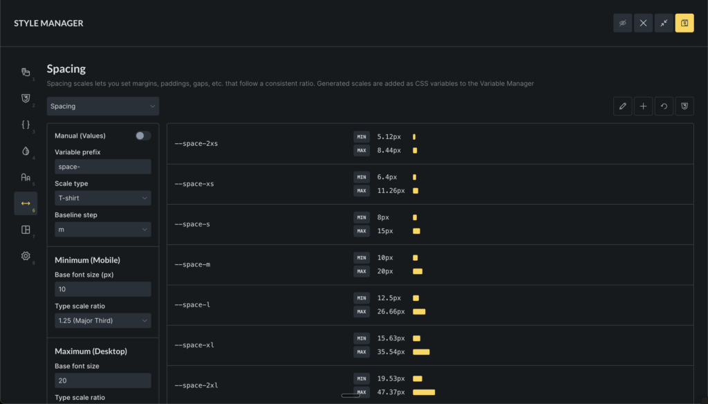
Typography & Spacing Scales
The new Typography & Spacing scale generator & editor enables users to create and manage scalable design systems for consistent typography and spacing across projects. It supports:
- Scale creation and editing with options for typography or spacing scopes, including naming, variable prefixes, and baseline steps.
- Scale types such as t-shirt (e.g., 2xs to 2xl), numeric (1 to n), or custom steps, with configurable scale ratios (e.g., Minor Second to Octave).
- Responsive scaling by setting minimum (mobile) and maximum (desktop) font sizes and ratios, generating fluid variables that adapt between breakpoints (via Style Manager “Settings”).
- Variable generation that creates CSS custom properties for each scale step, with previews showing min/max values and typography/spacing examples.
- Utility class configuration allowing users to define class names and CSS properties (e.g., font-size, margin) that map to scale variables, automatically generating global classes.
- CSS export for downloading generated variables and utility classes as files.
- Reset and rename functionality to restore defaults or update scale names.
CSS Framework Importer
The CSS Framework Importer is a tool that lets you extract the classes & variables of any CSS framework into the class & variable manager in Bricks.
Simply paste the content CSS file content into the code editor, and Bricks automatically shows you all extracted classes grouped into categories like layout, colors, and typography. Plus, it extracts all CSS variables.
You can add prefixes to avoid conflicts, choose categories, and import everything with customizable options for custom CSS and variable values.

Component Slots
The Component slots feature in Bricks introduces a powerful way to create flexible, reusable components. By adding Slot elements as placeholders within a component, users can define specific areas where custom content can be inserted when the component is instantiated.
This allows for dynamic content injection, enabling components to adapt to different contexts while maintaining a consistent structure.
When editing a component instance, users can drag and drop elements directly into these virtual slots, which are visually represented in the builder’s structure panel. Slot elements render the assigned content seamlessly, providing a slot-based architecture similar to modern web frameworks.
Component Style Variants
Create multiple visual variations of a component without duplicating its structure by defining custom variants (e.g., primary, secondary styles for buttons) alongside a base/default variant, streamlining design consistency and reusability.
Key capabilities include:
- Variant management for components: Add, rename, and delete custom variants.
- Editing variants during component creation, with a selector to switch between base and custom variants for targeted styling.
- Instance selection for component usages, allowing users to apply specific variants (e.g., different button styles) via a dropdown in the element panel.
- Integration with Gutenberg blocks, exposing variant options as select controls for seamless editing in the WordPress editor.
- Base variant labeling with customizable labels for the default state.
This feature enhances component flexibility, reducing redundancy and enabling efficient style variations across projects.
Nested Components: Property bindings
Nested component property bindings enable developers to connect properties of nested (child) components directly to their parent component’s properties, allowing automatic value inheritance and dynamic updates within component hierarchies.
Components as blocks: Set block icon, category, preview image
The “Components as blocks: Set block icon, category, preview image” feature allows Bricks components to be registered as Gutenberg blocks in the WordPress editor. It provides controls to customize each component’s block representation, including:
- Block category: Assign components to specific Gutenberg block categories (e.g., Bricks components or custom categories) for organized block insertion.
- Block icon: Set a custom icon for the component block in the block inserter, improving visual identification.
- Preview image: Upload or select an image to display as a preview thumbnail in the block editor, enhancing usability and design workflow.
Search Criteria
The new “Search Criteria” feature in Bricks 2.2 provides granular control over search behavior for both native WordPress searches (via Search element and Search Result template) and Filter – Search elements in query filters.
Users can specify which fields to search—such as post fields (title, content, excerpt), term fields (name, slug, description), user fields (username, email, etc.), and custom meta fields—replacing the default WordPress “s” parameter logic.
Optional weight scoring allows ranking results based on field importance, with higher weights prioritizing matches in those fields.
Configurations are set in the Search Result template for native searches or directly in Filter – Search element settings for filtered queries.
New Query Type: Array
The new “Array” query type enables querying custom PHP arrays or JSON data directly, allowing dynamic content loops from user-defined data sources without relying on WordPress database queries. It supports pagination, conditional filtering, and integration with dynamic data providers for flexible, custom data handling in elements like Posts or Carousel.
Color, Class & Variable preview on hover (opt-in via Bricks setting)
This productivity boost lets you preview colors, classes, and variables in real-time when you hover over them in the control panel while editing an element.
This opt-in feature can be enabled for all three properties individually under:Bricks > Settings > Builder > Control Panel
Builder: Instant navigation (experimental)
Instant navigation lets you switch between pages in the builder without full reloads or loading screens, making page-to-page editing noticeably faster.
This feature is opt-in and currently marked as experimental, as it may not be compatible with all setups. You can enable it under Bricks > Settings > Builder.
Bricks Templates
“Wireframes” and “Design sets” features have exited the experimental stage and are now stable for production use.
Design sets Liv, Sizzle, Reality, and Digital have been updated with improvements.
The “Community templates” option has been retired. We’ll eventually launch a proper “Template Marketplace” for third-party template contributions (free & paid).

More Highlights
- Spacing control: Remember linked state (enable via Bricks > Settings > Builder)
- Nav menu & nestable: Custom Mobile Menu Breakpoint
- Contextual spacing: Add setting to “Remove default padding”
- Add to cart element: Provide controls to style Group Products
- WooCommerce: New template for “My Account – Payment Methods”
- New filter hooks to use Pagination element for different query object type
- https://academy.bricksbuilder.io/article/filter-bricks-pagination-total_pages/
- https://academy.bricksbuilder.io/article/filter-bricks-pagination-current_page/
- https://academy.bricksbuilder.io/article/filter-bricks-pagination-custom_logic/
- New dynamic data tags: