LayoutManager
Dynamic layout dynamic evaluation
Section titled “Dynamic layout dynamic evaluation”
DynamicLayout
Set DynamicLayout to re-evaluate the layout in response to changes such as window resizing.
Specify the width without changing the height of a JButton, etc.
Section titled “Specify the width without changing the height of a JButton, etc.”
ButtonWidth
You can change the size of JButtons, JComboBoxes, JTextFields, etc., by specifying only the width while leaving the height at the default value.
Arrange them in a list using BoxLayout
Section titled “Arrange them in a list using BoxLayout”
ComponentList
Components of different heights are arranged in a list format so that they can be scrolled.
Create a JButton in the form of an ImageIcon.
Section titled “Create a JButton in the form of an ImageIcon.”
RoundImageButton
Create a JButton using an arbitrary shape and an image with a transparent color set for that shape.
Using SpringLayout
Section titled “Using SpringLayout”
SpringLayout
We use SpringLayout to specify the arrangement so that the size of each label and its distance from the panel are in a constant ratio.
Using GridBagLayout
Section titled “Using GridBagLayout”
GridBagLayout
We'll use GridBagLayout to fix the size of the left and right components, while making the center component horizontally expandable.
Arranged in a brick pattern using GridBagLayout
Section titled “Arranged in a brick pattern using GridBagLayout”
Using GroupLayout
Section titled “Using GroupLayout”
GroupLayout
This compares GroupLayout and GridBagLayout, which were newly introduced in JDK6.
Using OverlayLayout
Section titled “Using OverlayLayout”
Place a JButton in the margin of the JTabbedPane.
Section titled “Place a JButton in the margin of the JTabbedPane.”
TabbedPaneWithButton
Create some padding in the tab area of the JTabbedPane, and then place a JButton there using OverlayLayout.
Create a JTabbedPane-like component using CardLayout
Section titled “Create a JTabbedPane-like component using CardLayout”
CardLayoutTabbedPane
We will create a JTabbedPane-like component by combining CardLayout with JRadioButton and JTableHeader.
Change the JTabbedPane-style tab layout using the layout manager.
Section titled “Change the JTabbedPane-style tab layout using the layout manager.”
NewTabButton
This explains how to change the tab arrangement of a JTabbedPane-like component created with CardLayout and JRadioButton using a custom layout manager.
Use LayoutManager to perform panel unfolding animations.
Section titled “Use LayoutManager to perform panel unfolding animations.”
LayoutAnimation
We will create a LayoutManager that uses animation to unfold and collapse panels.
JMenuBar’s JMenu wrap
Section titled “JMenuBar’s JMenu wrap”
A JTextArea slides in as a caption on top of the image.
Section titled “A JTextArea slides in as a caption on top of the image.”
Extend LayoutManager to place components along curves
Section titled “Extend LayoutManager to place components along curves”
Place the JComponent in the bottom right corner of the border.
Section titled “Place the JComponent in the bottom right corner of the border.”
RightAlignComponentBorder
We'll use a JLayeredPane with SpringLayout configured to place a JComponent in the bottom right corner of the border.
Change the alignment of the progress text in JProgressBar.
Section titled “Change the alignment of the progress text in JProgressBar.”
ProgressStringAlignment
This will change the progress text of the JProgressBar to a JLabel and modify the alignment and other settings.
Switching display on a grid basis using GridLayout and JScrollPane
Section titled “Switching display on a grid basis using GridLayout and JScrollPane”
GridScrollAnimation
We add components to a JPanel using GridLayout, place them in a JScrollPane, and then display them in grid units and switch between them using scroll animations.
Create a composite button by layering multiple JButtons using OverlayLayout.
Section titled “Create a composite button by layering multiple JButtons using OverlayLayout.”
CompoundButton
We will create a composite button by placing four fan-shaped buttons and a circular button on a JPanel with an OverlayLayout applied.
Make the JScrollBar semi-transparent
Section titled “Make the JScrollBar semi-transparent”
TranslucentScrollBar
Create a semi-transparent JScrollBar and place it inside the JViewport.
Place a JButton inside a JMenuItem.
Section titled “Place a JButton inside a JMenuItem.”
ButtonsInMenuItem
Place a JButton inside the JMenuItem to perform cut, copy, and paste operations.
Create a breadcrumb trail by layering buttons in FlowLayout.
Section titled “Create a breadcrumb trail by layering buttons in FlowLayout.”
BreadcrumbList
By setting the horizontal spacing of the FlowLayout to a negative value and displaying JRadioButtons on top of each other, we create a breadcrumb-like component.
Change the layout of JPopupMenu and add a menu button to the top.
Section titled “Change the layout of JPopupMenu and add a menu button to the top.”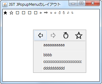
PopupMenuLayout
By changing the layout of JPopupMenu, the menu buttons will be displayed horizontally at the top.
Visualize passwords with JPasswordField
Section titled “Visualize passwords with JPasswordField”
ShowHidePasswordField
Create a button to toggle the display of the password entered in JPasswordField, and place it in the input field or similar location.
Testing centering of a JLabel in a BoxLayout
Section titled “Testing centering of a JLabel in a BoxLayout”
BoxLayoutAlignment
This test centers a JLabel with a minimum size setting on a JPanel that has a BoxLayout configured.
Replace the JInternalFrame in JDesktopPane with the tabs in JTabbedPane.
Section titled “Replace the JInternalFrame in JDesktopPane with the tabs in JTabbedPane.”
SwapInternalFramesWithTabs
When switching between JDesktopPane and JTabbedPane using CardLayout, all of the JInternalFrames and tabs within them are also swapped.
Displaying JToggleButtons overlaid in FlowLayout
Section titled “Displaying JToggleButtons overlaid in FlowLayout”
BackgroundButtonIcon
This example uses FlowLayout to overlap non-rectangular JToggleButtons with left-aligned button text by a specified width.
Switching CardLayout containers in tab areas created with JTableHeader
Section titled “Switching CardLayout containers in tab areas created with JTableHeader”
TableHeaderTabArea
Use a JTableHeader as a tab area and set up a mouse listener so that clicking a TableColumn switches the CardLayout container.
Switch the display state of a dialog box placed on top of a component with animation.
Section titled “Switch the display state of a dialog box placed on top of a component with animation.”
OverlayBorderLayout
We'll create a layout manager that animates the position of a search dialog box placed on top of a component, and toggle its visibility using keyboard input.
Resizing a component using LayoutManager
Section titled “Resizing a component using LayoutManager”
SizeLayoutManager
Use LayoutManager to change the size and position of components based on their state.
Change the filename and filter labels in JFileChooser to right-align.
Section titled “Change the filename and filter labels in JFileChooser to right-align.”
FileChooserFileAndFilterAlignment
This changes the alignment of the filename and filter labels displayed at the bottom of JFileChooser from left-aligned to right-aligned.
Creating a side menu with JTree and CardLayout
Section titled “Creating a side menu with JTree and CardLayout”
VerticalNavigationMenu
We'll modify the JTree's style to create a side menu-like component and implement panel switching in CardLayout based on node selection.
Share the maximum width of JLabels to align vertical positions across different panels.
Section titled “Share the maximum width of JLabels to align vertical positions across different panels.”
AlignedLabel
To align the vertical position of JLabels across different panels, we search for the widest JLabel and use this as the recommended size for all of them.
Speed up the deletion of large numbers of items from JList.
Section titled “Speed up the deletion of large numbers of items from JList.”
FastRemoveOfListItems
This tests a fast method for deleting a large number of items from a JList's ListModel.
When a JToolBar is dragged out, change its LayoutManager.
Section titled “When a JToolBar is dragged out, change its LayoutManager.”
FloatingToolBarLayout
When a JToolBar is dragged out, its LayoutManager is changed from the default BoxLayout to GridLayout.
Create a LayoutManager that arranges components in three columns, fixes the width in the center, and stretches them evenly on both sides.
Section titled “Create a LayoutManager that arranges components in three columns, fixes the width in the center, and stretches them evenly on both sides.”
ThreeColumnLayout
Create a LayoutManager that arranges the Components in three columns, with the center component always having a fixed width and the left and right components stretching horizontally equally.
Change the order of components added to JPanel.
Section titled “Change the order of components added to JPanel.”
ComponentZOrder
This changes the display order of components within a JPanel by modifying their Z-axis index.
Arrange JButtons in a keyboard-like layout using GridBagLayout
Section titled “Arrange JButtons in a keyboard-like layout using GridBagLayout”
Get the cell position within a GridLayout.
Section titled “Get the cell position within a GridLayout.”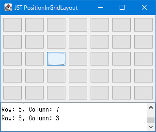
PositionInGridLayout
This code retrieves the cell position when a JButton placed within a JPanel with a GridLayout is clicked.
Display the JEditorPane minimap.
Section titled “Display the JEditorPane minimap.”
MiniMap
A minimap for JEditorPane is created using an ImageIcon, and this is then overlaid on a JScrollPane using a LayoutManager.
Wrap JPanel child components horizontally
Section titled “Wrap JPanel child components horizontally”
ScrollableWrapLayout
This code wraps child components placed within a JPanel horizontally and dynamically expands their horizontal spacing to ensure even distribution.
Display the cards before and after the CardLayout to the left and right.
Section titled “Display the cards before and after the CardLayout to the left and right.”
CarouselCardLayout
This code retrieves the cards before and after the current card from a Container with a CardLayout configured, and displays them semi-transparently to the left and right of the current card.
Place a JComboBox for switching cards using OverlayLayout on a panel that has a CardLayout set up.
Section titled “Place a JComboBox for switching cards using OverlayLayout on a panel that has a CardLayout set up.”
OverlayCardLayout
The JComboBox for switching between cards is placed inside the panel with the CardLayout setting, using an OverlayLayout.
Change the layout of the popup window opened from JMenu to two columns.
Section titled “Change the layout of the popup window opened from JMenu to two columns.”
TwoColumnsMenu
Change the layout of the popup window that opens when you click JMenu to GridLayout to display JMenuItem and other elements in two columns.
Draw paragraph borders using JSeparator.
Section titled “Draw paragraph borders using JSeparator.”
ColumnRules
This draws a JSeparator as a border between columns created using a GridLayout or similar.
Display a horizontal JScrollBar in the tab area of a JTabbedPane-like component created with CardLayout.
Section titled “Display a horizontal JScrollBar in the tab area of a JTabbedPane-like component created with CardLayout.”
TabAreaScrollBar
We'll use CardLayout to create a JTabbedPane-like component and display a horizontal JScrollBar in its tab area to make it scrollable.
Implement LayoutManager to always center child components.
Section titled “Implement LayoutManager to always center child components.”
CenterLayout
Implement a LayoutManager to set the child components to their desired size and ensure they are always centered.
Modify the tab area layout of JTabbedPane and add list view buttons, etc.
Section titled “Modify the tab area layout of JTabbedPane and add list view buttons, etc.”
TabAreaLayout
This modifies the tab area layout of JTabbedPane, adding margins and a tab list display button to the right edge.
Set the background color of the TitledBorder.
Section titled “Set the background color of the TitledBorder.”
TitledBorderBackground
I will test how to change the background color of the TitledBorder.
Position the JRadioButton so that its text starts at the same position as the vertically aligned JLabel.
Section titled “Position the JRadioButton so that its text starts at the same position as the vertically aligned JLabel.”
RadioButtonsLabelAlignment
The text of JRadioButtons and JCheckBoxes, excluding the selection icons, will be aligned with the text of vertically positioned JLabels.
Switch the display direction of JToolTip depending on the position of the JToolBar.
Section titled “Switch the display direction of JToolTip depending on the position of the JToolBar.”
ToolBarButtonToolTipOrientation
The JToolTip display position of JButtons placed inside the JToolBar is always switched to face inward, depending on the JToolBar's position, orientation (vertical/horizontal), and language-dependent orientation.
Change the layout of the JMenuBar to position the JMenu vertically.
Section titled “Change the layout of the JMenuBar to position the JMenu vertically.”
VerticalMenuBar
We will change the JMenuBar layout to a vertical BoxLayout to create a sidebar that arranges JMenus vertically.
Place multiple JLabels within a JButton using BorderLayout.
Section titled “Place multiple JLabels within a JButton using BorderLayout.”
NumericKeypad
Create a keycap by placing two JLabels inside a JButton using BorderLayout, and then arrange this keycap in a numeric keypad-like layout within a JPanel using GridBagLayout.
Place the JSlider and the text input field on top of each other.
Section titled “Place the JSlider and the text input field on top of each other.”
CompactSlider
This creates a numeric input component by layering a JSlider and a JFormattedTextField using an OverlayLayout.