JTableHeader TableColumn
Set the width of the TableColumn as a ratio.
Section titled “Set the width of the TableColumn as a ratio.”
HeaderRatio
This setting adjusts column widths to match the default JTable, ensuring each TableColumn in the header has a specified width.
Add row headers to JTable
Section titled “Add row headers to JTable”
TableRowHeader
Add the row header created with JList to the RowHeaderView of the JScrollPane that has a JTable configured.
Add a JCheckBox to the JTableHeader to switch the cell value.
Section titled “Add a JCheckBox to the JTableHeader to switch the cell value.”
TableHeaderCheckBox
Add a JCheckBox to the JTableHeader and switch all the values displayed in the JCheckBoxes in the same column.
Add JPopupMenu to JTableHeader and sort.
Section titled “Add JPopupMenu to JTableHeader and sort.”
Click the JTableHeader to select all cells in that column.
Section titled “Click the JTableHeader to select all cells in that column.”
ColumnSelection
When you click on a JTableHeader, all cells below that column are selected.
Change the alignment of the JTableHeader.
Section titled “Change the alignment of the JTableHeader.”
HorizontalAlignmentHeaderRenderer
The text alignment of the JTableHeader is changed using TableCellRenderer.
Change the font of the JTableHeader
Section titled “Change the font of the JTableHeader”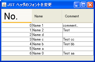
Change the Tooltips for each column in the JTableHeader.
Section titled “Change the Tooltips for each column in the JTableHeader.”
HeaderTooltips
This will make the JTableHeader's Tooltips display the contents of the column where the cursor is located.
Display JToolTip only if the JTable cell is clipped.
Section titled “Display JToolTip only if the JTable cell is clipped.”
Fix the column width of only some of the JTable columns.
Section titled “Fix the column width of only some of the JTable columns.”
Disable replacing JTable headers.
Section titled “Disable replacing JTable headers.”
Reordering
This toggles whether JTable column headers can be rearranged using drag-and-drop with the mouse.
Hide JTableHeader
Section titled “Hide JTableHeader”
RemoveTableHeader
This dynamically switches whether or not to display the JTableHeader in a JTable.
Switching CardLayout containers in tab areas created with JTableHeader
Section titled “Switching CardLayout containers in tab areas created with JTableHeader”
TableHeaderTabArea
Use a JTableHeader as a tab area and set up a mouse listener so that clicking a TableColumn switches the CardLayout container.
Make the JTable header transparent.
Section titled “Make the JTable header transparent.”
TransparentTableHeader
This hides the header background and vertical gridlines between cells in the JTable.
Add a JButton to the JTableHeader
Section titled “Add a JButton to the JTableHeader”
ButtonInTableHeader
Add a JButton to the JTableHeader that displays a popup menu when clicked.
Add an icon for an undefined state to a JCheckBox.
Section titled “Add an icon for an undefined state to a JCheckBox.”
TriStateCheckBox
In addition to the selected and unselected states of JCheckBox, an icon will be added to represent an undefined state.
Change the height of the JTableHeader
Section titled “Change the height of the JTableHeader”
TableHeaderHeight
We will test a method to change only the height of the JTableHeader while keeping the internal font size and other elements the same.
Use the Renderer for the column headers in the row headers of a JTable.
Section titled “Use the Renderer for the column headers in the row headers of a JTable.”
RowHeaderStyle
The renderer of the column header obtained from the JTableHeader is applied to the rendering of the JTable rows.
Rename the column names in a JTable
Section titled “Rename the column names in a JTable”
Display JTable sorting with multiple keys in the header.
Section titled “Display JTable sorting with multiple keys in the header.”
MultisortHeaderRenderer
The sort status of the JTable using multiple keys will be displayed separately in the header.
Receive events when a JTable model is changed.
Section titled “Receive events when a JTable model is changed.”
TableModelEvent
This process receives changes to the JTable model and updates the JCheckBox added to the JTableHeader.
Resize only the last TableColumn when resizing a JTable
Section titled “Resize only the last TableColumn when resizing a JTable”
ResizingColumnAndTable
When a JTable is resized, the last TableColumn is configured to absorb the change in width.
Highlighting of JTableHeader
Section titled “Highlighting of JTableHeader”
ColumnHeaderHighlight
If a JTable cell is selected, the focus is set to the column header where that cell is located.
Restricting the selectable columns in a JTable
Section titled “Restricting the selectable columns in a JTable”
ColumnSelectability
This restricts selection of any column in a JTable by preventing mouse clicks or other actions.
Save and restore TableColumnModel as an XML file.
Section titled “Save and restore TableColumnModel as an XML file.”
ColumnModelPersistence
The TableColumnModel is retrieved from the JTable header, and then saved and restored as an XML file using XMLEncoder and XMLDecoder.
Display icons in the column headers of a JTable.
Section titled “Display icons in the column headers of a JTable.”
TableColumnHeaderIcon
Configure the JTable to display an icon and title text in each column header.
Display a checkbox generated using HTML formatted input tags in a JLabel.
Section titled “Display a checkbox generated using HTML formatted input tags in a JLabel.”
InputTypeCheckBox
A checkbox generated using an HTML-formatted input tag is displayed in the TableCellRenderer of the header, which inherits from JLabel, and its state changes when clicked.
Grouping TableColumns using JTableHeader
Section titled “Grouping TableColumns using JTableHeader”
GroupableTableHeader
This enables grouping of TableColumns and column joining in JTableHeaders.
Set the JTable column to be editable but not selectable.
Section titled “Set the JTable column to be editable but not selectable.”
DisableColumnSelection
This setting allows editing of a specified column in a JTable, but prevents selection.
Reset the display order of the JTable’s TableColumns to their default state.
Section titled “Reset the display order of the JTable’s TableColumns to their default state.”
RestoreTableColumnOrder
If the display order of the JTable's TableColumns has been changed, this will restore them to their initial state, which is the model order.
Draw the header in the margin of the JTableHeader.
Section titled “Draw the header in the margin of the JTableHeader.”
TableHeaderFiller
This code draws a pseudo-header in the margins that appear when the column width of a JTableHeader is not automatically adjusted.
Configure the JTable to automatically expand column widths if its width is below a certain level, and to display a horizontal scroll bar if it is above that level.
Section titled “Configure the JTable to automatically expand column widths if its width is below a certain level, and to display a horizontal scroll bar if it is above that level.”
ScrollableTracksViewportWidth
This setting ensures that if the JTable width is below a certain level, the column width is maintained and a horizontal scrollbar is displayed; otherwise, the column width is automatically adjusted to expand to the JTable width.
Display the width of a TableColumn using a JToolTip while it is being resized.
Section titled “Display the width of a TableColumn using a JToolTip while it is being resized.”
ColumnWidthTooltip
When a TableColumn is being resized with the mouse, its width is displayed in a JToolTip placed in the JWindow.
Toggle the display/hide of each TableColumn added to the JTableHeader.
Section titled “Toggle the display/hide of each TableColumn added to the JTableHeader.”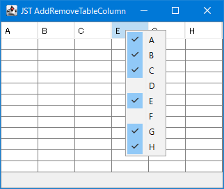
AddRemoveTableColumn
The JCheckBoxMenuItem is used to toggle whether a TableColumn in a JTableHeader is visible or hidden.
Make it impossible to reorder columns in a JTableHeader by right-clicking and dragging with the mouse.
Section titled “Make it impossible to reorder columns in a JTableHeader by right-clicking and dragging with the mouse.”
DisableRightButtonReordering
Use JLayer to prevent reordering of JTableHeader columns by dragging them with the right mouse button.
Round the corners of the JTableHeader.
Section titled “Round the corners of the JTableHeader.”
RoundedCornerTableHeader
We create a calendar by setting a TableCellRenderer to round the corners of the JTableHeader and changing the background color according to the month.
Change the resize cursor for JSplitPane and TableColumn.
Section titled “Change the resize cursor for JSplitPane and TableColumn.”
ResizeColumnCursor
This modifies the mouse cursor displayed when resizing components in JSplitPane's Divider or JTableHeader's TableColumn.
Display JTableHeaders as links and disable clicking on cell margins.
Section titled “Display JTableHeaders as links and disable clicking on cell margins.”
HyperlinkHeaderCellRenderer
This setting displays the column text of the JTableHeader as a link, and prevents column sorting from being performed when clicking on the blank space within the cell other than the link.
Display the sort icon in the JTableHeader, right-aligned to the header cell.
Section titled “Display the sort icon in the JTableHeader, right-aligned to the header cell.”
TableHeaderRightAlignSortArrow
This changes the display position of the sort icon in the JTableHeader from to the right of the title string to right-aligned to the header cell.
Display the sort icon for JTableHeader in the upper left corner of the header cell.
Section titled “Display the sort icon for JTableHeader in the upper left corner of the header cell.”
SortIconLayoutHeaderRenderer
This sets the sort icon for any column in a JTableHeader to be displayed in the upper left corner of the header cell using the table tag.
Rotate the column title strings in the JTableHeader for vertical display.
Section titled “Rotate the column title strings in the JTableHeader for vertical display.”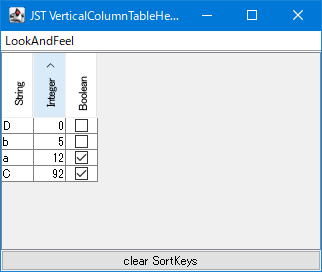
VerticalColumnTableHeader
This rotates the column title text of the JTableHeader 90 degrees counterclockwise and displays it vertically.
Divide the TableColumn of the JTableHeader with a diagonal line.
Section titled “Divide the TableColumn of the JTableHeader with a diagonal line.”
DiagonalHeaderCellBorder
The 0th TableColumn of the JTableHeader is divided by a diagonal line to display different headings for the row and column.
Add a footer to a JTable
Section titled “Add a footer to a JTable”
TableHeaderAndFooter
This displays both a header and a sortable and column-rearrangeable footer created with JTableHeader in the JTable.
Add a rollover separator between TableColumns in the JTableHeader.
Section titled “Add a rollover separator between TableColumns in the JTableHeader.”
TableHeaderRolloverSeparator
A JLayer is used to draw a separator between each TableColumn in a JTableHeader that only appears on rollover.
Display an insert cursor on the column boundary of a JTable.
Section titled “Display an insert cursor on the column boundary of a JTable.”
InsertTableColumn
When you move the mouse between each column of a JTable, a cursor is drawn on the boundary line where clicking will insert a new TableColumn.
Restricting the area where TableColumns can be reordered by dragging.
Section titled “Restricting the area where TableColumns can be reordered by dragging.”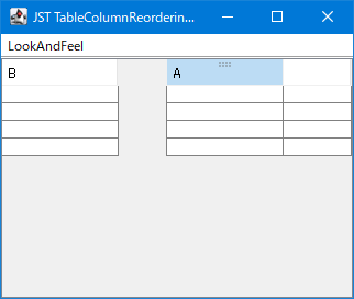
TableColumnReorderingIcon
This code limits the area where column reordering drags can be initiated in a JTableHeader to the upper half of the TableColumn, and performs mouse cursor changes and drag handle icon rendering on the JLayer.
Execute JTable sorting by keyboard input.
Section titled “Execute JTable sorting by keyboard input.”
TableSortActionMap
This setting allows sorting via keyboard input rather than mouse clicks when a JTable or JTableHeader has focus.
Highlight the sort status of the Table Column.
Section titled “Highlight the sort status of the Table Column.”
SortingHeaderColumnPainter
This setting allows you to change the background color of a TableColumn while it's being sorted in a JTable to highlight it.
Change the background color of the header column cells in the JTableHeader.
Section titled “Change the background color of the header column cells in the JTableHeader.”
HeaderColumnBackground
A HeaderRenderer is set for each column in the JTableHeader, and the header cell is rendered with a string and background color corresponding to the day of the week.
The JTableHeader and the height of each row are automatically adjusted evenly until the parent JScrollPane is filled.
Section titled “The JTableHeader and the height of each row are automatically adjusted evenly until the parent JScrollPane is filled.”
AutoResizeTableHeader
The JTableHeader and JTable row heights will automatically expand and contract evenly until they fill the height of the parent JScrollPane.