JTabbedPane
Drag and drop tabs into JTabbedPane.
Section titled “Drag and drop tabs into JTabbedPane.”
Drag and drop tabs between JTabbedPanes.
Section titled “Drag and drop tabs between JTabbedPanes.”
Use JLayer to draw the insertion position of tabs in a JTabbedPane.
Section titled “Use JLayer to draw the insertion position of tabs in a JTabbedPane.”
DnDLayerTabbedPane
Using JLayer, the destination of a tab moved via drag and drop is drawn on a JTabbedPane.
Clip the title of JTabbedPane
Section titled “Clip the title of JTabbedPane”
ClippedTabLabel
Using the feature introduced in JDK6 to add components to tabs, tabs with long titles will have their text clipped for display.
Display JTabbedPane thumbnails using JToolTip
Section titled “Display JTabbedPane thumbnails using JToolTip”
Place a JButton in the margin of the JTabbedPane.
Section titled “Place a JButton in the margin of the JTabbedPane.”
TabbedPaneWithButton
Create some padding in the tab area of the JTabbedPane, and then place a JButton there using OverlayLayout.
Place a JCheckBox in the margin of the JTabbedPane.
Section titled “Place a JCheckBox in the margin of the JTabbedPane.”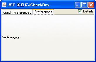
TabbedPaneWithCheckBox
A JCheckBox is placed in the margin of the JTabbedPane to open and close specific tabs.
Place a JTextField in a JTabbedPane tab and edit the title.
Section titled “Place a JTextField in a JTabbedPane tab and edit the title.”
TabTitleEditor
This command places a JTextField on the selected tab in JTabbedPane and allows you to edit its title.
Change the tab title in JTabbedPane
Section titled “Change the tab title in JTabbedPane”
Update the name of the Tab component.
Section titled “Update the name of the Tab component.”
RevalidateTabComponent
This code uses a JTabbedPane with a TabComponent to edit and update tab names.
Add a tab close button to JTabbedPane.
Section titled “Add a tab close button to JTabbedPane.”
TabWithCloseButton
Using a new feature in JDK6, we'll add a button to close the JTabbedPane tab itself.
Show JTabbedPane’s CloseButton only when it has focus.
Section titled “Show JTabbedPane’s CloseButton only when it has focus.”
HoverCloseButton
The JTabbedPane tab close button will only be displayed when the tab has focus.
Display JProgressBar in JTabbedPane tabs
Section titled “Display JProgressBar in JTabbedPane tabs”
TabWithProgressBar
A JProgressBar is placed on a tab in JTabbedPane to display the progress.
Added a tab close icon to JTabbedPane.
Section titled “Added a tab close icon to JTabbedPane.”
Display text in the margin of a JTabbedPane
Section titled “Display text in the margin of a JTabbedPane”
TabbedPaneWithText
This displays text in the right-hand margin of the JTabbedPane tab area.
Make JTabbedPane tabs monospaced and clip the titles.
Section titled “Make JTabbedPane tabs monospaced and clip the titles.”
ClippedTitleTab
The tabs in JTabbedPane are set to a fixed width, and long titles are clipped for display.
Fix the tab width of JTabbedPane.
Section titled “Fix the tab width of JTabbedPane.”
TabWidth
This fixes the tab width of the JTabbedPane to a consistent size as much as possible.
Disable the selection of tabs in JTabbedPane.
Section titled “Disable the selection of tabs in JTabbedPane.”
Change the selected text color in JTabbedPane.
Section titled “Change the selected text color in JTabbedPane.”
Add and remove tabs in JTabbedPane
Section titled “Add and remove tabs in JTabbedPane”
Sort JTabbedPane tabs
Section titled “Sort JTabbedPane tabs”
Highlight tab strings in JTabbedPane
Section titled “Highlight tab strings in JTabbedPane”
TabTitleHighlight
This changes the text color of a JTabbedPane tab when the mouse cursor is over it.
Add Mnemonic to the JTabbedPane tab.
Section titled “Add Mnemonic to the JTabbedPane tab.”
Create a JTabbedPane-like component using CardLayout
Section titled “Create a JTabbedPane-like component using CardLayout”
CardLayoutTabbedPane
We will create a JTabbedPane-like component by combining CardLayout with JRadioButton and JTableHeader.
Change the JTabbedPane-style tab layout using the layout manager.
Section titled “Change the JTabbedPane-style tab layout using the layout manager.”
NewTabButton
This explains how to change the tab arrangement of a JTabbedPane-like component created with CardLayout and JRadioButton using a custom layout manager.
Scrolling through TabArea in JTabbedPane
Section titled “Scrolling through TabArea in JTabbedPane”
JTabbedPane tab icon and title position
Section titled “JTabbedPane tab icon and title position”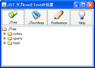
TabTitleTextPosition
This modifies the position of the title and icon within the JTabbedPane tab.
Change the height of the selected tab in JTabbedPane.
Section titled “Change the height of the selected tab in JTabbedPane.”
Changed the TabTitle of JTabbedPane to left alignment.
Section titled “Changed the TabTitle of JTabbedPane to left alignment.”
TabTitleAlignment
This changes the alignment of the TabTitle in JTabbedPane from the default center alignment to left alignment.
Testing the background color of the tab area in JTabbedPane.
Section titled “Testing the background color of the tab area in JTabbedPane.”
TabAreaBackground
I'm testing how to change the background color of a tab area using MetalLookAndFeel's JTabbedPane.
Pinning tabs in JTabbedPane
Section titled “Pinning tabs in JTabbedPane”
PinTabbedPane
Add JPopupMenu to JTabbedPane to change the title and position of the specified tab and fix the tab in place.
Display text modified in JTextPane as HTML source in JTextArea.
Section titled “Display text modified in JTextPane as HTML source in JTextArea.”
HTMLEditorKit
We are testing how to display, edit, and reflect text formatted in JTextPane using HTMLEditorKit as HTML source in JTextArea and JTextPane.
Add a JButton to each tab of the JTabbedPane, right-aligned.
Section titled “Add a JButton to each tab of the JTabbedPane, right-aligned.”
CloseableTabbedPane
Draw a JButton to close the tab on the JTabbedPane, right-aligned, using a JLayer.
Drop list items onto the tabs in the JTabbedPane.
Section titled “Drop list items onto the tabs in the JTabbedPane.”
DropOnTabTitle
By dropping an item onto a tab in the JTabbedPane, the selected ListItem will be moved to the JList within that tab.
Replace the JInternalFrame in JDesktopPane with the tabs in JTabbedPane.
Section titled “Replace the JInternalFrame in JDesktopPane with the tabs in JTabbedPane.”
SwapInternalFramesWithTabs
When switching between JDesktopPane and JTabbedPane using CardLayout, all of the JInternalFrames and tabs within them are also swapped.
How to change the tab selected after closing the current tab in JTabbedPane
Section titled “How to change the tab selected after closing the current tab in JTabbedPane”
FocusAfterClosingCurrentTab
JTabbedPane saves a history of tab selections and uses this to determine which tab to select after closing the currently selected tab.
Make JTabbedPane tabs semi-transparent
Section titled “Make JTabbedPane tabs semi-transparent”
TranslucentTabbedPane
This sets the tabs, tab area, and content area of the JTabbedPane to be semi-transparent.
Changing the style in NimbusLookAndFeel for JTabbedPane
Section titled “Changing the style in NimbusLookAndFeel for JTabbedPane”
NimbusTabbedPanePainter
This modifies the style of tabs, tab areas, etc., in JTabbedPane in NimbusLookAndFeel.
Add a JCheckBox to the JTabbedPane tab.
Section titled “Add a JCheckBox to the JTabbedPane tab.”
Execute InputVerifier validation when switching tabs in JTabbedPane.
Section titled “Execute InputVerifier validation when switching tabs in JTabbedPane.”
TabbedPaneInputVerifier
When switching tabs in JTabbedPane, the InputVerifier set for the tab component is executed, and if the input is invalid during validation, the tab switch is canceled.
Change the shape of the JTabbedPane tabs to trapezoids.
Section titled “Change the shape of the JTabbedPane tabs to trapezoids.”
IsoscelesTrapezoidTabs
This changes the shape of the JTabbedPane tabs to a trapezoid and sets the tabs on the left to appear at the top.
Disable tab switching via mouse or keyboard input in JTabbedPane
Section titled “Disable tab switching via mouse or keyboard input in JTabbedPane”
PreventChangingTabsByInput
This disables tab switching triggered by user actions such as mouse clicks and keyboard inputs in JTabbedPane.
Close the JTabbedPane tab by clicking the middle mouse button.
Section titled “Close the JTabbedPane tab by clicking the middle mouse button.”
MaskForButton
Configure JTabbedPane tabs to close when the middle mouse wheel button is clicked.
Change the tab rendering of JTabbedPane to a flat design style.
Section titled “Change the tab rendering of JTabbedPane to a flat design style.”
FlatTabbedPane
This disables borders, text shifts, and other elements drawn on JTabbedPane tabs, giving them a flat design look.
Changing the text shift amount of tabs in JTabbedPane
Section titled “Changing the text shift amount of tabs in JTabbedPane”
TabbedPaneLabelShift
This modifies settings such as the amount of tab text shift when a JTabbedPane is selected.
Setting margins for the tab area in JTabbedPane
Section titled “Setting margins for the tab area in JTabbedPane”
TabAreaContentMargins
This test retrieves and modifies the tab area margins of a JTabbedPane.
Expand only the width of the selected tab in JTabbedPane.
Section titled “Expand only the width of the selected tab in JTabbedPane.”
ExpandActiveTabWidth
This sets the width of the currently selected tab in JTabbedPane to expand, while the width of other tabs to shrink.
Change the tab string overflow effect in JTabbedPane to a fade-out effect.
Section titled “Change the tab string overflow effect in JTabbedPane to a fade-out effect.”
TextOverflowFadeTabbedPane
If the tab string in JTabbedPane overflows, instead of truncating it with the ... symbol, the characters near the edges will be made transparent with a fade-out effect.
Configure the JTabbedPane scroll layout policy so that not all tabs are hidden.
Section titled “Configure the JTabbedPane scroll layout policy so that not all tabs are hidden.”
VisibilityOfTab
I'm testing ways to avoid the situation where all tabs become hidden when using a JTabbedPane with a scrollable tab layout policy.
Disable rotation of JTabbedPane tabs and runs.
Section titled “Disable rotation of JTabbedPane tabs and runs.”
RotateTabRuns
This disables run rotation via tab selection, even when wrapping tabs across multiple runs in JTabbedPane.
If JTabbedPane uses a tab wrap layout, the remaining tabs are removed to eliminate the space.
Section titled “If JTabbedPane uses a tab wrap layout, the remaining tabs are removed to eliminate the space.”
PadTabRun
This modifies how JTabbedPane handles and clears excess tabs in a tab-wrapped layout.
Rotate the tab title text in JTabbedPane and display it vertically.
Section titled “Rotate the tab title text in JTabbedPane and display it vertically.”
RotatedVerticalTextTabs
This sets the tab title text of the JTabbedPane to be rotated vertically according to the left/right arrangement of the tabs.
Change tab selection in JTabbedPane using the mouse wheel.
Section titled “Change tab selection in JTabbedPane using the mouse wheel.”
MouseWheelTabCycling
You can change the tab selection in JTabbedPane by rotating the mouse wheel up and down.
Resizing the tab area of JTabbedPane by dragging with the mouse.
Section titled “Resizing the tab area of JTabbedPane by dragging with the mouse.”
ResizeTabAreaByDragging
Select the tab area of the JTabbedPane with your mouse and drag it to resize it.
Move focus to the tab component that has become visible through tab selection in JTabbedPane.
Section titled “Move focus to the tab component that has become visible through tab selection in JTabbedPane.”
RequestFocusForVisibleComponent
This setting ensures that when a JTabbedPane tab is selected with a left mouse press, the focus moves to the visible tab component.
Display titles only for the selected tab in JTabbedPane.
Section titled “Display titles only for the selected tab in JTabbedPane.”
SelectedTabTitleText
This code uses a JLabel with an icon set in the JTabbedPane tab component, and displays the title of the selected tab when it is selected.
Display a horizontal JScrollBar in the tab area of a JTabbedPane-like component created with CardLayout.
Section titled “Display a horizontal JScrollBar in the tab area of a JTabbedPane-like component created with CardLayout.”
TabAreaScrollBar
We'll use CardLayout to create a JTabbedPane-like component and display a horizontal JScrollBar in its tab area to make it scrollable.
The tab components of JTabbedPane are placed in JSPlitPane so that they can be displayed in different sizes.
Section titled “The tab components of JTabbedPane are placed in JSPlitPane so that they can be displayed in different sizes.”
TabComponentsOfDifferentSizes
Place the JTabbedPane inside the JSplitPane and adjust the position of the Divider and other elements so that each tab component can be displayed at a different size.
Change the focus border of a JTabbedPane tab to an underline when a tab is selected.
Section titled “Change the focus border of a JTabbedPane tab to an underline when a tab is selected.”
UnderlineTabFocusIndicator
This changes the focus border of a JTabbedPane tab when it is selected from a dotted border to an underline.
Extends the rendering of tab borders in the second row and above of a JTabbedPane to the tab content area.
Section titled “Extends the rendering of tab borders in the second row and above of a JTabbedPane to the tab content area.”
ExtendTabsToBase
This setting changes whether to extend the rendering of tab borders in the second row and above to the tab content area when NimbusLookAndFeel is applied to a JTabbedPane.
Modify the tab area layout of JTabbedPane and add list view buttons, etc.
Section titled “Modify the tab area layout of JTabbedPane and add list view buttons, etc.”
TabAreaLayout
This modifies the tab area layout of JTabbedPane, adding margins and a tab list display button to the right edge.
A new JFrame is created when a JTabbedPane tab is dropped outside the frame.
Section titled “A new JFrame is created when a JTabbedPane tab is dropped outside the frame.”
DragDropEndNewFrame
When a tab from a JTabbedPane is dragged and dropped outside the frame, a new JFrame and a JTabbedPane containing that tab are created.
Display the focus border of the previously selected tab in JTabbedPane as a history.
Section titled “Display the focus border of the previously selected tab in JTabbedPane as a history.”
PreviouslySelectedTabColor
This changes the focus border color of the currently selected tab and the tab that was selected immediately before it in JTabbedPane.
Changing the horizontal alignment of tab text and icons in a JTabbedPane using NimbusLookAndFeel
Section titled “Changing the horizontal alignment of tab text and icons in a JTabbedPane using NimbusLookAndFeel”
NimbusTabbedPaneIcon
This modifies the horizontal alignment and spacing of tab text and icons in a JTabbedPane with NimbusLookAndFeel enabled.
Set the JTabbedPane arrow buttons to scroll to the first or last tab.
Section titled “Set the JTabbedPane arrow buttons to scroll to the first or last tab.”
ScrollToFirstOrLastTabAction
This adds an action to the JTabbedPane scroll tab layout that scrolls to the first or last tab when the arrow button is clicked while holding down the Ctrl key.
Perform continuous scrolling with the tab scroll button in JTabbedPane.
Section titled “Perform continuous scrolling with the tab scroll button in JTabbedPane.”
ScrollTabsActionRepeater
This setting configures the JTabbedPane scroll tab layout so that scrolling persists while the arrow buttons are pressed.
Modify the scroll arrow buttons in JTabbedPane using NimbusLookAndFeel
Section titled “Modify the scroll arrow buttons in JTabbedPane using NimbusLookAndFeel”
TabbedPaneUseBasicArrows
This switches whether the scroll arrow buttons of a JTabbedPane with NimbusLookAndFeel applied use BasicArrowButton or SynthArrowButton.
Modify the behavior of tab selection transitions using cursor keys in JTabbedPane.
Section titled “Modify the behavior of tab selection transitions using cursor keys in JTabbedPane.”
NavigateSelectedTab
This modifies the tab selection transitions using the cursor keys in JTabbedPane, preventing looping or allowing movement even when the tab does not have focus.
Override the container border of the JTabbedPane with the selected tab.
Section titled “Override the container border of the JTabbedPane with the selected tab.”
TabbedPaneTabsOverlapBorder
This setting allows you to toggle whether the JTabbedPane container border is overridden by the selected tab.
Separate the selection tab and focus tab in JTabbedPane.
Section titled “Separate the selection tab and focus tab in JTabbedPane.”
TabbedPaneSelectionFollowsFocus
This setting allows you to switch between matching the selected tab and the focused tab when switching tabs using keyboard input in JTabbedPane, or treating them separately.
Change the tooltips in JTabbedPane to speech bubbles that correspond to the tab position.
Section titled “Change the tooltips in JTabbedPane to speech bubbles that correspond to the tab position.”
SpeechBalloonToolTipTail
This modifies the shape of the tooltip for tabs in JTabbedPane to a speech bubble, and changes the direction of its tail according to the tab position.
Configure JPopupMenu to open in TabArea on JTabbedPane.
Section titled “Configure JPopupMenu to open in TabArea on JTabbedPane.”
TabAreaPopupMenu
This configures JTabbedPane to open different JPopupMenus on tabs and within TabAreas.
Get the location of the run where the JTabbedPane tabs are placed.
Section titled “Get the location of the run where the JTabbedPane tabs are placed.”
RunForTab
This function retrieves which tab run a JTabbedPane tab is located in and displays it using JToolTip.
You can create a new JFrame and discard an empty JFrame by dragging out the tabs in JTabbedPane.
Section titled “You can create a new JFrame and discard an empty JFrame by dragging out the tabs in JTabbedPane.”
DockAndUndockTabs
If you drag a tab from a JTabbedPane outside of a JFrame, a new JFrame containing that tab will be created. If the original JTabbedPane becomes empty, the entire parent JFrame will be discarded.
Double-click the tab area in JTabbedPane to create a new tab.
Section titled “Double-click the tab area in JTabbedPane to create a new tab.”
DoubleClickInTabAreaToCreateNewTab
Create a new tab by double-clicking the tab area in JTabbedPane with the left mouse button.
Center each tab in the JTabbedPane.
Section titled “Center each tab in the JTabbedPane.”
CenterAlignTabs
If the sum of the widths of all tabs in a JTabbedPane is less than or equal to the tab area, the tabs will be centered instead of left-aligned.
Change the JTabbedPane tab switching behavior to occur after a mouse click.
Section titled “Change the JTabbedPane tab switching behavior to occur after a mouse click.”
ChangeSelectedTabAfterClicking
This changes the JTabbedPane tab selection switching behavior from immediately after mouse press to after the click is completed.
Highlight the location where tabs are added in JTabbedPane.
Section titled “Highlight the location where tabs are added in JTabbedPane.”
TabOrScrollButtonHighlightAnimation
This setting enables the addition of a tab to JTabbedPane by highlighting the tab area, or the scroll button if the area is hidden, with an animation to indicate the tab's position.
Synchronize tab selections in JTabbedPane.
Section titled “Synchronize tab selections in JTabbedPane.”
SynchronizeTabSelection
By sharing the SingleSelectionModel of JTabbedPane, we configure the tab selection to be synchronized.
Create a weekly schedule with JTabbedPane
Section titled “Create a weekly schedule with JTabbedPane”
WeeklyScheduleCalendar
Display the dates and days of the week for one week in the tabs of JTabbedPane, and create a selectable weekly schedule calendar.