JSlider
Change the style of JSlider
Section titled “Change the style of JSlider”
GradientTrackSlider
Make the JSlider's tracks and knobs transparent, and draw the values in a semi-transparent color.
Change the UI and colors of JSlider
Section titled “Change the UI and colors of JSlider”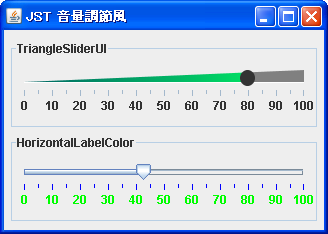
VolumeSlider
We'll create a volume control-style slider by changing the tracks, knobs, and colors of JSlider.
Slide the knob to the position you clicked in JSlider.
Section titled “Slide the knob to the position you clicked in JSlider.”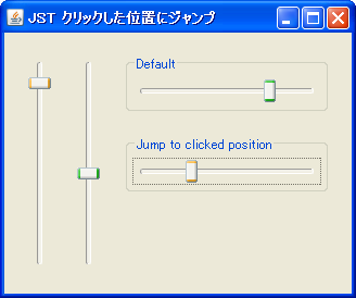
JumpToClickedPositionSlider
When you click on JSlider with the mouse, the knob slides to that position and becomes draggable.
Apply JSlider’s SnapToTicks to mouse drags as well.
Section titled “Apply JSlider’s SnapToTicks to mouse drags as well.”
SnapToTicksDrag
This configures JSlider's SnapToTicks to apply even while dragging with the mouse.
Add icons and text to JSlider scales.
Section titled “Add icons and text to JSlider scales.”
SliderLabelTable
By displaying JComponents on the JSlider's scale, you can add icons, change the color of text, and more.
Using JScrollBar as JSlider
Section titled “Using JScrollBar as JSlider”
Using JSlider for JTable’s CellEditor and CellRenderer
Section titled “Using JSlider for JTable’s CellEditor and CellRenderer”
Change the JSlider scale to icons.
Section titled “Change the JSlider scale to icons.”
TriangleTickSlider
This code retrieves the JLabel used for the JSlider's scales and makes modifications such as adding icons and changing the text color.
Display the value in a tooltip while dragging the JSlider knob.
Section titled “Display the value in a tooltip while dragging the JSlider knob.”
SliderToolTips
The current value of the JSlider knob is displayed in a tooltip while you are dragging it.
Reverse the order of JSlider elements.
Section titled “Reverse the order of JSlider elements.”
Change the shape of the JSlider’s handle.
Section titled “Change the shape of the JSlider’s handle.”
ThumbArrowShape
The shape of the JSlider's slider knob will be changed to match the shape when the scale is displayed.
Displaying JProgressBar progress in a circular format.
Section titled “Displaying JProgressBar progress in a circular format.”
Change the text color of the label corresponding to the current value of the JSlider.
Section titled “Change the text color of the label corresponding to the current value of the JSlider.”
SliderCurrentLabelColor
When a value label set for the large tick marks of a JSlider is closest to the knob representing the current value, its color will be changed.
Update the numeric text labels in JSlider
Section titled “Update the numeric text labels in JSlider”
UpdateSliderLabel
When the value of a JSlider's numeric text label is changed, a method is executed to update its position and size so that it is rendered correctly.
Restrict component input by removing MouseListener and similar components.
Section titled “Restrict component input by removing MouseListener and similar components.”
UninstallListeners
By removing MouseListener, MouseMotionListener, and other similar components, input operations to the JSlider are restricted.
Disable the JSlider knob with the right mouse button.
Section titled “Disable the JSlider knob with the right mouse button.”
OnlyLeftMouseButtonDrag
This setting allows you to toggle whether the JSlider knob can be controlled with the right mouse button.
Limit the range in JSlider where values can be changed by mouse dragging.
Section titled “Limit the range in JSlider where values can be changed by mouse dragging.”
DragLimitedSlider
In addition to the minimum and maximum values of JSlider, this restricts the range within which the value can be changed by mouse dragging.
Use a JSlider with NimbusLookAndFeel applied to fill a range.
Section titled “Use a JSlider with NimbusLookAndFeel applied to fill a range.”
NimbusFilledSlider
The background of the area showing the current value of the track is filled with NimbusLookAndFeel applied to the JSlider.
Drag the component added to the JSplitPane to change the Divider’s position.
Section titled “Drag the component added to the JSplitPane to change the Divider’s position.”
DividerLocationDragLayer
This sets up a JLayer that allows you to change the position of the Divider by dragging the margins of the child components added to the JSplitPane.
Configure JSlider so that clicking on a track does not change its value.
Section titled “Configure JSlider so that clicking on a track does not change its value.”
DisableScrollDueToClickInTrack
This modifies the JSlider's value to be changed only by dragging the knob and using the cursor keys, and disables value changes via mouse clicks on the track.
Hide the FocusBorder of the JSlider.
Section titled “Hide the FocusBorder of the JSlider.”
SliderFocusBorder
In a JSlider that uses WindowsLookAndFeel, set the dotted FocusBorder to be hidden.
Create an on/off switch button using JSlider.
Section titled “Create an on/off switch button using JSlider.”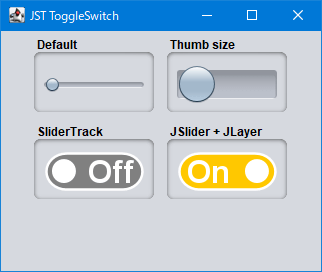
ToggleSwitch
We will use JSlider to create a switch button that can be toggled on and off with a mouse click or a drag of the slider.
Use the checkbox to toggle the display of the JSlider added to JPopupMenu.
Section titled “Use the checkbox to toggle the display of the JSlider added to JPopupMenu.”
SliderMenuItem
You can use JCheckBox or JCheckBoxMenuItem, which are also added to JPopupMenu, to toggle the display of JSlider and other elements added to JPopupMenu.
The current value is always displayed at the top of the JSlider.
Section titled “The current value is always displayed at the top of the JSlider.”
SliderPaintValue
This setting will permanently display the current value at the top of the JSlider's knob.
Place a vertical JSlider in JPopupMenu and display it above the JToggleButton.
Section titled “Place a vertical JSlider in JPopupMenu and display it above the JToggleButton.”
PopupVolumeSlider
A vertical JSlider is placed in the JPopupMenu, and when the JToolTip set in the JToggleButton is displayed, it is overlaid on top of it.
Draw scales inside the JSlider track.
Section titled “Draw scales inside the JSlider track.”
MajorTickOnTrack
The JSlider displays the main tick marks inside the track and the current value inside the knob.
Double-click the JSlider knob to reset its value to its initial value.
Section titled “Double-click the JSlider knob to reset its value to its initial value.”
ZoomLevelsSlider
Double-clicking a JSlider knob resets its value to its initial value, or makes the knob snap to a value near its initial value.
Change the track background color up to the current value using a JSlider with MetalLookAndFeel applied.
Section titled “Change the track background color up to the current value using a JSlider with MetalLookAndFeel applied.”
SliderAltTrackColor
This modifies the track background color of the area showing the current value in a JSlider that has MetalLookAndFeel applied.
Create a JButton to increase or decrease the value of a JSlider.
Section titled “Create a JButton to increase or decrease the value of a JSlider.”
SliderWithArrowButtons
Create JButtons to decrease and increase the value of the JSlider, and place them to the left and right of it.
Change the position of the JSlider’s scale to the top of the track.
Section titled “Change the position of the JSlider’s scale to the top of the track.”
SliderTicksPosition
This modifies the horizontal JSlider so that the scale is displayed at the top of the track, and the knob's arrow is drawn pointing upwards.
Change the color of the JSlider’s scale.
Section titled “Change the color of the JSlider’s scale.”
SliderTickColor
We will test the color change of the JSlider's scales for each LookAndFeel.
Change the alignment of the Labels that display the minimum and maximum values of the JSlider.
Section titled “Change the alignment of the Labels that display the minimum and maximum values of the JSlider.”
SliderLabelAlignment
This sets the JSlider to display the minimum value label left-aligned and the maximum value label right-aligned.
Place the JSlider and the text input field on top of each other.
Section titled “Place the JSlider and the text input field on top of each other.”
CompactSlider
This creates a numeric input component by layering a JSlider and a JFormattedTextField using an OverlayLayout.
Place JSpinner as a MenuItem in JPopupMenu.
Section titled “Place JSpinner as a MenuItem in JPopupMenu.”
SpinnerMenuItem
Use components such as JSpinner or JSlider that do not implement MenuElement as MenuItems for JPopupMenu.
Create a range selection slider with JSliders positioned vertically.
Section titled “Create a range selection slider with JSliders positioned vertically.”
RangeSlider
We create a range selection slider by placing JSliders above and below the selection range and the JLabel for displaying the tick marks, using them as adjustment knobs.