JLayer
Change the hue of JProgressBar using JLayer
Section titled “Change the hue of JProgressBar using JLayer”
Prohibit input to components specified in JLayer.
Section titled “Prohibit input to components specified in JLayer.”
DisableInputLayer
This code uses JLayer, introduced in JDK7, to block input to a specified component.
Use JLayer to draw the insertion position of tabs in a JTabbedPane.
Section titled “Use JLayer to draw the insertion position of tabs in a JTabbedPane.”
DnDLayerTabbedPane
Using JLayer, the destination of a tab moved via drag and drop is drawn on a JTabbedPane.
Change the text color of a disabled component using JLayer
Section titled “Change the text color of a disabled component using JLayer”
JLayerDisabledText
Use JLayer to change the text color when a component such as a JButton is disabled.
Drawing borders on adjacent components using JLayer
Section titled “Drawing borders on adjacent components using JLayer”
OverlapBorderPaintLayer
JLayer is used to draw edges and shadows on adjacent components.
Restricting input to child components with JLayer
Section titled “Restricting input to child components with JLayer”
Displaying the string in JProgressBar using JLayer
Section titled “Displaying the string in JProgressBar using JLayer”
ProgressStringLayer
This code displays the text from a vertical JProgressBar in a horizontal layout using JLayer.
Drag-scroll a JPanel containing multiple components within a JScrollPane using JLayer.
Section titled “Drag-scroll a JPanel containing multiple components within a JScrollPane using JLayer.”
DragScrollLayer
Drag events from a JPanel containing multiple nested components are received by a JLayer that wraps a JScrollPane, making it scrollable.
Display text in the margin of JTabbedPane
Section titled “Display text in the margin of JTabbedPane”
TabbedPaneWithText
This displays text in the right-hand margin of the JTabbedPane tab area.
Place a JButton inside a JMenuItem.
Section titled “Place a JButton inside a JMenuItem.”
ButtonsInMenuItem
Place a JButton inside the JMenuItem to perform cut, copy, and paste operations.
Perform a highlighting search in JTextArea.
Section titled “Perform a highlighting search in JTextArea.”
HighlightSearch
This function searches for strings within a JTextArea based on specified criteria and highlights all matching strings.
Add a JButton to each tab of the JTabbedPane, right-aligned.
Section titled “Add a JButton to each tab of the JTabbedPane, right-aligned.”
CloseableTabbedPane
Draw a JButton to close the tab on the JTabbedPane, right-aligned, using a JLayer.
Forward the MouseWheelEvent to the parent JScrollPane.
Section titled “Forward the MouseWheelEvent to the parent JScrollPane.”
WheelOverNestedScrollPane
Use JLayer to forward MouseWheelEvents to nested JScrollPanes and configure scrolling to continue.
Use JLayer to sort components
Section titled “Use JLayer to sort components”
ReorderingLayer
When rearranging components placed within a JPanel, the component being dragged is rendered using a JLayer.
Set a JLayer in the ComboBoxEditor to display the validity of the input.
Section titled “Set a JLayer in the ComboBoxEditor to display the validity of the input.”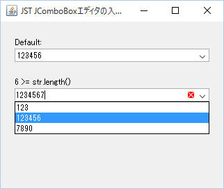
ComboBoxEditorVerifier
A JLayer is set in the ComboBoxEditor of the JComboBox, and an icon is displayed if the input is invalid.
Drag the component added to the JSplitPane to change the Divider’s position.
Section titled “Drag the component added to the JSplitPane to change the Divider’s position.”
DividerLocationDragLayer
This sets up a JLayer that allows you to change the position of the Divider by dragging the margins of the child components added to the JSplitPane.
Change the size of the JTree root node icon and set it so that a connecting line is drawn in the center.
Section titled “Change the size of the JTree root node icon and set it so that a connecting line is drawn in the center.”
MiddleXOfRootNodeIcon
This modifies only the JTree root node icon, enlarging its size and setting it to draw a vertical connecting line in the center of the icon.
Set ToolTipText for each item in the JComboBox and for each ArrowButton.
Section titled “Set ToolTipText for each item in the JComboBox and for each ArrowButton.”
ToolTipInComboBox
Set a different ToolTipText for each list item in the JComboBox and for each ArrowButton.
The JScrollBar is displayed only when the mouse cursor is over the JScrollPane.
Section titled “The JScrollBar is displayed only when the mouse cursor is over the JScrollPane.”
ScrollBarOnHover
This setting ensures that the vertical JScrollBar is only displayed when the mouse cursor is over the JScrollPane.
Disable tab switching via mouse or keyboard input in JTabbedPane
Section titled “Disable tab switching via mouse or keyboard input in JTabbedPane”
PreventChangingTabsByInput
This disables tab switching triggered by user actions such as mouse clicks and keyboard inputs in JTabbedPane.
Change the JSplitPane’s Divider to a circular, semi-transparent knob and place it in the center.
Section titled “Change the JSplitPane’s Divider to a circular, semi-transparent knob and place it in the center.”
TranslucentThumbDivider
We'll hide the original Divider of the JSplitPane and instead use a JLayer to create a semi-transparent circular handle and position it in the center.
Draw the header in the margin of the JTableHeader.
Section titled “Draw the header in the margin of the JTableHeader.”
TableHeaderFiller
This code draws a pseudo-header in the margins that appear when the column width of a JTableHeader is not automatically adjusted.
Set a JLayer in a ComboBoxEditor to display placeholder strings.
Section titled “Set a JLayer in a ComboBoxEditor to display placeholder strings.”
ComboEditorPlaceholder
This code sets a JLayer to the ComboBoxEditor of a JComboBox and displays a placeholder string if its text is empty.
If the content within the JScrollPane is larger than the width of the JViewport, a shadow will be drawn on its right edge.
Section titled “If the content within the JScrollPane is larger than the width of the JViewport, a shadow will be drawn on its right edge.”
ViewportBorderBounds
If the content width of a component added to a JScrollPane is greater than the width of the JViewport, and a horizontal scrollbar is displayed, a shadow will be shown at its right edge.
Make it impossible to reorder columns in a JTableHeader by right-clicking and dragging with the mouse.
Section titled “Make it impossible to reorder columns in a JTableHeader by right-clicking and dragging with the mouse.”
DisableRightButtonReordering
Use JLayer to prevent reordering of JTableHeader columns by dragging them with the right mouse button.
Divide a JTable cell diagonally.
Section titled “Divide a JTable cell diagonally.”
DiagonallySplitCellCalendar
We'll use JLayer to draw straight lines on the JTable's cell renderer to display diagonally divided cells.
Displaying a badge on an icon within a JLabel using JLayer
Section titled “Displaying a badge on an icon within a JLabel using JLayer”
NotificationBadge
A badge is displayed on top of the icon set in the JLabel using a JLayer.
Make components added to the JFrame’s title bar draggable.
Section titled “Make components added to the JFrame’s title bar draggable.”
DraggableTitleBarComponents
This creates a custom title bar for the JFrame and makes components added inside it draggable with the mouse.
Change the row height of a JTable by dragging with the mouse.
Section titled “Change the row height of a JTable by dragging with the mouse.”
ResizeRowHeightByDragging
Use JLayer to allow you to change the row height of a JTable by dragging it with the mouse.
Resizing the tab area of JTabbedPane by dragging with the mouse.
Section titled “Resizing the tab area of JTabbedPane by dragging with the mouse.”
ResizeTabAreaByDragging
Select the tab area of the JTabbedPane with your mouse and drag it to resize it.
Place a scroll lock button below the JScrollBar.
Section titled “Place a scroll lock button below the JScrollBar.”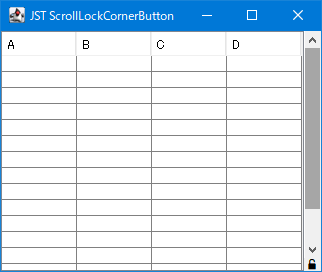
ScrollLockCornerButton
Place the vertical JScrollBars obtained from the JScrollPane and the JToggleButtons to lock their scrolling into a separate panel.
Round the corners of the JTableHeader.
Section titled “Round the corners of the JTableHeader.”
RoundedCornerTableHeader
We create a calendar by setting a TableCellRenderer to round the corners of the JTableHeader and changing its background color according to the month.
Add a JButton to the JScrollPane that performs a scrollback to the top area.
Section titled “Add a JButton to the JScrollPane that performs a scrollback to the top area.”
ScrollBackToTopButton
A JLayer is set on the JScrollPane to draw a JButton, and when a click event is captured here, a scrollback to the top area is performed.
Draw paragraph borders using JSeparator.
Section titled “Draw paragraph borders using JSeparator.”
ColumnRules
This draws a JSeparator as a border between columns created using a GridLayout or similar.
Configure JInternalFrame so that it does not maximize when the title is right-clicked.
Section titled “Configure JInternalFrame so that it does not maximize when the title is right-clicked.”
DisableRightDoubleClickMaximize
This setting prevents JInternalFrame from maximizing when its title bar is double-clicked with the right mouse button.
Display a horizontal JScrollBar in the tab area of a JTabbedPane-like component created with CardLayout.
Section titled “Display a horizontal JScrollBar in the tab area of a JTabbedPane-like component created with CardLayout.”
TabAreaScrollBar
We'll use CardLayout to create a JTabbedPane-like component and display a horizontal JScrollBar in its tab area to make it scrollable.
A semi-transparent ellipse is drawn when scrolling by mouse dragging outside the JScrollPane’s boundaries.
Section titled “A semi-transparent ellipse is drawn when scrolling by mouse dragging outside the JScrollPane’s boundaries.”
OverscrollEdgeEffect
When an event is detected where the mouse is dragged outside the JScrollPane's boundaries, a JLayer is used to draw a semi-transparent ellipse at the edge of the JViewport to indicate that it cannot be moved any further.
Change the outline displayed during JInternalFrame resizing to a dotted line.
Section titled “Change the outline displayed during JInternalFrame resizing to a dotted line.”
OutlineDragStroke
The outline displayed during JInternalFrame resizing is changed from a color-inverted straight line to a dotted line and drawn on the JLayer.
Disable drag-out with the right mouse button in JToolBar.
Section titled “Disable drag-out with the right mouse button in JToolBar.”
DisableRightButtonFloating
This restricts drag-out of the JToolBar to only being possible with the left mouse button.
Change the position of the JSlider’s scale to the top of the track.
Section titled “Change the position of the JSlider’s scale to the top of the track.”
SliderTicksPosition
This modifies the horizontal JSlider so that the scale is displayed at the top of the track, and the knob's arrow is drawn pointing upwards.
Changing the HTML text color when a JButton is disabled.
Section titled “Changing the HTML text color when a JButton is disabled.”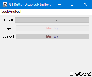
ButtonDisabledHtmlText
This overrides the default gray color of the HTML text when the JButton is disabled, using the original HTML text color with a semi-transparent finish.
Create a PIN code input field using JPasswordField
Section titled “Create a PIN code input field using JPasswordField”
Change the alignment of the Labels that display the minimum and maximum values of the JSlider.
Section titled “Change the alignment of the Labels that display the minimum and maximum values of the JSlider.”
SliderLabelAlignment
This sets the JSlider to display the minimum value label left-aligned and the maximum value label right-aligned.
Change the position and color of the horizontal borders in a JTable according to the sorting criteria.
Section titled “Change the position and color of the horizontal borders in a JTable according to the sorting criteria.”
StandingsTables
Create a ranking table using JTable and configure it to draw horizontal lines using JLayer to represent the division between top and bottom groups.
Right-click to select a row in the JTable and simultaneously open JPopupMenu.
Section titled “Right-click to select a row in the JTable and simultaneously open JPopupMenu.”
RightClickRowSelectionAndPopupMenu
This tests how to both change the selection state of a JTable row and display the JPopupMenu when a row is right-clicked.
Add a rollover separator between TableColumns in the JTableHeader.
Section titled “Add a rollover separator between TableColumns in the JTableHeader.”
TableHeaderRolloverSeparator
A JLayer is used to draw a separator between each TableColumn in a JTableHeader that only appears on rollover.
Draw a JRadioButton inside a JToggleButton, synchronized with its selection state.
Section titled “Draw a JRadioButton inside a JToggleButton, synchronized with its selection state.”
RadioCard
A RadioCard is created by drawing a JRadioButton with a synchronized selection state and multi-line text within a JTobbleButton.
Display an insert cursor on the column boundary of a JTable.
Section titled “Display an insert cursor on the column boundary of a JTable.”
InsertTableColumn
When you move the mouse between each column of a JTable, a cursor is drawn on the boundary line where clicking will insert a new TableColumn.
Implement fixed headers in Jlist
Section titled “Implement fixed headers in Jlist”
StickyHeaderList
The system searches for rows within the JList's display area, fixes cells containing specific data as headers on the JLayer, and renders them accordingly.
Restricting the area where TableColumns can be reordered by dragging.
Section titled “Restricting the area where TableColumns can be reordered by dragging.”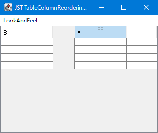
TableColumnReorderingIcon
This code limits the area where column reordering drags can be initiated in a JTableHeader to the upper half of the TableColumn, and performs mouse cursor changes and drag handle icon rendering on the JLayer.
Display the JButton only when the JList cell is highlighted.
Section titled “Display the JButton only when the JList cell is highlighted.”
ThreeDotsMenuButton
This draws JButtons on a JLayer for highlighting JList cells and displaying context menus.
Round the corners of the title background and border of the TitledBorder.
Section titled “Round the corners of the title background and border of the TitledBorder.”
RoundedTitledBorder
The title background of the TitledBorder is filled with a rounded rectangle with the bottom right corner rounded, and the border is also drawn with rounded rectangles with rounded corners on all four sides.
Highlight the sort status of the Table Column.
Section titled “Highlight the sort status of the Table Column.”
SortingHeaderColumnPainter
This setting allows you to change the background color of a TableColumn while it's being sorted in a JTable to highlight it.
Overwrite JTable cell selection by making it semi-transparent
Section titled “Overwrite JTable cell selection by making it semi-transparent”
TranslucentTableCellSelection
The JTable cell selection is drawn on the JLayer side, overwriting the cell selection state with a semi-transparent color and setting an outline around the cell selection area.
Fading out JList items that overflow from JScrollPane.
Section titled “Fading out JList items that overflow from JScrollPane.”
ListOverflowWithFadeScroll
If there are JList list items that overflow from the top and bottom of the JScrollPane, configure them to be displayed with a fade-out effect.
Change the JTabbedPane tab switching behavior to occur after a mouse click.
Section titled “Change the JTabbedPane tab switching behavior to occur after a mouse click.”
ChangeSelectedTabAfterClicking
This changes the JTabbedPane tab selection switching behavior from immediately after mouse press to after the click is completed.
Display an animation where a dashed line moves along the edge of the selected cell area in the JTable.
Section titled “Display an animation where a dashed line moves along the edge of the selected cell area in the JTable.”
DashedBorderAnimationForSelectedCells
The movement animation of the JTable is drawn by alternately switching between dashed lines with different dashed phases around the entire edge of the selected cell area.
Highlight the location where tabs are added in JTabbedPane.
Section titled “Highlight the location where tabs are added in JTabbedPane.”
TabOrScrollButtonHighlightAnimation
This setting enables the addition of a tab to JTabbedPane by highlighting the tab area, or the scroll button if the area is hidden, with an animation to indicate the tab's position.
Adds a selection highlight to a JMenu
Section titled “Adds a selection highlight to a JMenu”
MenuSelectionIndicator
Adds an underline or overline to the top-level JMenu you added to the JMenuBar to highlight its selected state.
Drawing column borders in a JTable
Section titled “Drawing column borders in a JTable”
VerticalRulesTable
Draws a double vertical line dividing the JTable into two parts down the center column.
Drag and rearrange JMenus placed on the JMenuBar
Section titled “Drag and rearrange JMenus placed on the JMenuBar”
DraggableMenu
Enables rearranging top-level JMenus placed on the JMenuBar via mouse drag.
Draw multi-day schedules on a calendar created with JTable using JLayer.
Section titled “Draw multi-day schedules on a calendar created with JTable using JLayer.”
CalendarTableWithEventBars
Wrap the monthly grid calendar created with JTable in a JLayer to display multi-day events using color bars spanning across date cells.