CellEditor CellRenderer
Display a JProgressBar in a JTable cell.
Section titled “Display a JProgressBar in a JTable cell.”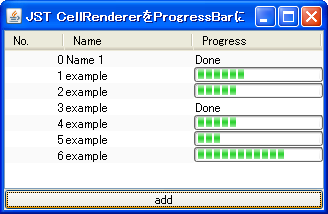
Add a JButton to a JTable cell and delete the row.
Section titled “Add a JButton to a JTable cell and delete the row.”
Place multiple JButtons in a JTable cell.
Section titled “Place multiple JButtons in a JTable cell.”
MultipleButtonsInTableCell
Place multiple clickable JButtons within the cells of a JTable.
Place a JRadioButton inside a JTable cell.
Section titled “Place a JRadioButton inside a JTable cell.”
Place multiple JCheckBoxes in a JTable cell.
Section titled “Place multiple JCheckBoxes in a JTable cell.”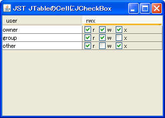
Set JComboBox to JTable’s CellRenderer
Section titled “Set JComboBox to JTable’s CellRenderer”
Set a JComboBox in the CellEditor of a JTable.
Section titled “Set a JComboBox in the CellEditor of a JTable.”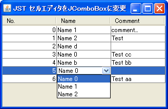
ComboCellEditor
We will use a JComboBox in the JTable's CellEditor to allow the user to select a value from a list.
Display a JCheckBox in a JTable cell and change the row background color.
Section titled “Display a JCheckBox in a JTable cell and change the row background color.”
CheckedRowColor
If a JCheckBox displayed in a JTable cell is checked, the background color of that row will be changed.
Using JSlider for JTable’s CellEditor and CellRenderer
Section titled “Using JSlider for JTable’s CellEditor and CellRenderer”
Change the date using JSpinner instead of CellEditor.
Section titled “Change the date using JSpinner instead of CellEditor.”
DateCellEditor
In JTable, change the cell editor for the column displaying the date to JSpinner.
Change the layout of the TableCellEditor
Section titled “Change the layout of the TableCellEditor”
CellEditorLayout
Change the layout of the TableCellEditor to place a JButton next to the CellEditor.
Use a larger cell editor to edit JTables.
Section titled “Use a larger cell editor to edit JTables.”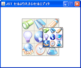
LargeCellEditor
Edit the JTable using a cell editor designed for selecting icons larger than the cells themselves, rather than the standard cell editor.
Change the border of the CellEditor
Section titled “Change the border of the CellEditor”
CellEditorBorder
Set the JTextField with the modified border as the default cell editor for the JTable.
Wrap text according to the cell width of the JTable
Section titled “Wrap text according to the cell width of the JTable”
Automatically adjust the height of JTable cells.
Section titled “Automatically adjust the height of JTable cells.”
AutoWrapTableCell
The height of JTable cells will be automatically adjusted according to text wrapping.
Displaying Hyperlinks in JTable cells
Section titled “Displaying Hyperlinks in JTable cells”
Clipping HTML-modified strings
Section titled “Clipping HTML-modified strings”
ClippedHtmlLabel
Modifying a string in HTML prevents it from being clipped, so create a clipped string beforehand before using HTML.
Make only links within JTable cells hoverable.
Section titled “Make only links within JTable cells hoverable.”
PointInsidePrefSize
This setting will only trigger a hover effect when the cursor hovers over an internal link within the JTable, rather than within a cell itself.
Edit JTable cells with a single click.
Section titled “Edit JTable cells with a single click.”
SingleClickCellEdit
This sets up a JTable so that a single click with the mouse puts it into edit mode.
Highlighting cells in a JTable
Section titled “Highlighting cells in a JTable”
CellHighlight
This changes the background color of a JTable cell when the mouse cursor is over it.
Set JPopupMenu in the JTable cell editor.
Section titled “Set JPopupMenu in the JTable cell editor.”
CellEditorPopupMenu
Set up a JPopupMenu in the JTable's cell editor to perform actions such as Copy, Paste, Undo, and Redo.
Roll over a JCheckBox cell.
Section titled “Roll over a JCheckBox cell.”
RolloverBooleanRenderer
This setting allows you to configure JCheckBoxes to roll over with the mouse cursor even when using them in JTable cells.
Change the background color of the BooleanCellEditor used by JTable.
Section titled “Change the background color of the BooleanCellEditor used by JTable.”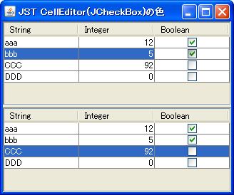
BooleanCellEditor
This changes the background color of the BooleanCellEditor used by JTable by default to the selected color.
Display only two rows within a JTable cell.
Section titled “Display only two rows within a JTable cell.”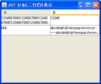
TwoRowsCellRenderer
This code displays text in a JTable cell for two lines, truncating any overflow with '...'.
Make the TableCellEditor scrollable.
Section titled “Make the TableCellEditor scrollable.”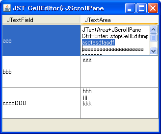
ScrollingCellEditor
We will use JTextArea and JScrollPane as TableCellEditors for the JTable.
Add padding to the JComboBox set in the JTable’s CellEditor.
Section titled “Add padding to the JComboBox set in the JTable’s CellEditor.”
ComboBoxCellEditorInsets
This adds padding to the JComboBox set in the JTable's CellEditor.
Using EnumSet for JTable columns
Section titled “Using EnumSet for JTable columns”
EnumSet
This code sets an EnumSet to a column in a JTable and displays its state using a renderer that utilizes a JCheckBox.
Use the Renderer for the column headers in the row headers of a JTable.
Section titled “Use the Renderer for the column headers in the row headers of a JTable.”
RowHeaderStyle
The renderer of the column header obtained from the JTableHeader is applied to the rendering of the JTable rows.
Connect JTable cells horizontally.
Section titled “Connect JTable cells horizontally.”
ColumnSpanningCellRenderer
This creates a cell renderer that concatenates JTable cells horizontally.
Highlight the search results in the JTable using RowFilter and Highlighter.
Section titled “Highlight the search results in the JTable using RowFilter and Highlighter.”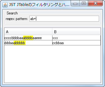
TableHighlightRegexFilter
In a JTable, we will display search results based on regular expressions using RowFilter and Highlighter.
Create a property list using JTable
Section titled “Create a property list using JTable”
PropertyTable
A property list table is created by applying a cell editor appropriate to the class to each row of the JTable.
Use a JProgressBar with a progress string set in a TableCellRenderer.
Section titled “Use a JProgressBar with a progress string set in a TableCellRenderer.”
StringPaintedCellProgressBar
Set JProgressBar as the TableCellRenderer for the JTable to display the progress string.
Setting the alignment when displaying multi-line HTML text in a TableCellRenderer.
Section titled “Setting the alignment when displaying multi-line HTML text in a TableCellRenderer.”
HtmlCellVerticalAlignment
This test examines how line alignment affects rendering when displaying multi-line HTML text in a JTable cell.
Place multiple components in a JTable’s CellEditor using JPanel
Section titled “Place multiple components in a JTable’s CellEditor using JPanel”
PanelCellEditorRenderer
By using JPanel in the JTable's CellEditor and CellRenderer, you can place multiple components inside the cell and add padding.
Make only JCheckBoxes inside JTable cells clickable.
Section titled “Make only JCheckBoxes inside JTable cells clickable.”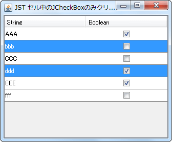
CheckBoxCellEditor
Set a JCheckBox placed in the center of the JPanel as the cell editor for the JTable, and configure it so that the selection state changes only when the JCheckBox is clicked.
Align text within JTable cells to both ends.
Section titled “Align text within JTable cells to both ends.”
InterIdeographJustify
This sets the text placed within a JTable cell to justify its alignment.
Set a JComboBox with hidden ArrowButtons in the CellEditor of a JTable.
Section titled “Set a JComboBox with hidden ArrowButtons in the CellEditor of a JTable.”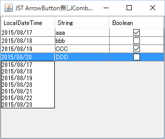
NoArrowButtonComboCellEditor
We will use a JComboBox with the ArrowButton hidden as the CellEditor for the JTable.
Aligning decimal points within JTable cells
Section titled “Aligning decimal points within JTable cells”
AlignDecimalCellRenderer
We use a JTextPane with TabSet configured as the cell renderer for the JTable, and align the decimal points of the numbers.
Configure the JComboBox cell editor so that the dropdown list is not displayed immediately after editing begins.
Section titled “Configure the JComboBox cell editor so that the dropdown list is not displayed immediately after editing begins.”
CellEditorTogglePopup
When a JComboBox is set as the cell editor for a JTable, and editing of that cell begins, the dropdown list will not be displayed immediately; instead, the cell will be in a selected state.
Use an editable JComboBox as the cell editor for a JTable.
Section titled “Use an editable JComboBox as the cell editor for a JTable.”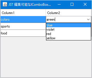
EditableComboCellEditor
Apply an editable JComboBox as a cell editor for the JTable, allowing you to add cell values and perform other actions.
In JTables, cells with the same content are displayed as blank to represent grouping.
Section titled “In JTables, cells with the same content are displayed as blank to represent grouping.”
RowGroupInTable
In a JTable, cells with the same content as the cell directly above them are displayed as blank to represent row grouping.
Draw JTable cell borders using MatteBorder.
Section titled “Draw JTable cell borders using MatteBorder.”
SudokuTableBorder
By drawing the cell borders of the JTable using MatteBorder, the thickness of the 3x3 block borders is changed.
Highlight text within JTable cells using HTML tags
Section titled “Highlight text within JTable cells using HTML tags”
Enable tab key focus movement within the JTable cell editor.
Section titled “Enable tab key focus movement within the JTable cell editor.”
CellEditorFocusCycle
This setting allows you to move focus within the cell editor using the Tab key when a JTable is being edited.
Validate input to the JTable cell editor.
Section titled “Validate input to the JTable cell editor.”
CellEditorInputVerifier
Use InputVerifier or similar tools to verify whether the input to the JTable cell editor is valid.
Change the JTable’s CellEditor to be non-editable but allow selection and copying.
Section titled “Change the JTable’s CellEditor to be non-editable but allow selection and copying.”
NonEditableCellEditor
Set a JTextField as the CellEditor for the JTable; this will be non-editable but selectable and copyable.
Divide a JTable cell diagonally.
Section titled “Divide a JTable cell diagonally.”
DiagonallySplitCellCalendar
We'll use JLayer to draw straight lines on the JTable's cell renderer to display diagonally divided cells.
Resizing the checkbox icon in JCheckBox.
Section titled “Resizing the checkbox icon in JCheckBox.”
ScaledIcon
This resizes the checkbox icons of JCheckBoxes set in the JTable's cell editor and cell renderer according to the row height of the JTable.
Display JTableHeaders as links and disable clicking on cell margins.
Section titled “Display JTableHeaders as links and disable clicking on cell margins.”
HyperlinkHeaderCellRenderer
This setting displays the column text of the JTableHeader as a link, and prevents column sorting from being performed when clicking on the blank space within the cell other than the link.
Click the JCheckBox placed within a JTable cell to expand or collapse the row height.
Section titled “Click the JCheckBox placed within a JTable cell to expand or collapse the row height.”
TableCellExpandCollapseOnClick
A JCheckBox is placed inside a JTable cell, and when clicked, the row height expands to the recommended size of the adjacent cell.
When renaming is initiated in the JFileChooser cell editor, the file name excluding the extension is selected.
Section titled “When renaming is initiated in the JFileChooser cell editor, the file name excluding the extension is selected.”
SelectFileNameWithoutExtension
This code retrieves the JTextField used as a renameable cell editor in the ListView or DetailsView of the JFileChooser, and sets it so that the file name excluding the extension, rather than the entire file name, is selected.
Display an uncertain progress status JProgressBar in a JTable cell.
Section titled “Display an uncertain progress status JProgressBar in a JTable cell.”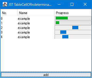
TableCellOfIndeterminateProgressBar
This code applies a JProgressBar to the cells of a JTable, which displays an animation indicating an uncertain progress state for a set period of time.
Change the background drawing of selected rows in a JTable to a rounded rectangle.
Section titled “Change the background drawing of selected rows in a JTable to a rounded rectangle.”
RoundedCornerTableRowSelection
The JTable's row selection background is drawn with rounded corners using the TableCellRenderer of the first and last cells so that the entire row appears as a rounded rectangle.
When you start editing a JTable cell, scroll until the entire cell editor is displayed.
Section titled “When you start editing a JTable cell, scroll until the entire cell editor is displayed.”
ScrollCellEditorToVisible
This setting allows you to configure JTable to scroll to a position where the entire cell editor is visible when cell editing begins via key input.
Use the calendar created in the JTable as the date cell editor for the JTable.
Section titled “Use the calendar created in the JTable as the date cell editor for the JTable.”
DateChooserCellEditor
By placing a calendar created with JTable into JPopupMenu and using it as a cell editor for the JTable's Date field, you can select and change dates.