Border
Title position of TitledBorder
Section titled “Title position of TitledBorder”
Border animation
Section titled “Border animation”
Place the JComponent in the border.
Section titled “Place the JComponent in the border.”
Place the JComponent in the bottom right corner of the border.
Section titled “Place the JComponent in the bottom right corner of the border.”
RightAlignComponentBorder
We'll use a JLayeredPane with SpringLayout configured to place a JComponent in the bottom right corner of the border.
Grouping JComboBox items by decorating them with a border.
Section titled “Grouping JComboBox items by decorating them with a border.”
Change the border of the CellEditor
Section titled “Change the border of the CellEditor”
CellEditorBorder
Set the JTextField with the modified border as the default cell editor for the JTable.
Set Border for JToolTip
Section titled “Set Border for JToolTip”
ToolTipBorder
Override the JComponent's createToolTip method to generate a JToolTip with a modified border.
Decorate the label border with MatteBorder.
Section titled “Decorate the label border with MatteBorder.”
MatteBorder
A MatteBorder is used to decorate the JLabel, drawing a border with a different line width on each of its four sides.
Round the corners of the JComboBox.
Section titled “Round the corners of the JComboBox.”
RoundedComboBox
This sets a border to round the top-left and top-right corners of the JComboBox.
Display the TitledBorder title vertically.
Section titled “Display the TitledBorder title vertically.”
Use StrokeBorder
Section titled “Use StrokeBorder”
Create a TitledSeparator using TitledBorder and MatteBorder.
Section titled “Create a TitledSeparator using TitledBorder and MatteBorder.”
Highlight search results in the JScrollBar
Section titled “Highlight search results in the JScrollBar”
ScrollBarSearchHighlighter
This highlights the results of a string search in a JTextArea, such as in a JScrollBar.
Drawing borders on adjacent components using JLayer
Section titled “Drawing borders on adjacent components using JLayer”
OverlapBorderPaintLayer
JLayer is used to draw edges and shadows on adjacent components.
Change the border when a JTree node gains focus.
Section titled “Change the border when a JTree node gains focus.”
DrawsTreeFocus
The border rendering when a JTree node is selected and focuses is changed using UIManager.
Add JSeparator to JTextPane
Section titled “Add JSeparator to JTextPane”
SeparatorOnTextPane
Add elements such as hr, JSeparator, or a JLabel with a MatteBorder to the JTextPane as separators.
Create a border that draws the edges specified by BasicStroke.
Section titled “Create a border that draws the edges specified by BasicStroke.”
StrokeMatteBorder
We will create a border that draws a dotted line using BasicStroke instead of a MatteBorder's border fill.
Display an icon in the title of TitledBorder
Section titled “Display an icon in the title of TitledBorder”
If the TitledBorder title is omitted, a ToolTip will be displayed.
Section titled “If the TitledBorder title is omitted, a ToolTip will be displayed.”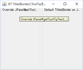
TitledBorderToolTip
If the title of a TitledBorder exceeds the width of the component it's set for, causing the trailing string to be truncated, the entire title will be displayed using a JToolTip.
Change the border lines of the table tag displayed in the JLabel.
Section titled “Change the border lines of the table tag displayed in the JLabel.”
HtmlTableBorderStyle
This changes the borders of tables drawn using the HTML table tag in components such as JLabel from separate to combined.
Change the size of the BevelBorder projection.
Section titled “Change the size of the BevelBorder projection.”
CustomBevelBorder
Change the size of the BevelBorder projection and set it to the JButton.
Sets the inner margin up to the title text in TitledBorder.
Section titled “Sets the inner margin up to the title text in TitledBorder.”
TitledBorderHorizontalInsetOfText
This test sets the inner margin from the left edge of the border to the title text using a left-aligned TitledBorder.
Use CompoundBorder
Section titled “Use CompoundBorder”
CompoundBorder
CompoundBorder is used to synthesize multiple borders and generate a new single border.
Draw cell borders in a JTable using MatteBorder.
Section titled “Draw cell borders in a JTable using MatteBorder.”
SudokuTableBorder
By drawing the cell borders of the JTable using MatteBorder, the thickness of the 3x3 block borders is changed.
Hide the FocusBorder of the JSlider.
Section titled “Hide the FocusBorder of the JSlider.”
SliderFocusBorder
In a JSlider that uses WindowsLookAndFeel, set the dotted FocusBorder to be hidden.
Change the target of the JComboBox’s FocusBorder from the internal items to the JComboBox itself.
Section titled “Change the target of the JComboBox’s FocusBorder from the internal items to the JComboBox itself.”
ComboBoxFocusBorder
This method hides the dotted FocusBorder applied to internal items in a JComboBox using WindowsLookAndFeel, and instead displays a solid FocusBorder on the JComboBox itself.
Set borders for the JTable body, header, parent JScrollPane, etc.
Section titled “Set borders for the JTable body, header, parent JScrollPane, etc.”
TableBorder
We will test setting different borders for JTables, their internal JTableHeaders, and their parent JScrollPane and JViewport.
Edit the title of the TitledBorder directly.
Section titled “Edit the title of the TitledBorder directly.”
EditableTitledBorder
Double-clicking the title of the TitledBorder will display the JTextField placed on the GlassPane on top of it, making the text editable.
Set the border color of the button placed in the JToolBar.
Section titled “Set the border color of the button placed in the JToolBar.”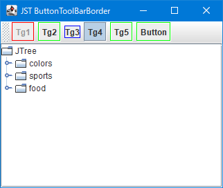
ButtonToolBarBorder
This sets the border color of JToggleButtons and JButtons placed in the JToolBar.
Change the border of the check icon in JCheckBox to flat.
Section titled “Change the border of the check icon in JCheckBox to flat.”
BorderPaintedFlat
This changes the border of the checkbox icon in JCheckBox to a flat drawing.
Round the corners of the JScrollPane.
Section titled “Round the corners of the JScrollPane.”
Draw a border created from a rounded corner shape using LinearGradientPaint.
Section titled “Draw a border created from a rounded corner shape using LinearGradientPaint.”
RoundGradientBorder
Override EmptyBorder and place a rounded-corner shape in its margin, then fill it with LinearGradientPaint.
Change the default icon of the JRadioButton to a thumbnail.
Section titled “Change the default icon of the JRadioButton to a thumbnail.”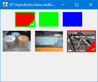
RadioButtonSelectedBorder
This modifies the default radio buttons in JRadioButton to image thumbnails, and the selected state button to an icon with an outline drawn over the thumbnail.
Change the drag icon in JToolBar
Section titled “Change the drag icon in JToolBar”
ToolBarBorder
This modifies the drag icon that appears as a border when the JToolBar is movable.
Draw paragraph borders using JSeparator.
Section titled “Draw paragraph borders using JSeparator.”
ColumnRules
This draws a JSeparator as a border between columns created using a GridLayout or similar.
Change the focus border of a JTabbedPane tab to an underline when a tab is selected.
Section titled “Change the focus border of a JTabbedPane tab to an underline when a tab is selected.”
UnderlineTabFocusIndicator
This changes the focus border of a JTabbedPane tab when it is selected from a dotted border to an underline.
Display the focus border of the previously selected tab in JTabbedPane as a history.
Section titled “Display the focus border of the previously selected tab in JTabbedPane as a history.”
PreviouslySelectedTabColor
This changes the focus border color of the currently selected tab and the tab that was selected immediately before it in JTabbedPane.
Set the background color of the TitledBorder.
Section titled “Set the background color of the TitledBorder.”
TitledBorderBackground
I will test how to change the background color of the TitledBorder.
Display an image as the background of the JTextArea.
Section titled “Display an image as the background of the JTextArea.”
CentredBackgroundBorder
Display an image centered using a border as the background for components such as JTextArea.
Divide the TableColumn of the JTableHeader with a diagonal line.
Section titled “Divide the TableColumn of the JTableHeader with a diagonal line.”
DiagonalHeaderCellBorder
The 0th TableColumn of the JTableHeader is divided by a diagonal line to display different headings for the row and column.
Round the corners of a JTextField.
Section titled “Round the corners of a JTextField.”
Set a border for a JTextField that changes its border color depending on whether it has focus or not.
Section titled “Set a border for a JTextField that changes its border color depending on whether it has focus or not.”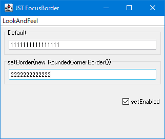
FocusBorder
This sets a border that changes the color of the border around the JTextField and highlights it when it receives focus.
Create a frame-like shape using Path2D and use it as a border.
Section titled “Create a frame-like shape using Path2D and use it as a border.”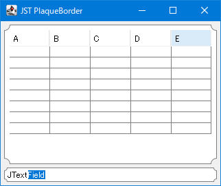
PlaqueBorder
Create a border using Path2D's Bézier curves to draw a frame-like shape with rounded corners, and set it as a component such as a JTextField.
Round the corners of JPopupMenu
Section titled “Round the corners of JPopupMenu”
RoundedCornerPopupMenu
The background of JPopupMenu is made transparent, and a rounded border is applied to it.
Switch the border of a JComboBox depending on whether the dropdown list is displayed.
Section titled “Switch the border of a JComboBox depending on whether the dropdown list is displayed.”
VariableRoundedBorderOnComboBox
Switch the JComboBox's border setting while the dropdown list is displayed, so that the left and right edges are drawn as straight lines.
Round the corners of the title background and border of the TitledBorder.
Section titled “Round the corners of the title background and border of the TitledBorder.”
RoundedTitledBorder
The title background of the TitledBorder is filled with a rounded rectangle with the bottom right corner rounded, and the border is also drawn with rounded rectangles with rounded corners on all four sides.
Display the JPopupMenu label as the title.
Section titled “Display the JPopupMenu label as the title.”
Specify the JSpinner value as a percentage.
Section titled “Specify the JSpinner value as a percentage.”
Adding non-selectable characters to a JSpinner text field.
Section titled “Adding non-selectable characters to a JSpinner text field.”
ParticularyNonEditableSpinner
This adds a string to the JSpinner text field that cannot be selected or edited.
Disable direct input to JSpinner.
Section titled “Disable direct input to JSpinner.”
SpinnerEditor
This will disable editing in the JSpinner editor, allowing values to be changed only via buttons.
Hide the JSpinner text.
Section titled “Hide the JSpinner text.”
DecimalFormatSymbols
When a JSpinner that uses SpinnerNumberModel is disabled, the numerical value will be hidden.
Loop through the values of the JSpinner model.
Section titled “Loop through the values of the JSpinner model.”
CyclingSpinnerModel
The JSpinner model is configured to loop when the value exceeds the maximum and minimum values.
Do not allow invalid values to be entered in JSpinner.
Section titled “Do not allow invalid values to be entered in JSpinner.”
NumberFormatter
We retrieve a JFormattedTextField from JSpinner and configure it to not allow invalid values to be entered.
Inner margin when JSpinner is made non-editable
Section titled “Inner margin when JSpinner is made non-editable”
InactiveSpinnerInsets
This modifies the background color and internal margin color when JSpinner is made non-editable.
Arrange the JSpinner buttons on the left and right.
Section titled “Arrange the JSpinner buttons on the left and right.”
SpinnerButtonLayout
Change the layout of JSpinner to place the arrow buttons on the left and right.
Add a ToolTip to a JSpinner button.
Section titled “Add a ToolTip to a JSpinner button.”
Change the date using JSpinner instead of CellEditor.
Section titled “Change the date using JSpinner instead of CellEditor.”
DateCellEditor
In JTable, change the cell editor for the column displaying the date to JSpinner.
Increasing or decreasing values using MouseWheel
Section titled “Increasing or decreasing values using MouseWheel”
Enter a value that exceeds the upper limit in SpinnerNumberModel.
Section titled “Enter a value that exceeds the upper limit in SpinnerNumberModel.”
SpinnerNumberModel
This tests the value displayed when you directly enter a number in the JSpinner's text field that exceeds the upper limit set by SpinnerNumberModel.
Compare the upper and lower limits of JSpinner using BigDecimal.
Section titled “Compare the upper and lower limits of JSpinner using BigDecimal.”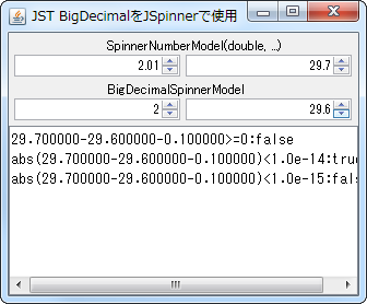
BigDecimalSpinnerModel
When using floating-point models in JSpinner, the maximum and minimum values will now be compared using BigDecimal.
Specify the width of JComboBox etc. by the number of columns.
Section titled “Specify the width of JComboBox etc. by the number of columns.”
SetColumns
The widths of JTextField, JPasswordField, JSpinner, and JComboBox are compared by specifying the number of columns.
Set the date in JSpinner
Section titled “Set the date in JSpinner”
SpinnerDateModel
We will test date changes by setting a SpinnerDateModel with a lower limit in JSpinner.
Use JComboBox instead of JSpinner
Section titled “Use JComboBox instead of JSpinner”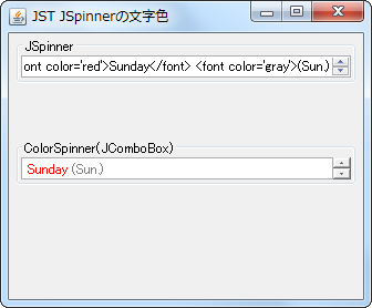
SpinnerTextColor
By using JComboBox instead of JSpinner, we are able to change the text color and other properties of the items.
Convert JSpinner’s notation to hexadecimal.
Section titled “Convert JSpinner’s notation to hexadecimal.”
HexFormatterSpinner
This displays the JSpinner's representation in hexadecimal and the character assigned to that Unicode code point.
Using LocalDateTime with JSpinner
Section titled “Using LocalDateTime with JSpinner”
SpinnerLocalDateTimeModel
Instead of using SpinnerDateModel, which uses Date or Calendar, we create a SpinnerModel that uses LocalDateTime, which was introduced in JDK8, and select the date with JSpinner.
Set a timer to repeat the action while the JButton is pressed with the mouse.
Section titled “Set a timer to repeat the action while the JButton is pressed with the mouse.”
AutoRepeatTimer
This sets up a timer that repeatedly executes a specified action while the JButton is pressed with the mouse.
Restrict the date field that can be changed in JSpinner spins
Section titled “Restrict the date field that can be changed in JSpinner spins”
SpinCalendarField
This restricts the date fields that can be modified using the JSpinner's spin buttons to only those specified by the initial value, rather than the field specified by the cursor.
Specify the increment/decrement size for each date field in the SpinnerDateModel configured in JSpinner.
Section titled “Specify the increment/decrement size for each date field in the SpinnerDateModel configured in JSpinner.”
CalendarFieldStepSize
Set SpinnerDateModel in JSpinner and specify the increment/decrement size for each date field when the spin button is clicked.
Change the JSpinner editor to JLabel to display HTML.
Section titled “Change the JSpinner editor to JLabel to display HTML.”
HtmlSpinnerEditor
This modifies the JSpinner's ListEditor to a JLabel to display the text in HTML.
If the JSpinner value reaches a boundary value, disable the ArrowButton.
Section titled “If the JSpinner value reaches a boundary value, disable the ArrowButton.”
DisableOnBoundaryValues
When the JSpinner value reaches its upper or lower limit, the corresponding ArrowButton is disabled and cannot be clicked.
Change the size of the ArrowButton in JSpinner
Section titled “Change the size of the ArrowButton in JSpinner”
SpinnerArrowButtonSize
This modifies the width and height of the ArrowButton in the JSpinner.
Change the text alignment in the JSpinner editor.
Section titled “Change the text alignment in the JSpinner editor.”
SpinnerEditorAlignment
This modifies the text alignment applied to JSpinner.DefaultEditor in JSpinner.
Make JSpinner’s TextField and ArrowButton semi-transparent
Section titled “Make JSpinner’s TextField and ArrowButton semi-transparent”
TranslucentSpinner
In a JSpinner to which NimbusLookAndFeel has been applied, set its FormattedTextField and ArrowButton to be semi-transparent.
Reverse the direction of increase/decrease using the arrow buttons in JSpinner.
Section titled “Reverse the direction of increase/decrease using the arrow buttons in JSpinner.”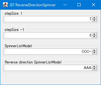
ReverseDirectionSpinner
This controls the increase or decrease of the value when clicking the JSpinner's arrow buttons, or swaps the previous and next directions.
Create a ButtonGroup or JComboBox for selecting an Enum constant using JRodioButton.
Section titled “Create a ButtonGroup or JComboBox for selecting an Enum constant using JRodioButton.”
EnumInputSelect
This process creates selection components such as JRadioButton's ButtonGroup, JComboBox, and JSpinner from a list of enum constants and retrieves the specified enum constant.
Set the JSpinner values so that the sum of the values within the group remains constant.
Section titled “Set the JSpinner values so that the sum of the values within the group remains constant.”
SpinnerNumberModelGroup
Create a group with multiple SpinnerNumberModels and configure it so that the sum of the numbers within the group is constant.
Place the JSlider and the text input field on top of each other.
Section titled “Place the JSlider and the text input field on top of each other.”
CompactSlider
This creates a numeric input component by layering a JSlider and a JFormattedTextField using an OverlayLayout.
Place JSpinner as a MenuItem in JPopupMenu.
Section titled “Place JSpinner as a MenuItem in JPopupMenu.”
SpinnerMenuItem
Use components such as JSpinner or JSlider that do not implement MenuElement as MenuItems for JPopupMenu.
Round down the JSpinner value to the nearest 0.5.
Section titled “Round down the JSpinner value to the nearest 0.5.”
RoundDownToHalfSpinner
This setting will round down or round up to the nearest 0.5 when displaying numbers in JSpinner.
Draw the border of the editor used within JSpinner.
Section titled “Draw the border of the editor used within JSpinner.”
SpinnerEditorBorderPainted
This toggles whether or not the border of the Editor component used internally by JSpinner is rendered.
Group JList items
Section titled “Group JList items”